The Spirit of the 90’s
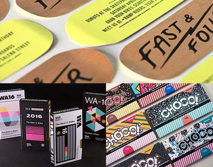
Whether it’s Day-Glo color palettes or an emphasis on retro imagery, the 90’s are definitely “in”. Just like the 80’s had their resurgence years back, we’re seeing designers embrace the past and harken back to the days of Dunkaroos and kicking it at the skatepark. Totally rad.
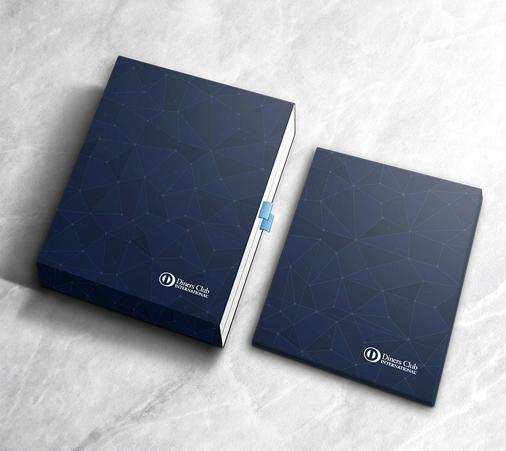
Geometric Patterns
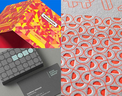
Patterns have been growing in popularity in all walks of design, but Print has really picked up on this trend and paired it with simple, shape-based patterns to add a touch of texture to their pieces. Patterns also create opportunity for additional brand elements throughout collateral and stationary.
Script Typography
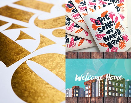
Handwritten scripts are a great way to add the “human” element into an otherwise flat medium. Gone are the days of looking for that perfect font. These days, designers are drawing their typefaces by hand, scanning them in, and applying them in ways that make print more intimate and inject a sense of personality.
Augmented Reality
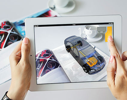
The introduction of AR into print design has opened up the possibilities for more informative, immersive advertising and articles. Why settle for a flat picture of the front end of a car when you can move around the car from every angle, using your phone as a viewport? We’re excited to see what solutions this technology creates in the coming year.
“Blah” Color Palettes
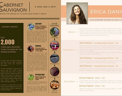
We’ve recently seen an upswing of muted grey and tan color palettes in print design, leading to a landscape of muddy, un-emphasized layouts and typography. This trend makes it difficult to drive emotion and draw attention to any one object. We hope this trend takes its leave in the next year.
Typographic Overload
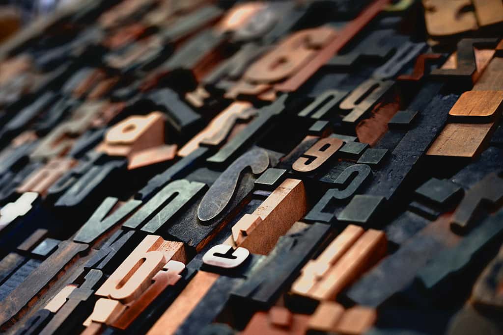
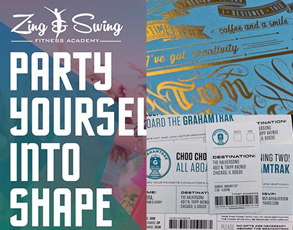
Can’t seem to pick out the perfect typeface for your project? Why not pick them all?! We’re a firm believer that a single design shouldn’t use more than three well-paired typefaces, but in the past year there has been a surge in heavy typographic layouts utilizing way too many typefaces. This combination of slabs, serifs, and scripts leads to designs without clear messaging that are often too busy for a reader to decipher.
It’s Hip To Be Square
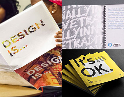
Letter and Tabloid layouts are so 2010. Square layouts are where it’s at! With their satisfying form factor and more compact end-product, we’re seeing a lot of growth in these designs. People love uniformity, and square formats give a sense of consistency and high-design aesthetic to everyday applications.
Takeaway: Brochure and booklet design is straying from previous norms in favor of more designerly layouts and sizes.
Like an EmBOSS
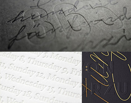
Embossing and letterpress aren’t new by any means, but we’ve seen quite the pick-up in their use recently. Both of these methods add a textural quality to an otherwise flat format and provide a unique aesthetic as well.
Takeaway: With all of the emphasis on vintage and retro trends, older printing methods are now coming back into the spotlight and proving that print doesn’t have to be restricted to the 4-color process standbys of yesterday.
