
VIBRANT COLORS
Color palettes are brighter, bolder, and more saturated than ever. These fearless hues often include gradients or high-contrast color combinations for even more impact and drama.
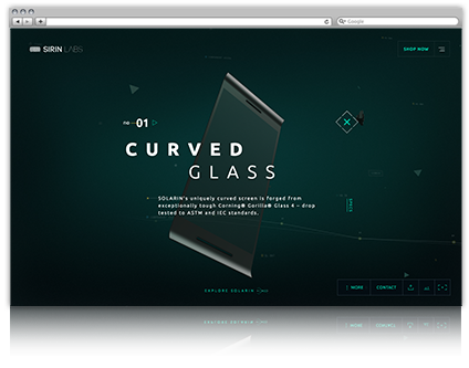
SKEUOMORPHIC ELEMENTS
While simple, flat design still reigns supreme, 2016 reintroduced three-dimensional elements to web design, albeit in a more restrained and deliberate fashion than we’ve seen in the past.
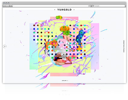
MULTI-LEVEL ELEMENTS
Overlapping elements allow for a fresh way to create depth in an otherwise 2D space. Multilevel overlays add dynamism to websites while keeping in line with minimal, flat design trends.
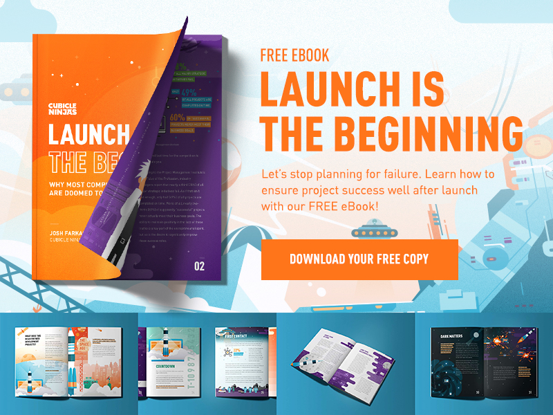
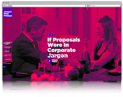
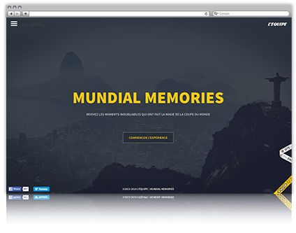
DYNAMIC ANIMATION
This year, animation became a key tool for story-telling. Page transitions, hover-states, imagery, and text often involve complex motion that takes users on a specific journey across pages.
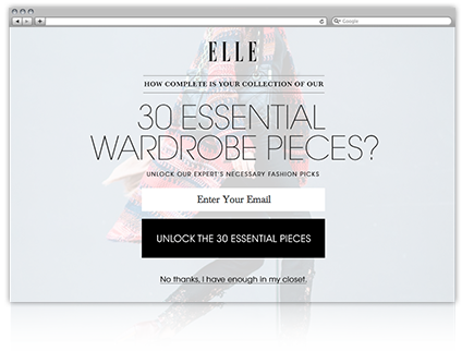
CONDESCENDING POP-UPS
Whether bothering you for your email or shaming you for your ad blocker, these annoyances often take over the entire webpage. Even worse, the only way to exit out is by clicking on a passive aggressive, first-person phrase.
HAMBURGER MENUS
From a UI/UX perspective, hamburger menus are a nightmare. Exploring a website should be an easy, seamless experience for users, not a treasure hunt with too much clicking and very little return. Let’s nix hidden navigation systems in 2017.
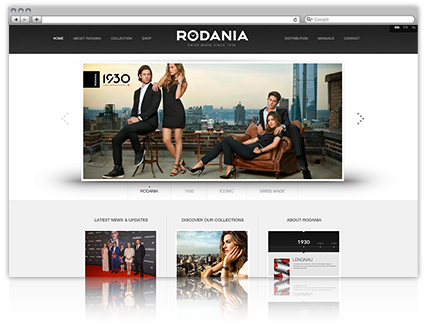
HOMEPAGE CAROUSELS
This isn’t to say that sliders can’t be designed well – however, homepage image carousels are often overused and can quickly cheapen the look of a website. The biggest problem comes with SEO. Hiding content hinders traffic by limiting a search engine’s ability to read keywords.
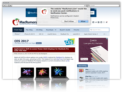
DESKTOP PUSH NOTIFICATIONS
Disclaimer – these aren’t inherently bad! The approach could use some work though. In 2017, keep the process convenient and efficient by foregoing the ugly pop-ups and letting users explore the site a bit before asking them to commit. The current trend is just too much, too soon.
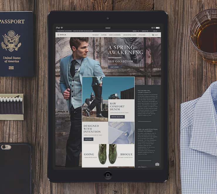
DIVERSE PAGE LAYOUTS
Forget matchy-matchy webpages hiding behind the guise of consistency. In 2017, we expect to see websites in which each page is unique and individual in its treatment – contributing to a cohesive visual look and system while maintaining structural independence.
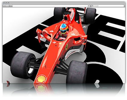
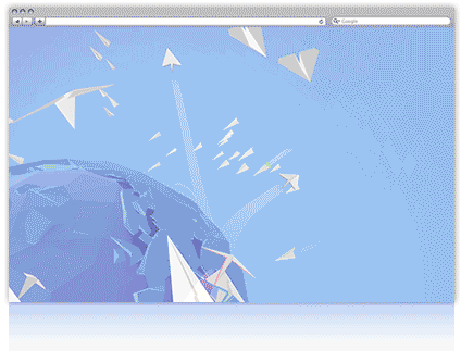
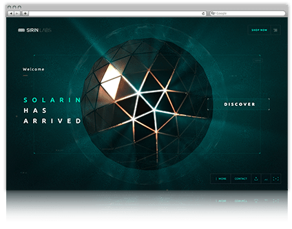
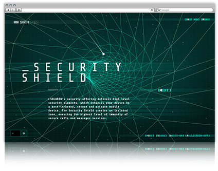
WEBGL
WEBGL – a JavaScript API that supports plug-in-free interactive 3D and 2D graphics – allows developers and designers alike to create complex animation sequences without the use of additional software. With the push for more immersive storytelling, we see this innovative tech being used much more in 2017.
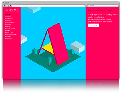
A-Frame
2016 was a big year for virtual reality and that momentum is continuing on into 2017. This is largely in part to tools like A-Frame, a web-based resource that allows users to build virtual reality experiences that can then be viewed on the Vive and Rift, as well as on desktop and mobile.
Takeaway: Web design is moving away from static templates and uniform design. In the future, websites will be interactive stories that focus on user interaction to highlight content.