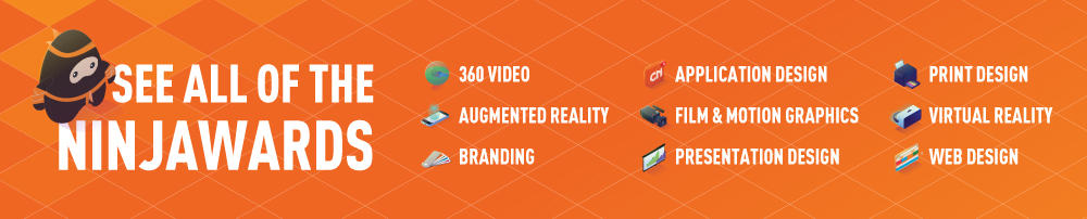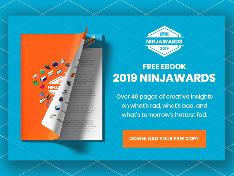
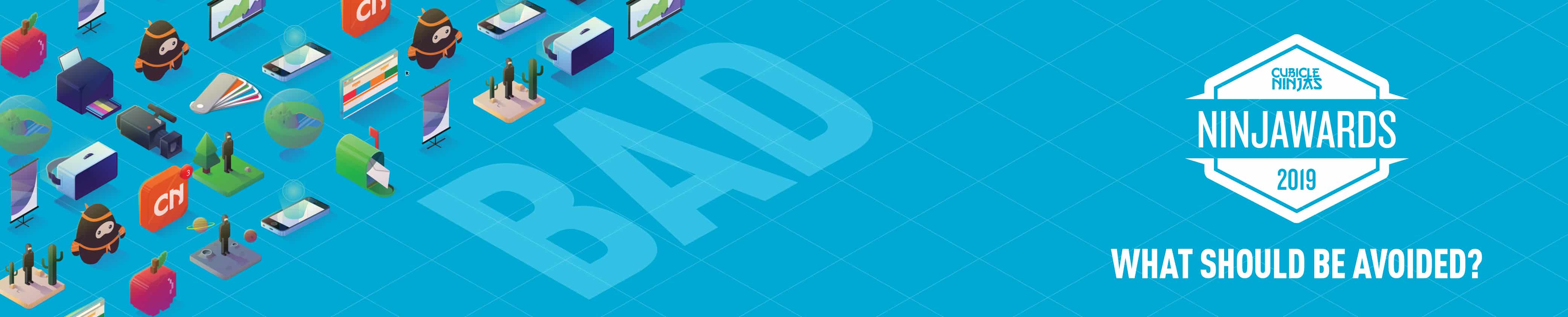
2019 Branding Trends – Ninjawards
One of the core ninja principles is to always question the status quo.
Each year, Cubicle Ninjas’ reviews the industry’s creative highs and lows to publish a curated list of notable efforts in each specialty. Think of it as a highlights reel of the years’ best and brightest, along with some cautionary tales.
The Ninjawards provides a platform for inspiration, constructive criticism, and ultimately, recognition of bright new areas of design or technology. We hope our thinking unlocks new perspectives about the future of your creative in Branding!
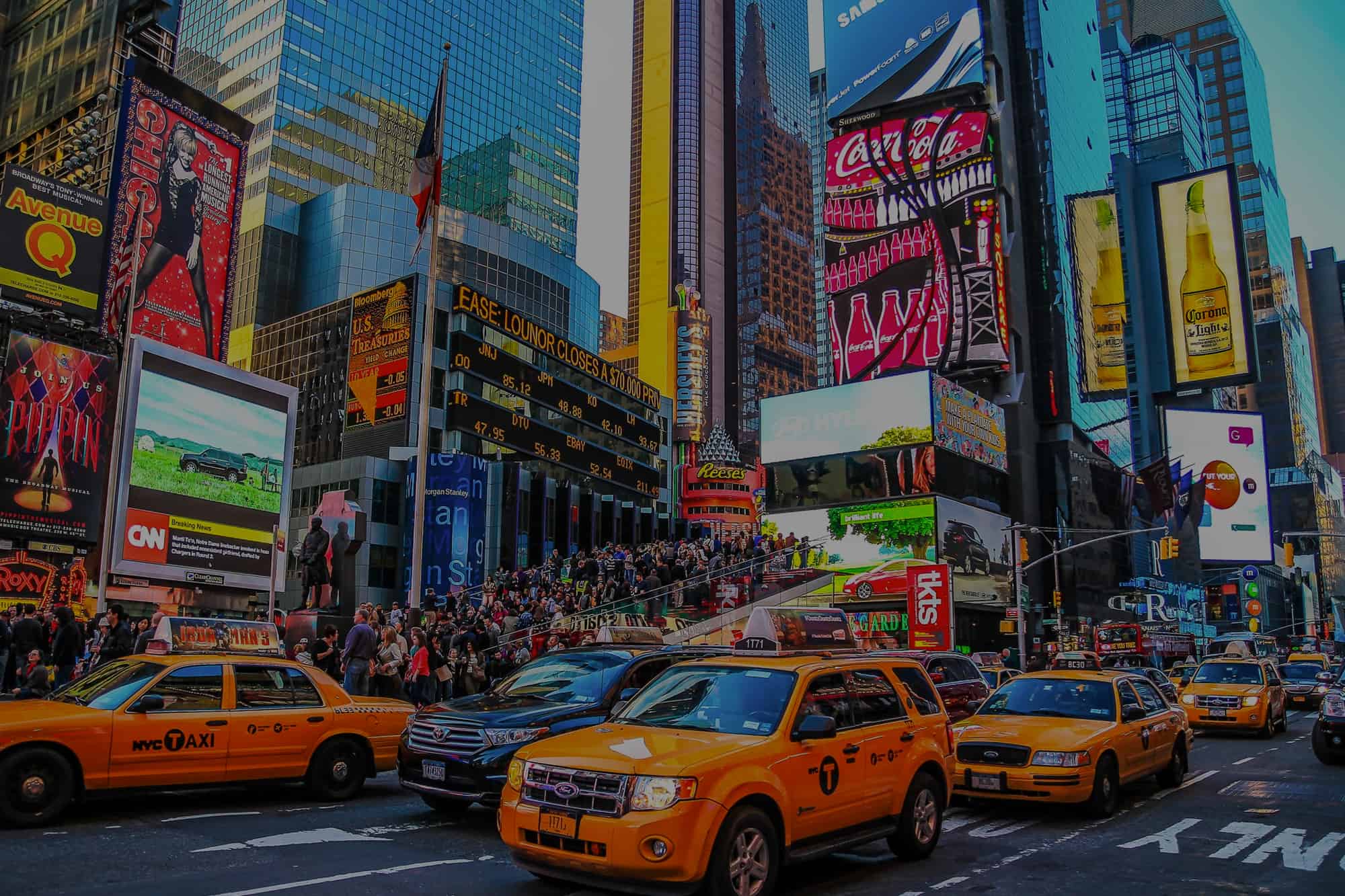
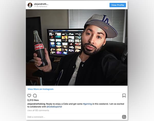
Brands are no longer influencers, Customers are
Customers drive brands. Brands are shifting to no longer being the driving force for a customers decision making, but rather the brands ability to give the customer choice and exist around that customer’s lifestyle. More and more, brands are doing the research to find the demographics and lifestyles of their core customers to market towards. Those customers are interacting with organizations they care about, generating new ideas in how the brand could evolve.
What does this have to do with identity? Brand design is, now more than ever, about being a good listener.
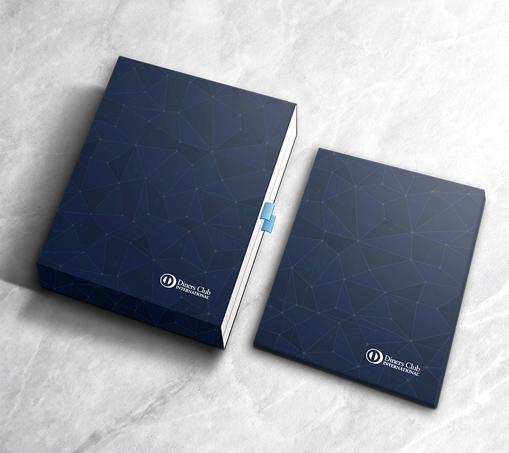
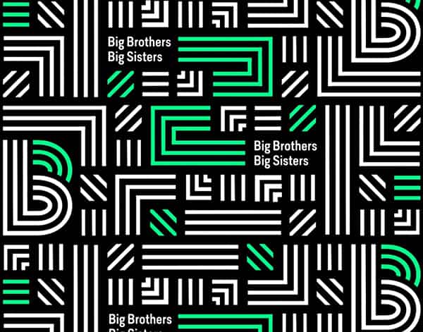
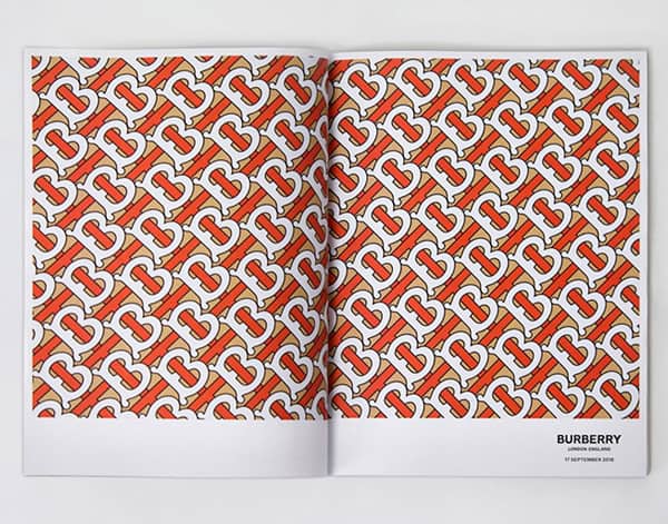
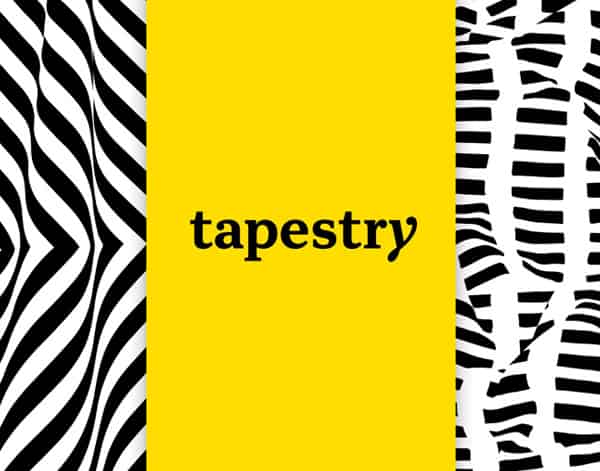
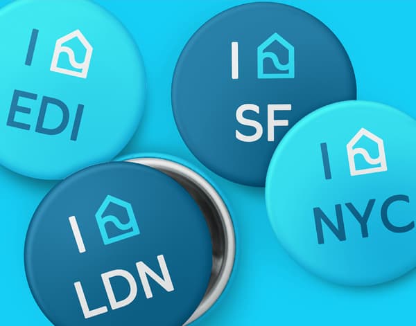
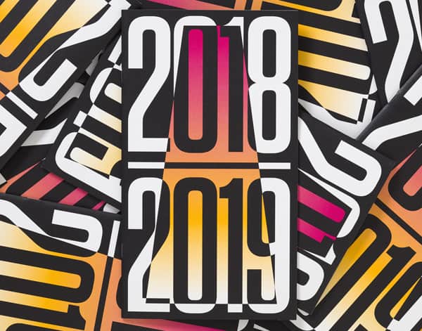
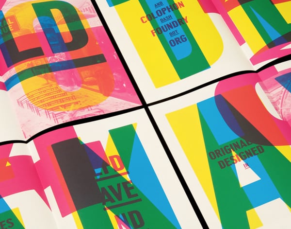
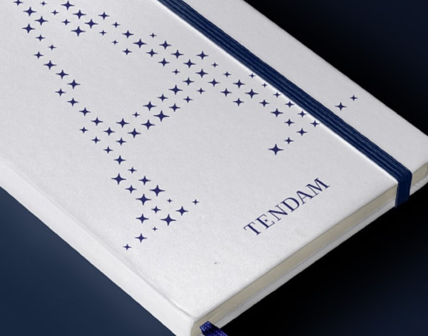
Pattern
2018 has been filled with brands incorporating pattern in their core branding. Playing off of a simple, modern look allows the aesthetic to take something simple and start to build an actual brand from it. This use of pattern often has varying levels of complexity, being responsive in nature, offering more flexibility when creating materials for multiple medias. Pattern also offers a change to create a unique sequence of elements to help separate from other brands.
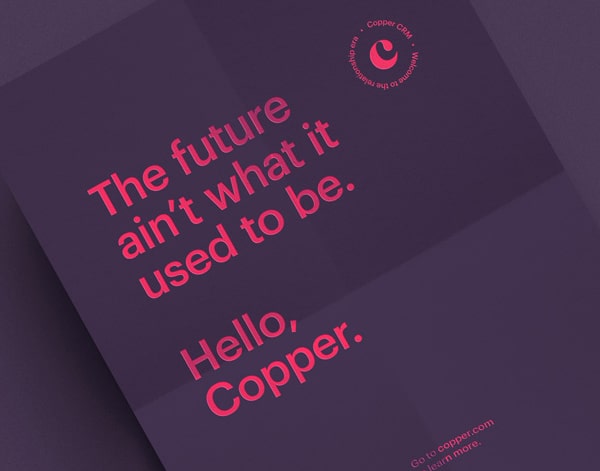
Monochromatic
There is no denying the burst of monochromatic style have grown this year. These brands aren’t necessarily minimalistic in nature, but rather feature a stripped down color palette. Focusing on large color blocks of the same one color allows that particular color to be tied to that brand and creating a memorable, lasting brand experience.
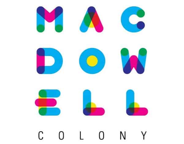
Overlaps
As flat 2.0 becomes more prevalent the opportunity for overlapping logos, colors, layouts, etc to be implemented across collateral grows. The overlap treatment has many forms by using colors shifts, form and shape, and transparency just to name a few. With higher resolution screens being the norm, vibrant colors being super popular, and semi flat design growing, this will continue to be a popular treatment in the design community.
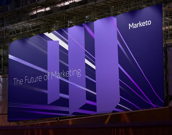
Flat 2.0
Unlike Flat 1.0, which prioritized minimal, two-dimensional elements, Flat 2.0 has evolved to include sleek gradients and precise shadows for a sleek interpretation of depth and space. The rise of digital platforms and retina screens are a big reason that truly flat elements aren’t as crucial or popular as they have been in the past. As digital spaces replace brick and mortar locations and as your inbox is larger than your mailbox, the space in which a logo lives could be completely digital.
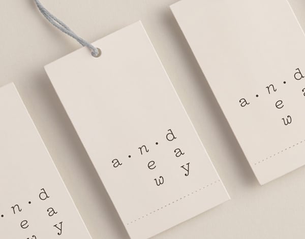
Over Simplicity
Boiling a brand down to its core values is refreshing. But making logos hyper simple for simplicity’s sake, and removing a brand’s unique perspective, is a design sin. Brands still need to be distinct and ideally indicating what product or service they engage in, on even the lightest of levels. A brand that doesn’t stand out from the competition is ultimately not a brand.
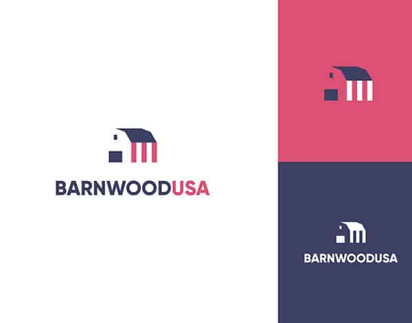
Bad Containers
Over the past year, we have seen several brands update to break out of the confined entrapments placed around their logos. Thoughtlessly trapping your logo in an encompassing line or shape destroys the originality tied into your marks form. Badges and emblems are not off the table, but let’s agree as a community to ensure there is purpose behind the application.
Careless Tracking / Kerning
Kerning and tracking is a great way to make your logotype stand out, but too much of a good thing can be a bad thing. Over applying these treatments by adding too much space between letterforms can result in illegible, sloppy looking wordmarks. Attention to detail and thoughtful application is key.
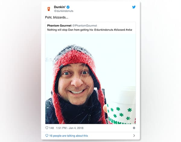
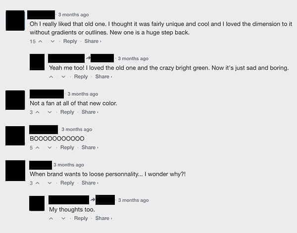
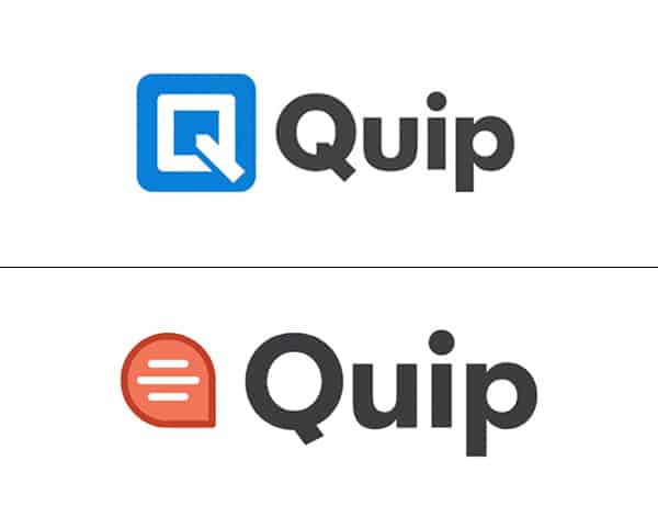
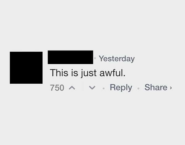
Audience Rejection
If brands are no longer influencers and their customers are in charge, then your customer’s reaction to a relaunch is all that matters. We’ve seen an increasing trend in customers rising up against a brand refresh they dislike, leading to embarrassing headlines and ultimately reversals. Gaining buy-in from your customers is just as essential as it would be from internal partners. As designers and marketers it might be frustrating to hear someone dislikes your direction, but ignoring these stakeholders can be costly decision.
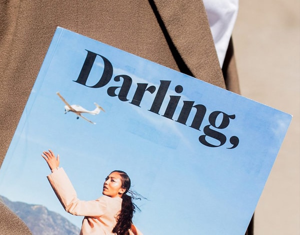
The Return of Serif Fonts
With in ever evolving technologically driven world and stylistic trends in the like larger type, it makes choosing a serif font once again once again a viable option. No longer does it set your brand at a disadvantage in a digital space. In an age with amazing resolutions, the readability for serif typefaces become more and more improved.
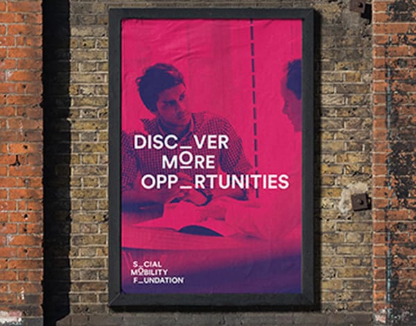
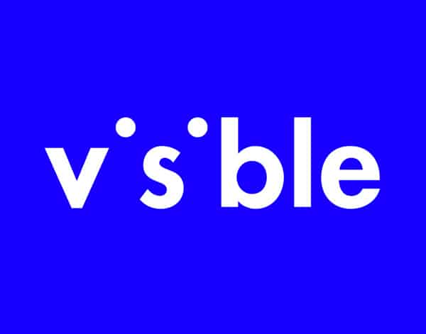
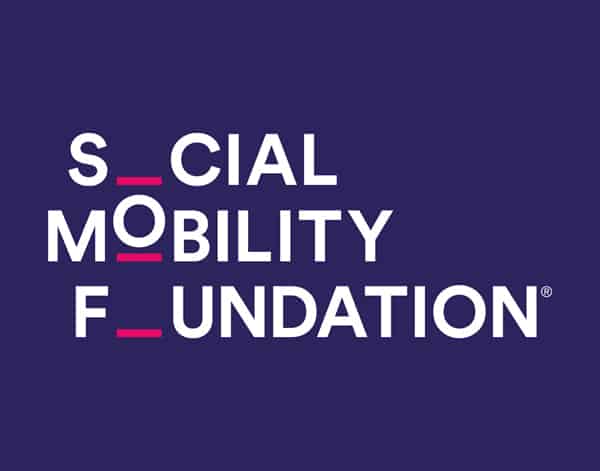
Negative Space
Logos that rely on negative space is a zombie fad. It lives, and dies, and rises from the grave once again. But it never seems to go away fully, continuing to sweep the design and branding world today. The amount of color and detail you can apply to this treatment fits in well with the popular use of gradients and vibrant colors. Using negative space could also allow for an unconventional treatment on a conventional piece of subject matter, always a sought after approach to an aesthetic solution within the design community.
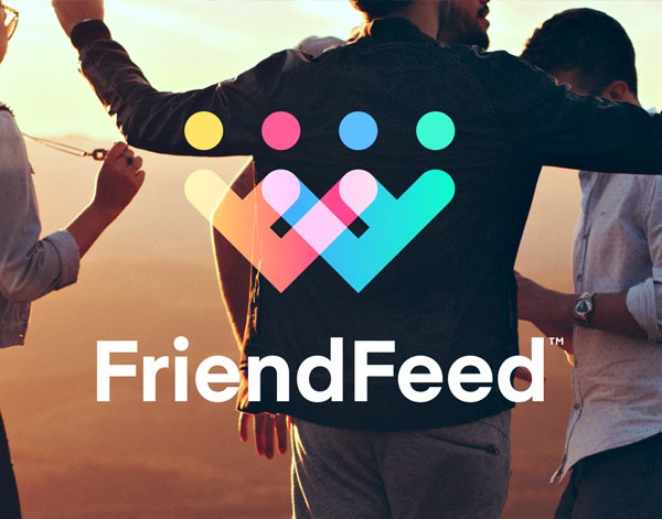
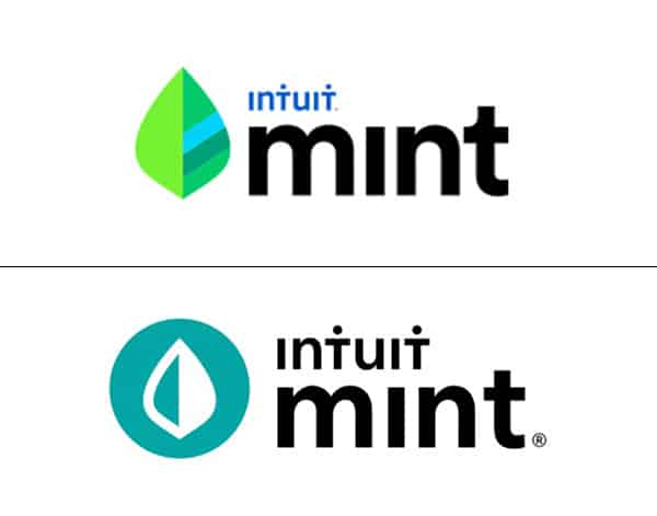
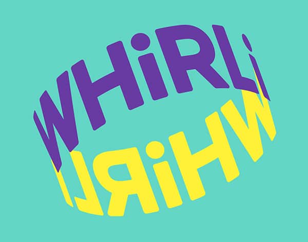
Expressive Logos
Major brands displaying their brand and logos in unusual colors and unexpected forms is growing trend. It is unknown if this deep dive into the expressive nature of companies is attributed to the popularity of vibrancy, technology, a reaction to minimalism, or something entirely different. But as designers we can’t help but love it. These brands stand out in fresh ways.
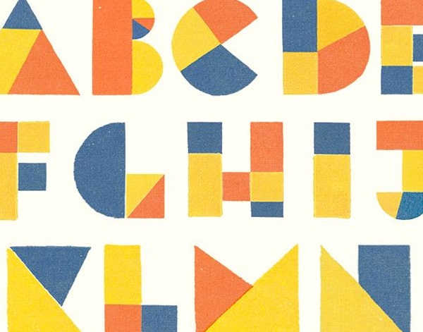
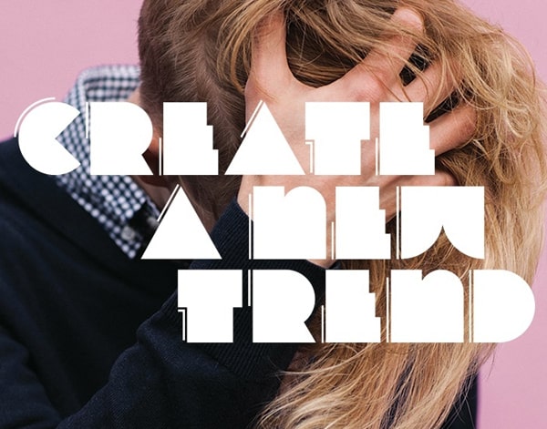
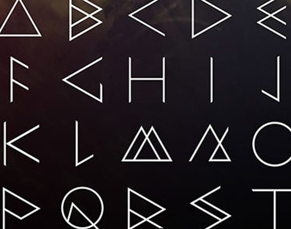
Custom Geometric Typeface
Simple geometric logos allow for interesting looks without relying too heavily on graphical elements. They allow for something super simple to have very clear messaging with a wide range of appeal in its readability, or even become the genesis of a brand pattern. The duality of being minimal while also being complex allows for a lot of creative avenues for designers and developers alike.
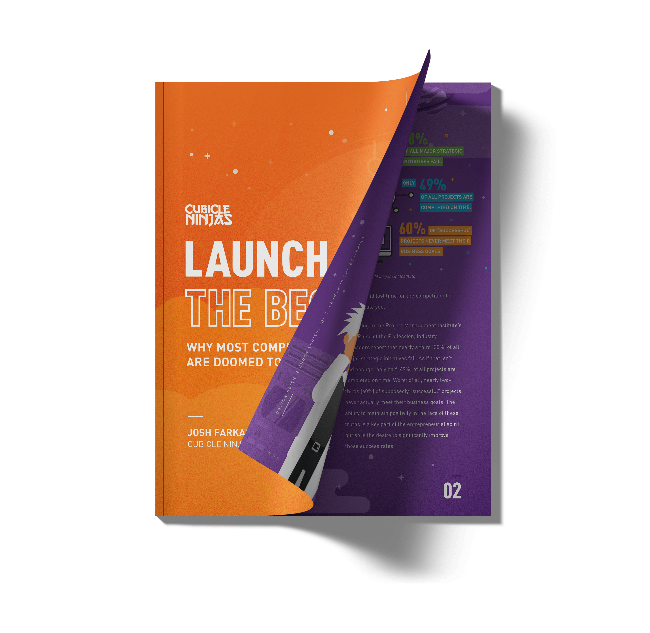
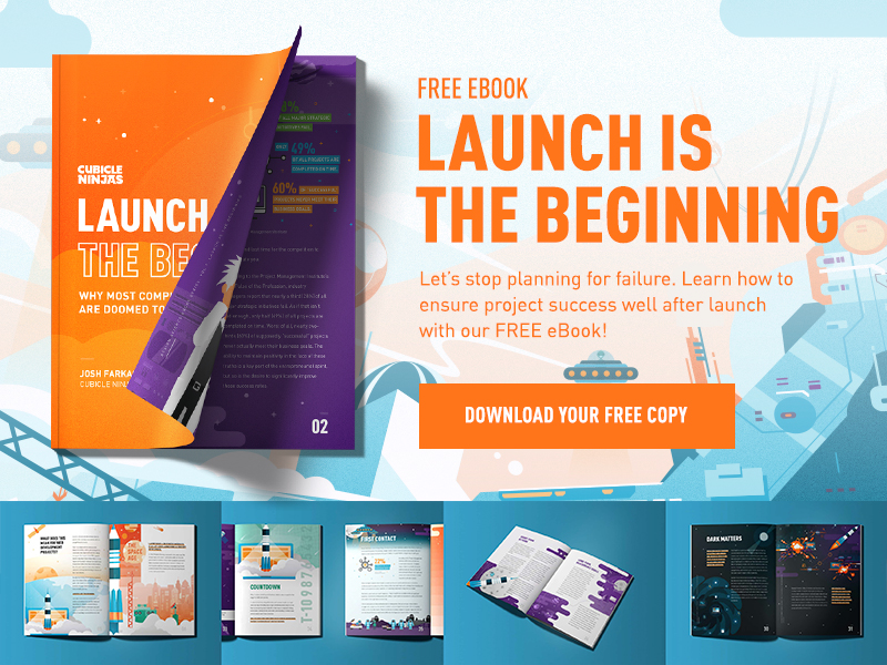
Launch is the Beginning
Cubicle Ninjas is celebrating our tenth birthday this year. With thousands of design and development projects under our belt from some of the world’s greatest brands, we’ve noticed a clear trend: successful teams see the world differently. Project launch isn’t a finish line, it’s just the beginning. Companies that think this way see exponentially greater and more frequent success in every project they touch. As part of our mission to stop bad design, we wrote a book about this revelation. To learn how to implement long-term design thinking in your organization, download our 100% free eBook, “Launch is the Beginning”.