
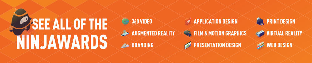
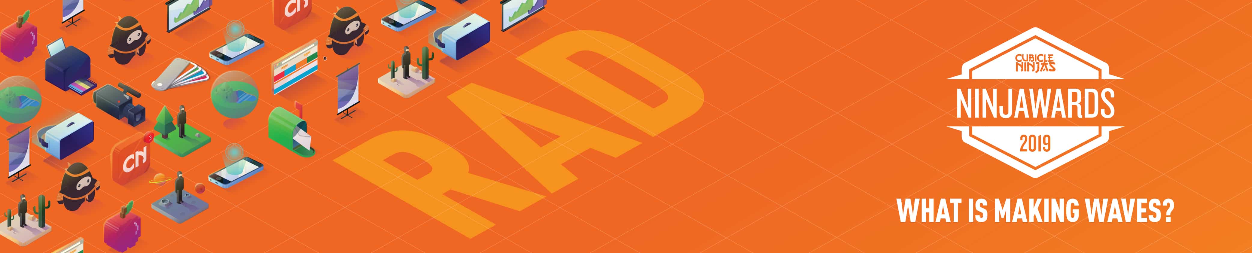
2019 Web Design Trends – Ninjawards
Each year, Cubicle Ninjas’ reviews the industry’s creative highs and lows to publish a curated list of notable efforts in each specialty. Think of it as a highlights reel of the years’ best and brightest, along with some cautionary tales.
One of the core ninja principles is to always question the status quo. The Ninjawards provides a platform for inspiration, constructive criticism, and ultimately, recognition of bright new areas of design or technology. We hope our thinking unlocks new perspectives about the future of your creative in Web Design!
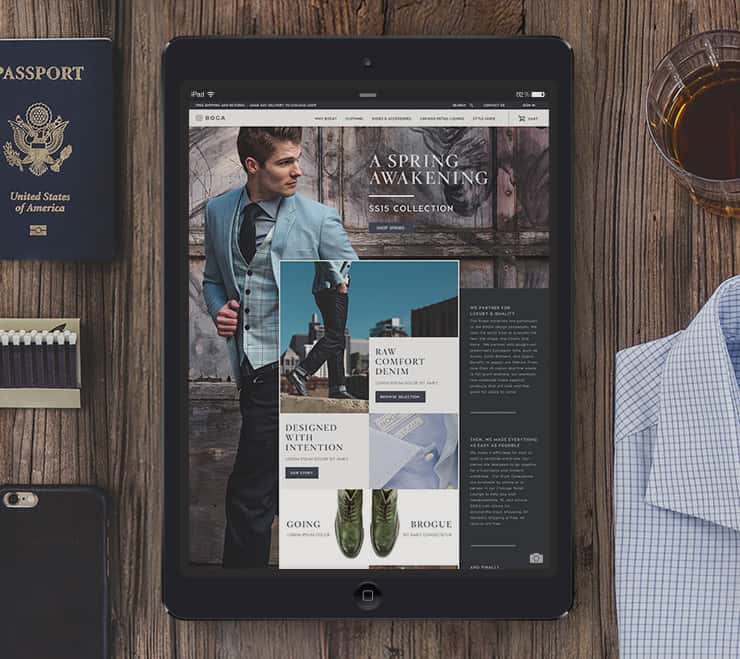
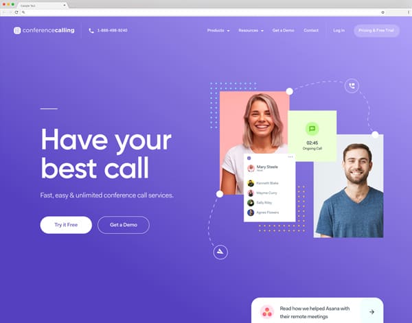
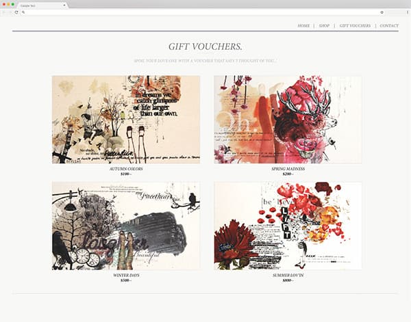
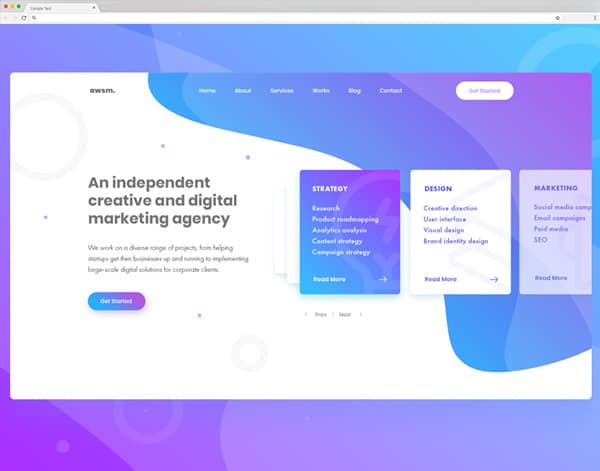
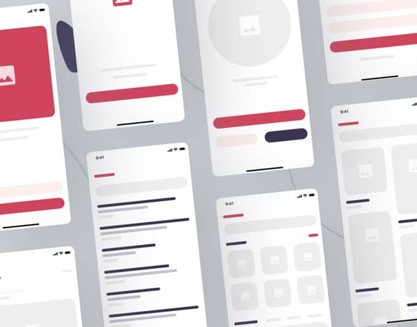
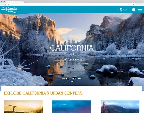
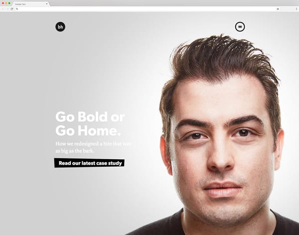
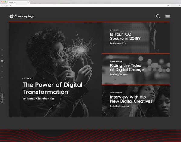
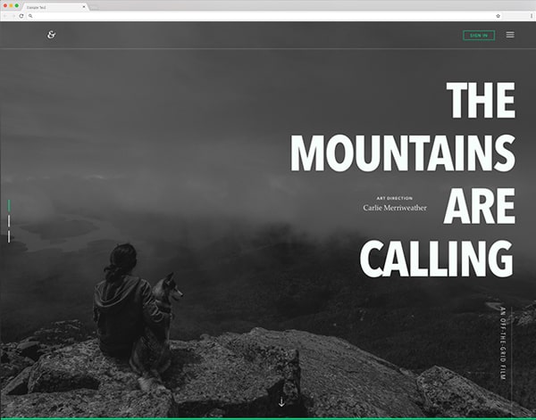
Large Type
Big. Bold. Beautiful. With companies messages becoming streamlined and folks attention spans becoming smaller and smaller, having an easily legible website is key. Large typography offers a solution for communicating instantaneously while quickly introducing your brand to the audience. When applied correctly, companies can reinforce the brand and telling a story, all while having a hyper legible page.
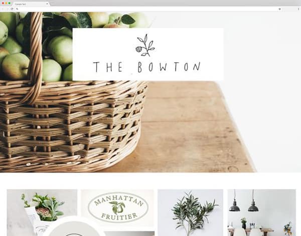
Hand Drawn Elements
In a world filled with amazing, simple technology bringing hand-drawn aesthetics outside of its native print platforms and into the web has never been easier. Creatives are always looking for ways to display information in an unexpected way, and crossing media platforms is a great way to do it. But let’s not forget to execute the elements well and leave the scary, messy sketches out of the internet.
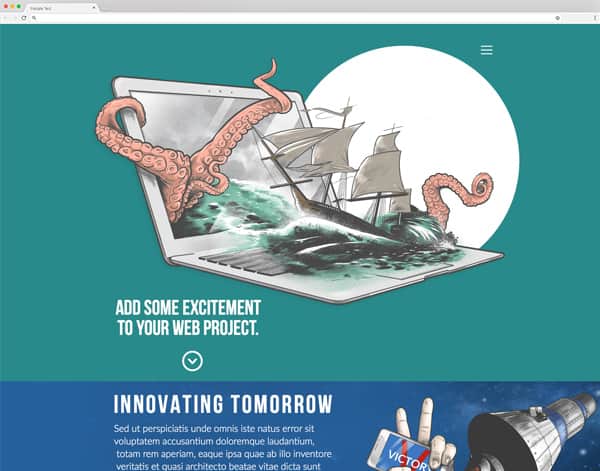
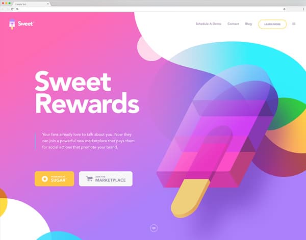
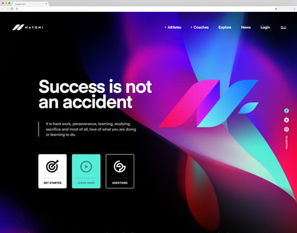
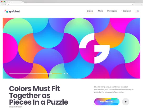
Dynamic Gradients
From fad to rad, our 2018 prediction comes to fruition as the use of dynamic gradients has exploded. Blends of vibrant color to creating depth and bold backgrounds has swept the digital design world. This trend is going strong and may be here awhile.
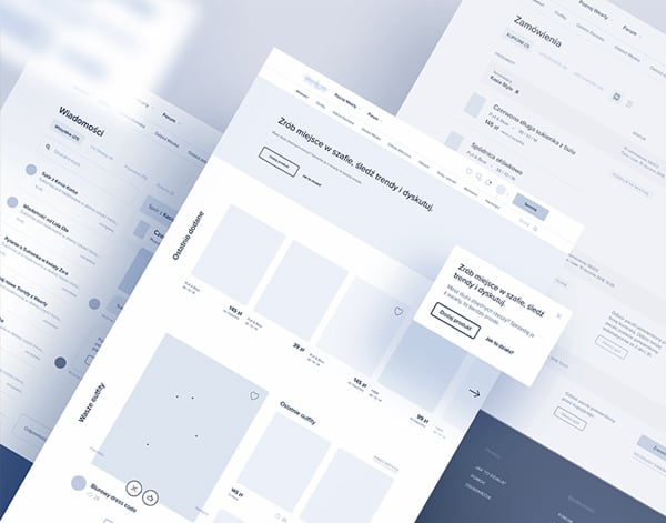
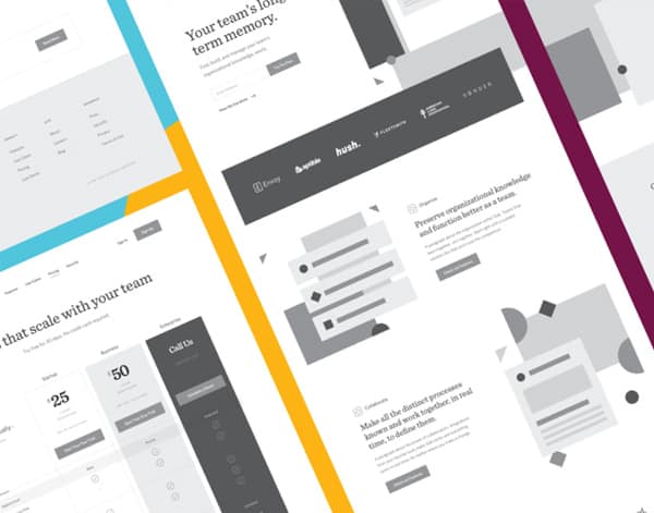
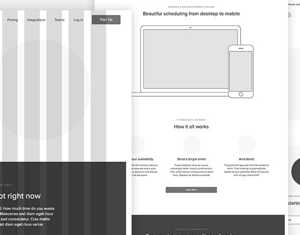
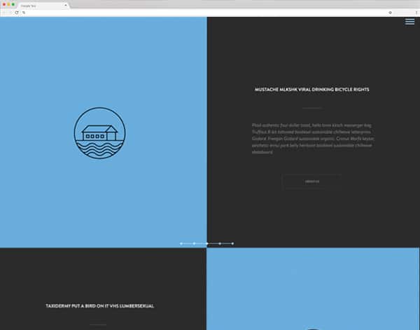
Death of Wireframes
Ding-dong the wireframes are dead! So long to those boxy, vague mockups and hello to moving straight into to high fidelity designs. This beginning stages of the creative process are no longer hindered by creating false expectations and feedback loops eating up valuable days on your timeline. May they be forever dead.
Animation on Interaction
With the technology moving forward at a rapid pace, the ways you can make your audiences experience more unique and memorable are almost limitless. By utilizing micro-interactions on your page, whether it be on hover or scroll, it is a great way to create an immersive experience for your users. Careful not to overdo the amount as it could distract the user from the meat of your content.
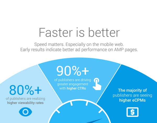
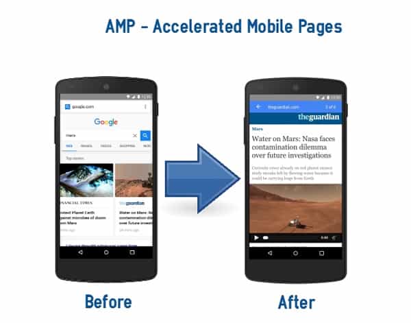
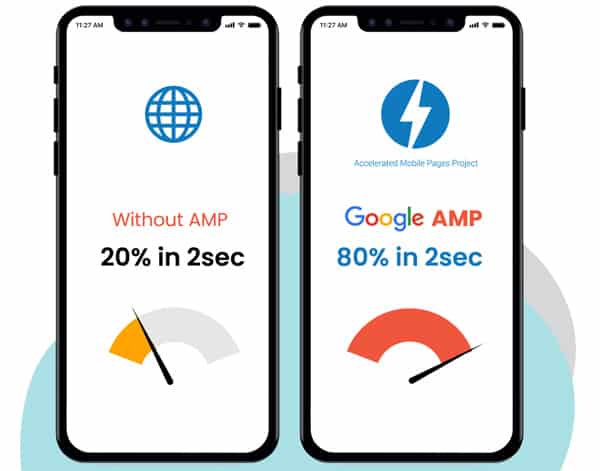
AMP Design is the new Responsive Design
While Google originally created Accelerated Mobile Pages (AMP) in 2016 to make the web even faster, it is now reaching mainstream viability. In fact, it makes the average website load 85% faster. That benefit does come with a catch: you have to ditch all of those fancy (and download heavy) images and javascript files, serving a simple content-focused result. But as designers, our challenge is to ensure that through all of this minimalism the brand still shines through. In 2019, every website Cubicle Ninjas creates will have AMP designs to grow our client’s success.
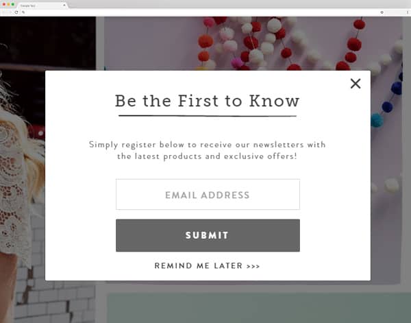
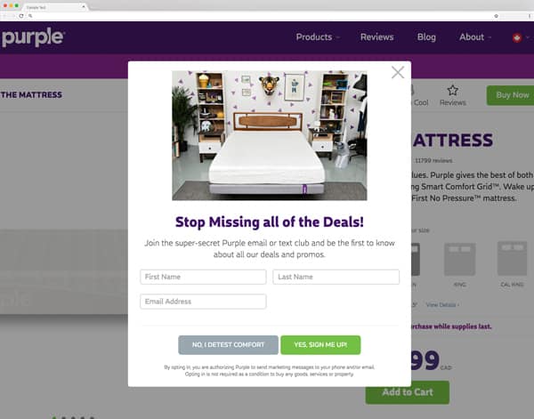
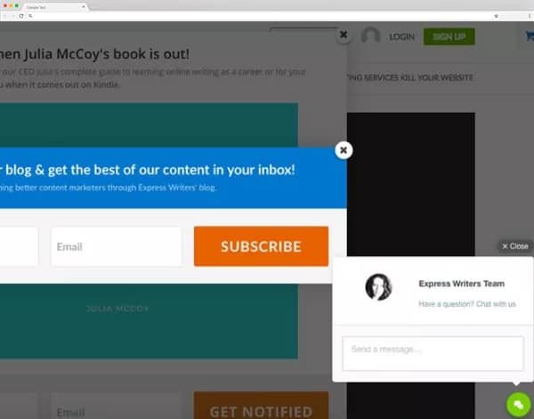
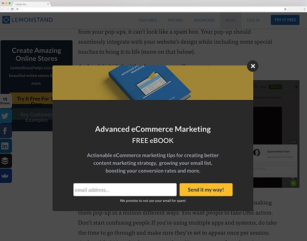
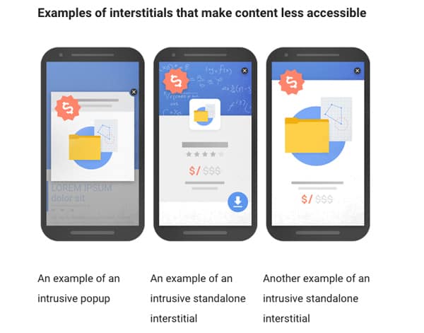
Pestering for Likes or Follows
We have all visited a website that immediately bombards you to follow, sign-up, like it, comment on it, and have moved the cursor towards the exit as fast as we could. Worse yet, many sites are abusing desktop notifications asking if they can send you a message whenever they choose. Whether the call to action is too prominent or shown too often, no one enjoys being pestered. There is nothing wrong with being consistent or subtle, but what your content or product should be the main driver for follows, likes, and user interaction in general.
Not Answering What You Do
Today’s internet user is constantly scanning for what they are looking for and moving on. If the crucial info of what you do or what you offer isn’t front and center, it will often go overlooked. Keep the company manifesto on the homepage at high-level by making sure it’s easily digestible, and save the biographies for the About page.
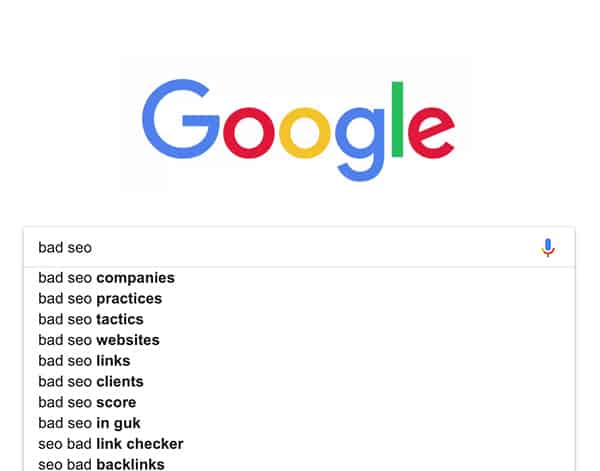
Bad SEO
We all know by now the importance of having current, consistent and well research SEO in our digital marketing materials. In this day and age, Google reigns supreme, and if you aren’t showing up in the first few pages your losing out on tons views and potential business. It doesn’t matter how great the product is or how well designed the site is, if people can’t find yours through organic search you’re in trouble.

Desktop Hamburger Menus
We’ve all seen it, those three little lines in the upper corners on desktop navigations. Maybe it’s a student trying to create different style, maybe it’s someone taking “mobile first” seriously, either its got to go. A hamburger menu is like having a URL on a print ad — there is a time and place for everything, and this is not it.
Abundant Animation
With coding becoming more sophisticated and the ability of adding animation to your web pages being easy than ever before, we must remember that subtlety is a virtue. Instead of delivering the fun and interactive feeling, you can make the users feel confused, lost and even distract from your content. The visual noise caused by the constant motion is always something to have in the back of your mind when planning your web design.
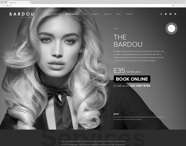
Monochromatic Sites
2018 has been filled with a lot of styles and monochromatic sites have been no exception. These pages have been heavily utilized by brands with simplistic color palettes or to categorize specific sections within a website. Whatever the case, these sites are best when combined with black and white elements. This allows key content pieces to pop and act as a call to action while avoiding a giant colored background that causes user’s eyes to bleed.
Parallax on Mobile/3D Photos
What you can do on mobile continues to grow more and more. With companies like facebook introducing 3D photos to their platforms, people are getting used to the functionality and are beginning to expect it. This doesn’t mean we should be abusing these features with every opportunity, but rather it gives creatives an opportunity to develop a more 1:1 user experience between platforms.
3D & Zoom Transitions
This year has been filled with fancy zooming and flipping page transitions. We often see this treatment with an image as a window to a section or 3D elements being brought in and navigated around to tell the story. The important thing to remember is not to make the transitions overly complicated and hard to follow. Guiding the user in this immersive experience and having intuitive UI is crucial to pulling the transitions off successfully.
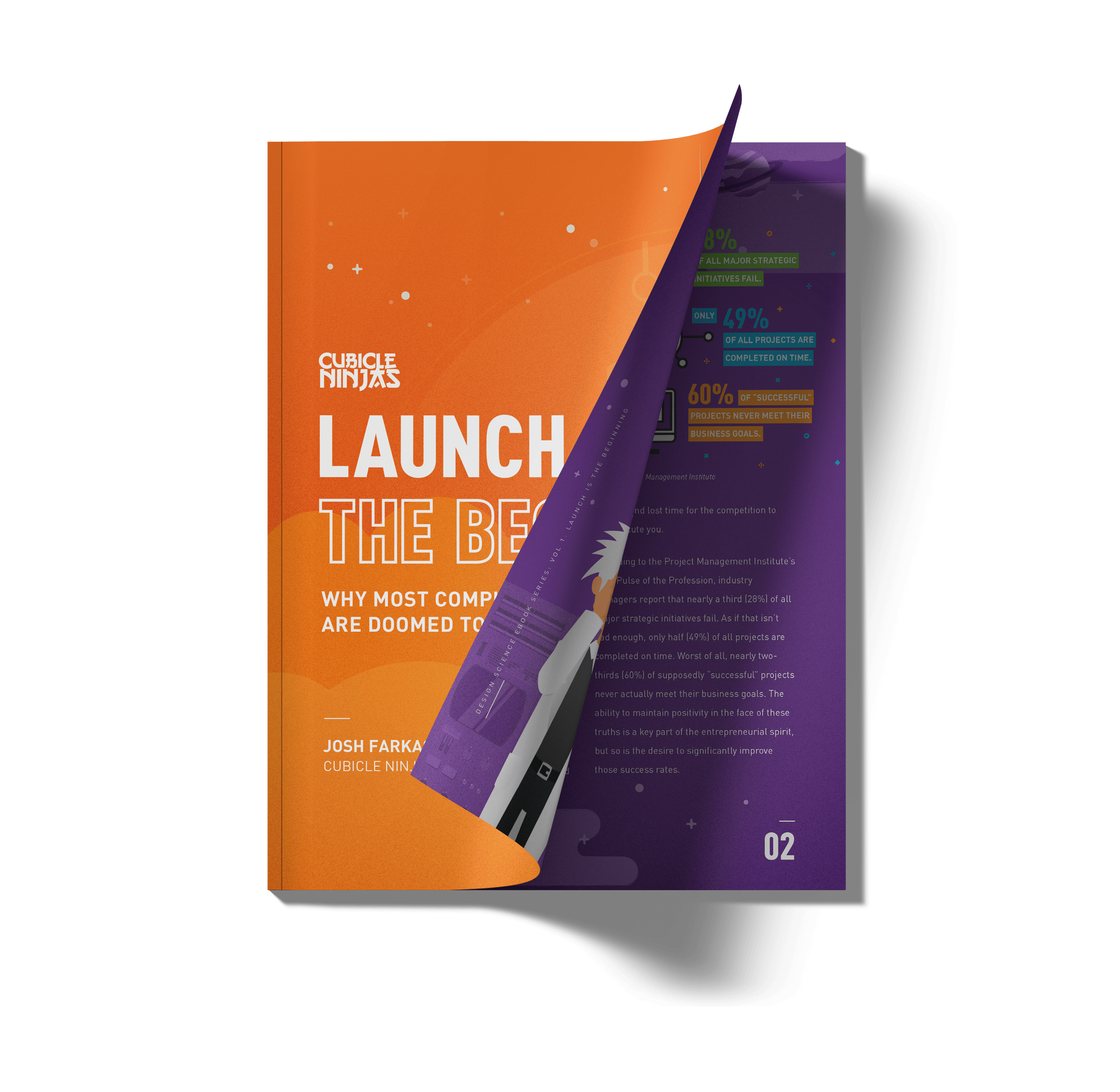
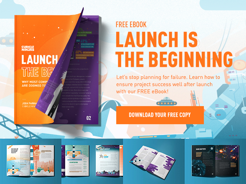
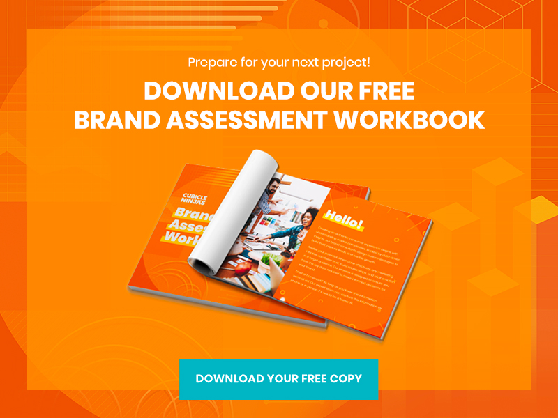
Launch is the Beginning
Cubicle Ninjas is celebrating our tenth birthday this year. With thousands of design and development projects under our belt from some of the world’s greatest brands, we’ve noticed a clear trend: successful teams see the world differently. Project launch isn’t a finish line, it’s just the beginning. Companies that think this way see exponentially greater and more frequent success in every project they touch. As part of our mission to stop bad design, we wrote a book about this revelation. To learn how to implement long-term design thinking in your organization, download our 100% free eBook, “Launch is the Beginning”.