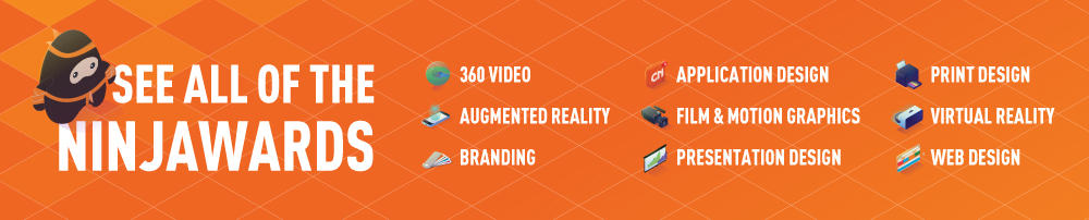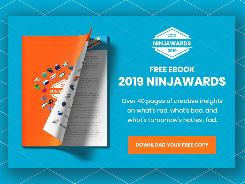

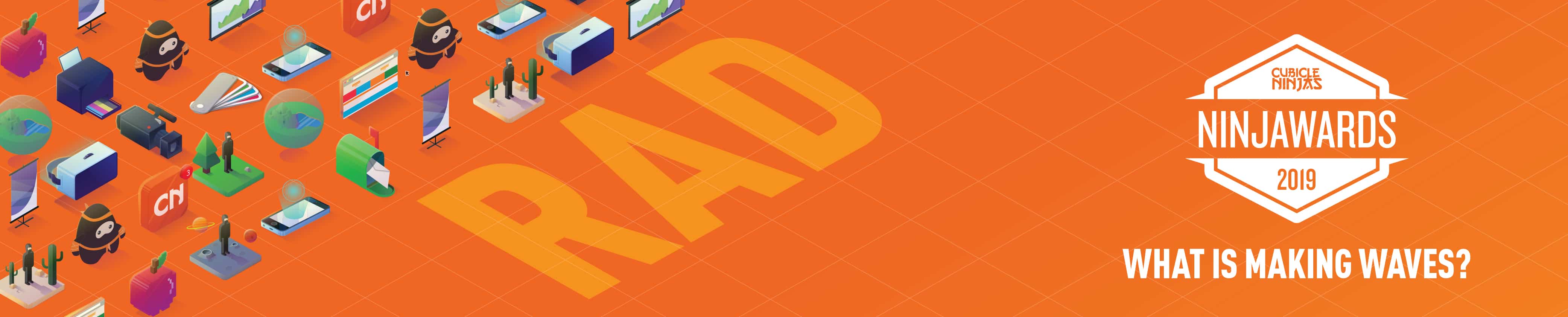
2019 Presentation Design Trends – Ninjawards
Each year, Cubicle Ninjas’ reviews the industry’s creative highs and lows to publish a curated list of notable efforts in each specialty. Think of it as a highlights reel of the years’ best and brightest, along with some cautionary tales.
One of the core ninja principles is to always question the status quo. The Ninjawards provides a platform for inspiration, constructive criticism, and ultimately, recognition of bright new areas of design or technology. We hope our thinking unlocks new perspectives about the future of your creative in Presentation Design!
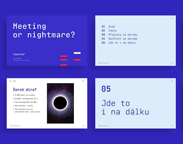
Embedded Fonts
The future is now! Custom fonts in presentations is now universal in powerpoint between PC and Mac. Although this will make the presentation uneditable for those who don’t have access to the fonts, this allows presentations to have a more unique characteristic and live closer to the brand. This will also help in separating your presentations the typical PowerPoint template. So long Arial, goodbye Calibri, hello primary brand typefaces.
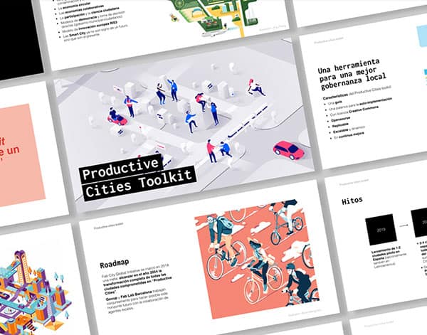
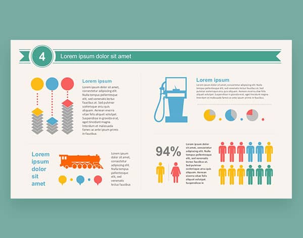
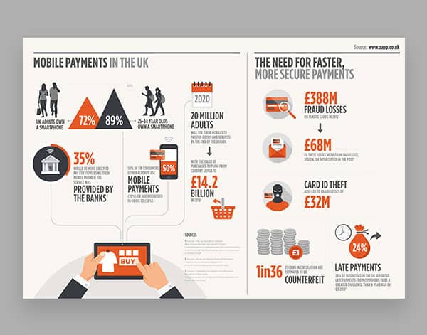
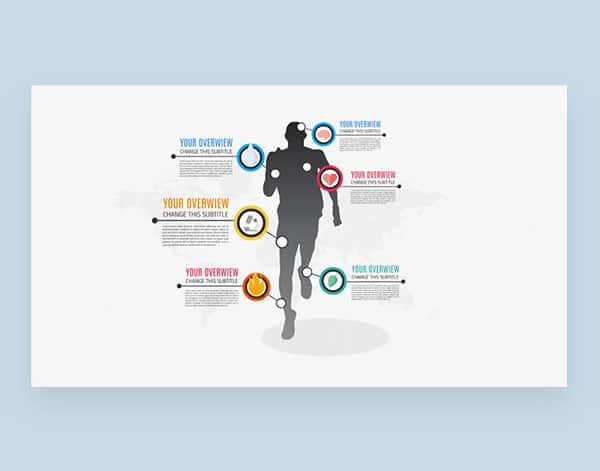
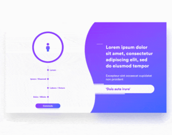
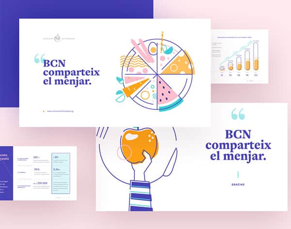
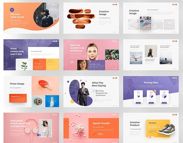
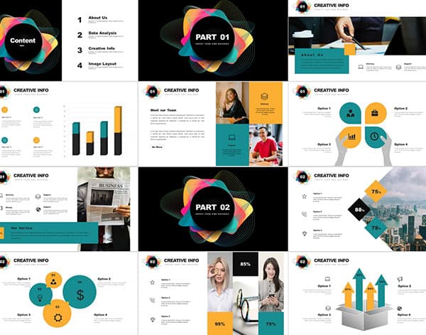
Infographics, Not Charts
Infographics in decks continue to be heavily used an expanded upon. It’s been long proven that people read icons faster than they can read text and the last thing you want is your slides to be drowning in copy. Leave the majority of your words in the Notes section and speak to each category, let the icon’s legibility and visual interest guide the audience’s eye through the slide. Also, infographics are a great way to give stats and figures the punch they need to capture your viewers.
Motion Graphics
From last year’s prediction, there is nothing to bring your sales pitch deck to the next level like silky smooth animation. The various built-in tools allow you to have more control than you think to make the perfect attention-grabbing sequence of information. It’s also a great way to capture the audience’s eye or call out certain information on the slide. But this can be a double-edged sword, the more intricate the animations are the harder it is to edit your slide.
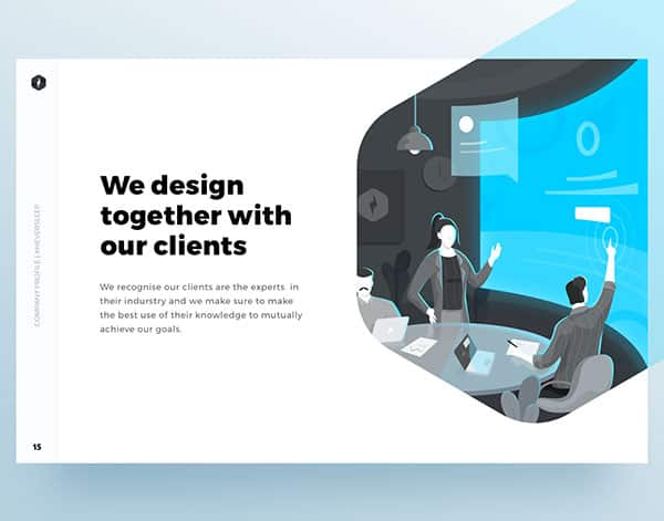
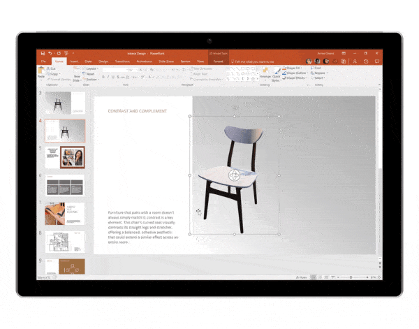
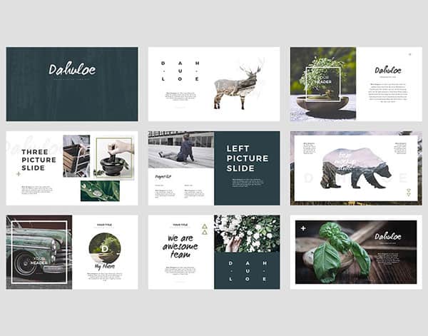
Custom Illustration
It is easier now than ever to work within PowerPoint to create custom shapes and illustration. Tools like Merge Shapes that correlate to Adobe’s Pathfinder give you more creative freedom to create something unique and cool. Even looking outside of presentation programs to create your graphics is better than settling for an aesthetic that feels generic or doesn’t fit your brand.
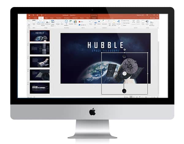
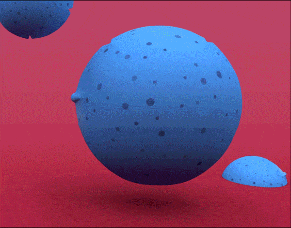
3D
It’s been 2 years since Microsoft announced 3D models in PowerPoint and they continue to be a viable tool in crafting better presentations. The ability to morph 3D files on the fly was significantly more useful than even we hoped. Viable for data, mapping, architecture, product design and beyond, we recommend utilizing this new feature to truly stand out among the competition.
Interested in using 3D in your next presentation? Subscribe to our emails to get notified of our upcoming free 3D Presentation Library with over 50 unique models. Or contact us to build something uniquely custom.
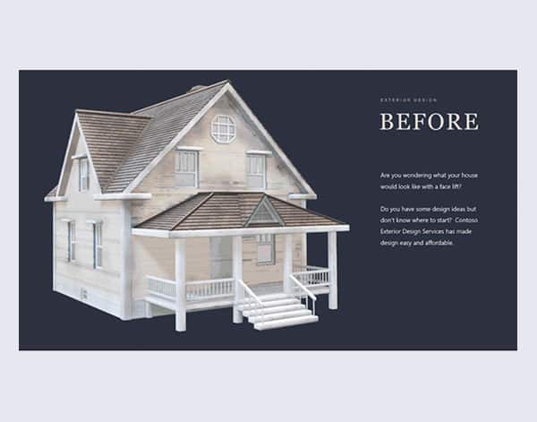
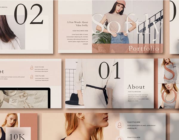
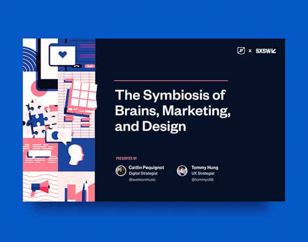
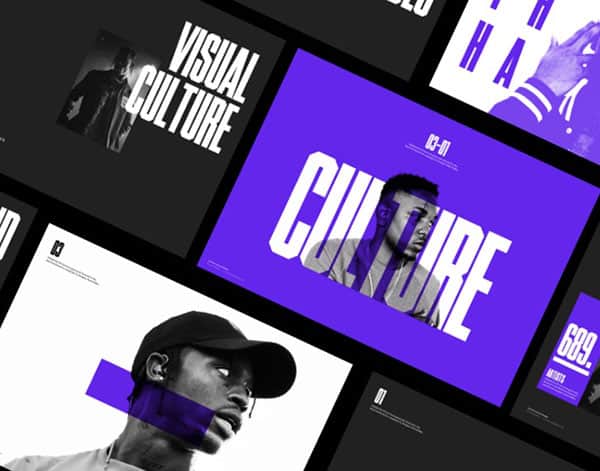
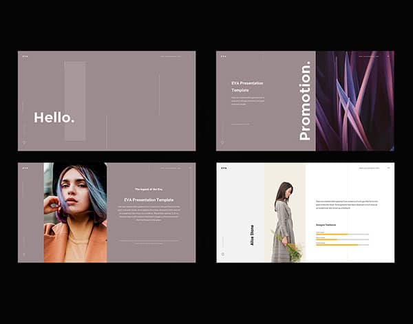
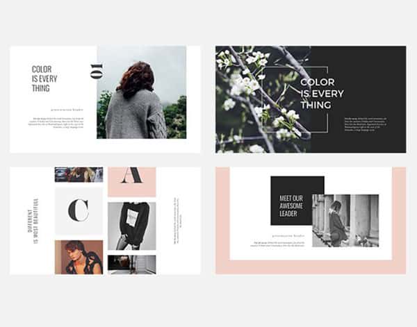
Beauty
Good powerpoint is now expected, having a text-heavy slide read to the audience doesn’t cut it anymore. The standards for today’s presentation, sales pitch, or investor deck are higher than ever before, each slide is assumed to be impactful, have a clear message, and look stunning. It’s not enough to simply include photography or iconography into your presentation, but you have to make sure each use case is on brand, beautiful, and appropriately supports the content.
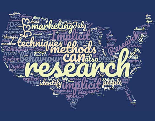
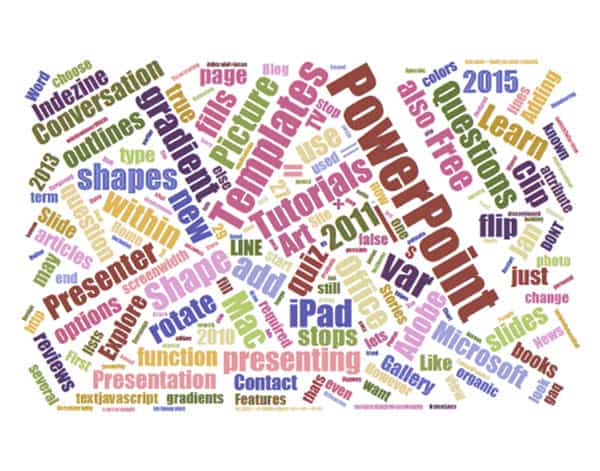
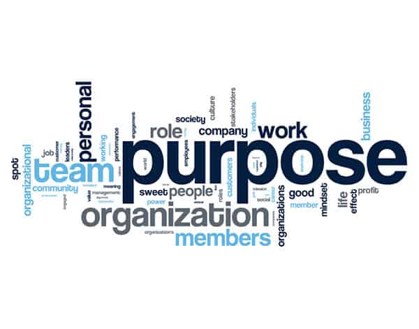
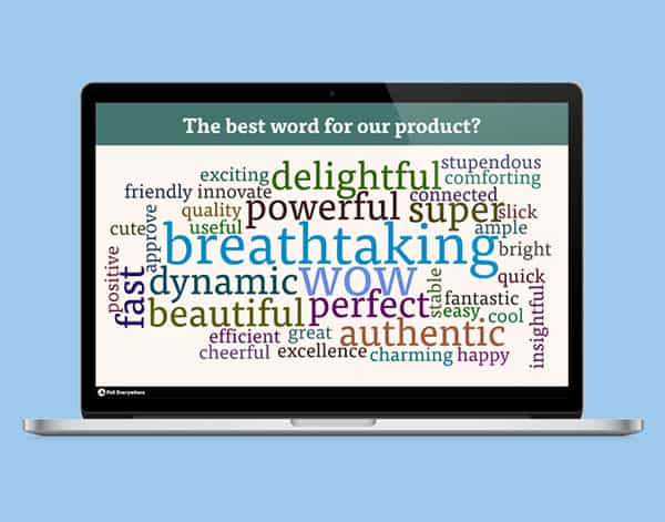
Word Clouds
Dreams do come true! At one point in time, word clouds were used to show the percentages of various categories on a specific topic, and the larger the word the higher the percentage that category covered. Eventually, people began to use word clouds as a crutch for communication, throwing out buzz words and hoping the message came across. The problem is this very often resulted in a messy, confusing slide that caused more of disconnect to the rest of the deck than. Other symptoms of word clouds include nausea, clenched jaw, and eye bleeding.
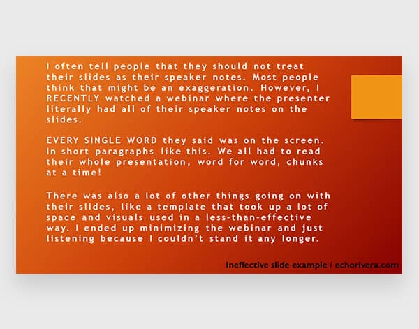
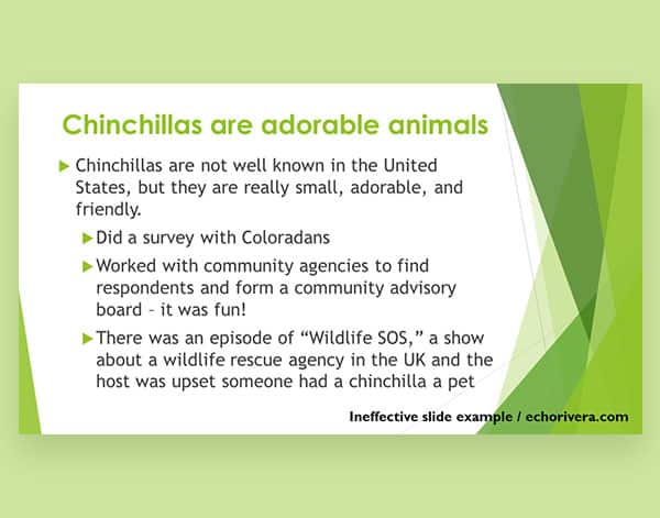
Too Many Messages Per Slide
Less is More. The same reason people remember phone numbers easy by breaking up the numbers to groups of 3-3-4 is the same reason understand a streamlined message rather than a multitude of key points on one slide. With technology giving us information faster and society’s attention getting span shorter, developing a heavy text slide into a 5 slide section might be a better solution for audience retention. Breaking up information also allows you more room to shuffle components around and tell a story rather than having the audience read.
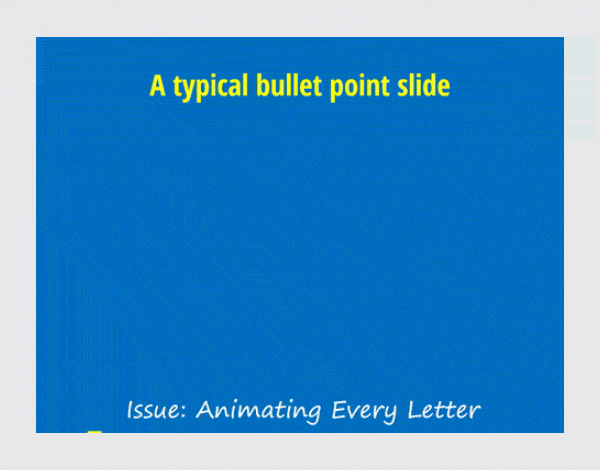
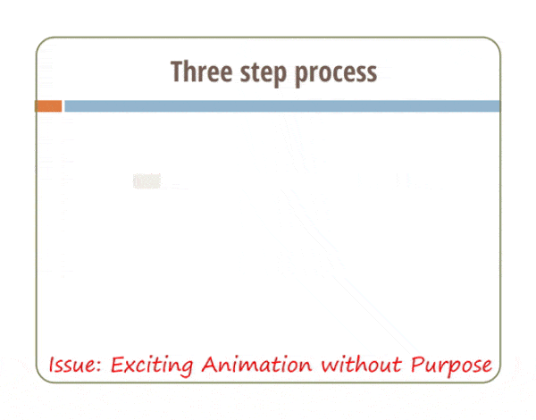
Excessive Animation
We all know too much of a good thing can become a bad thing and animation is no exception to becoming a double-edged sword. Especially regarding slides with a lot of elements, animating every element might create 10-20 seconds for the content to come in which can cause the speaker to pause before being able to talk to the information.
Ransom Notes
We’re all for variety, but if your presentation looks messy and cobbled together, it might be time to reassess. A franken-pitch composed of scraps from other decks will have a negative impact on viewer retention. It may even hurt your credibility. Always apply design best practices and when in doubt, talk to a professional!
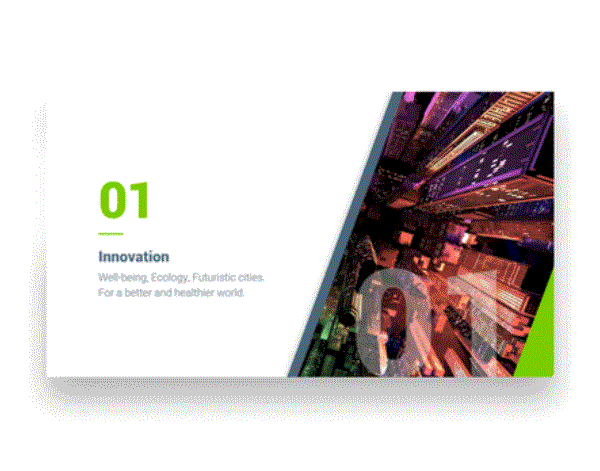
Non-Traditional Slide Header
With well designed presentations becoming more prevalent, the need to separate yourself from the rest continues to be a creative challenge. Finding ways to break the mold and develop a unique way to display your information is the goal we all strive for. Changing the placement of header is a great way to create a dynamic flow of storytelling and to avoid your presentation feeling to “samey.”
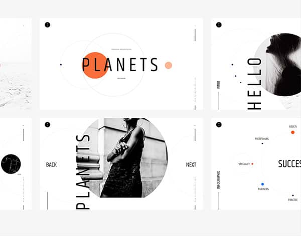
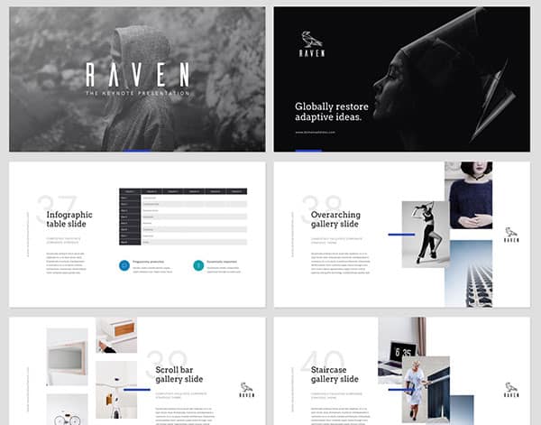
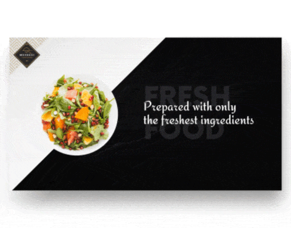
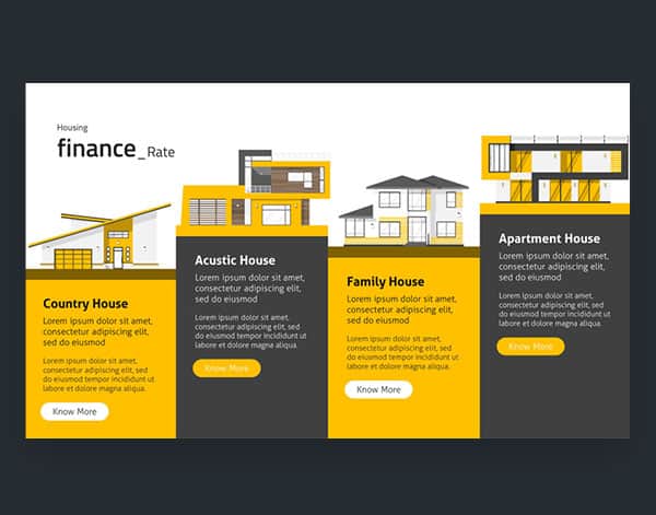
Dynamic Layouts
Piggybacking on non-traditional slide headers, dynamic layouts are almost always created as a result. A good goal to strive for is to have your presentation resemble a beautiful print piece, and you can have a gorgeous print piece without understanding layout. Keeping your layouts fresh and new is critical to a successful design, the last thing you want from your slides is to feel static and boring.

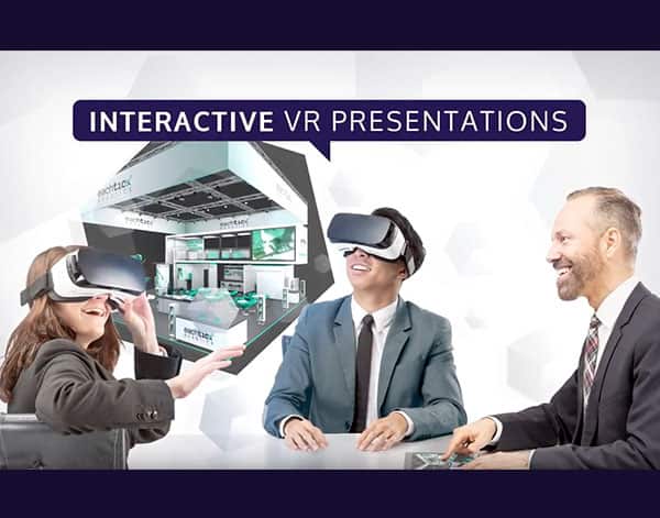
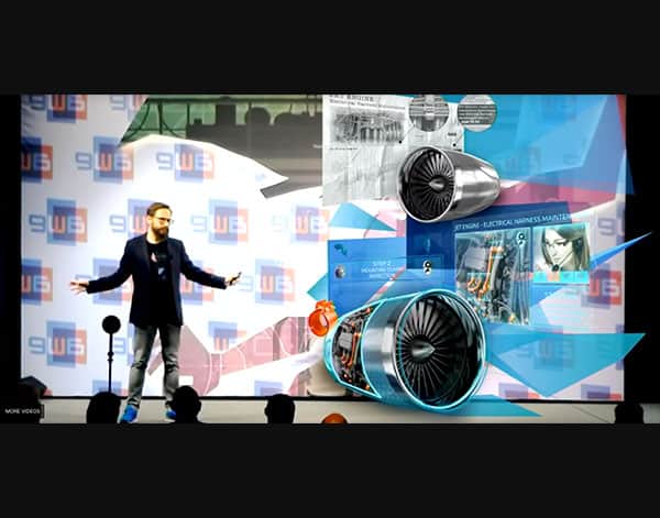
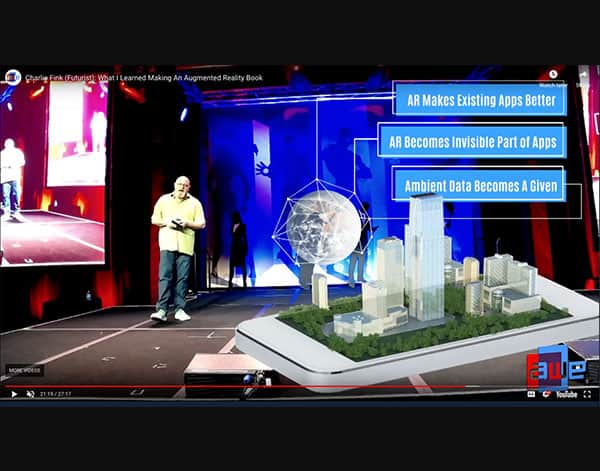
VR & AR
Immersive storytelling is the ultimate goal when presenting. But conveying your vision might require more than text on a screen. Capturing your audience with engaging technologies will only become more prominent in the years to come. Projects like Prezi AR are already working on making this type of interaction a reality, transforming the platform into more than just a screen. Many companies are building their own custom virtual reality apps to elevate the sales and marketing process.
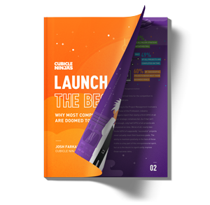
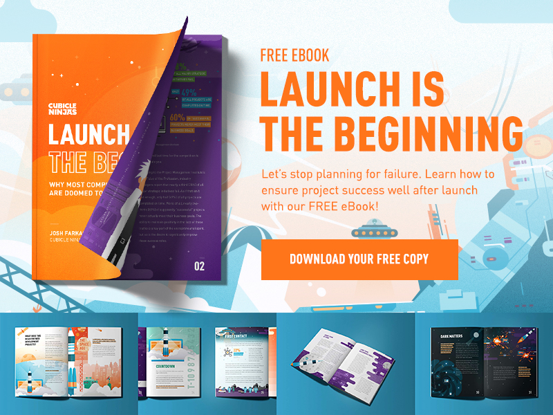
Launch is the Beginning
Cubicle Ninjas is celebrating our tenth birthday this year. With thousands of design and development projects under our belt from some of the world’s greatest brands, we’ve noticed a clear trend: successful teams see the world differently. Project launch isn’t a finish line, it’s just the beginning. Companies that think this way see exponentially greater and more frequent success in every project they touch. As part of our mission to stop bad design, we wrote a book about this revelation. To learn how to implement long-term design thinking in your organization, download our 100% free eBook, “Launch is the Beginning”.