


2020 Presentation Design Trends – Ninjawards
Each year, Cubicle Ninjas reviews the industry’s creative highs and lows to publish a curated list of notable efforts in each specialty. Think of it as a highlights reel of the years’ best and brightest, along with some cautionary tales.
One of the core ninja principles is to always question the status quo. The Ninjawards provides a platform for inspiration, constructive criticism, and ultimately, recognition of bright new areas of design or technology. We hope our thinking unlocks new perspectives about the future of your creative in Presentation Design!
Want to download all of the 2020 Ninjawards?
Our 2020 Ninajwards eBook is 100% free!

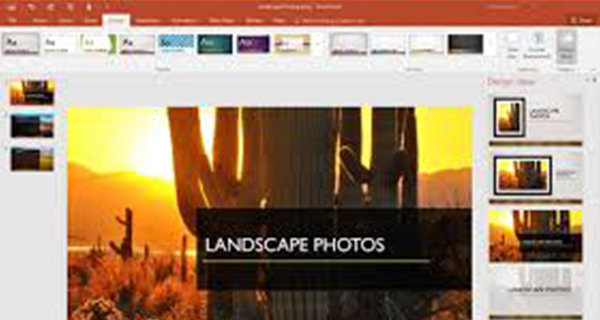
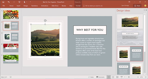
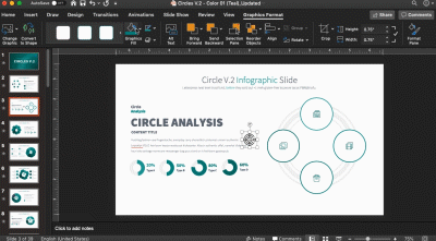
PowerPoint Layout Recommendations
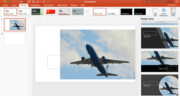
With PowerPoint Designer, creating well proportioned layouts has never been easier. Designer allows you to create professional layouts by detecting pictures, charts, and tables while giving you a design scheme based on what you import. It also allows the user to turn regular text into smart art like process graphics and timelines. Designer will also analyze your content and recommend illustrations.
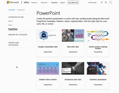
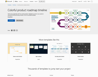
Microsoft’s Improved PowerPoint Template Library
Sure, everyone has seen the generic PowerPoint templates that pop up whenever you create a new presentation—we see them in our nightmares. Did you know that Microsoft has an extended slide library? You can find modern, sophisticated templates at templates.office.com. You can also find templates for Word and Excel, all you need is your Microsoft credentials to get started!
PowerPoint Morph Transition
Sick of creating slides with complicated and confusing animations? Morph is a new transition that allows you to create a unique experience by using the content of your slide. Morph takes the elements of your first slide and allows them to move and change size in the next slide’s layout. This is a lot easier than setting up an animation for each individual element. Morph is seamless, smooth, and allows you to create dynamic slides faster.


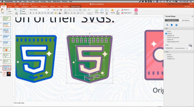
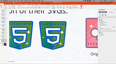
SVG Vector Graphic Capable
Of all this year’s design trends, presentations are unique in that the mechanics continue to take substantial leaps forward not just for the average user, but for design professionals. No longer are the days of creating graphics in Illustrator and using a third party program to bring them into PowerPoint. Now, you can simply save out you graphics from Illustrator as an .svg and directly import them into your presentation like you would with a picture. After that, you may change the color and scale the graphic like a basic PowerPoint shape. I think we speak for everyone when we say “it’s about time.”
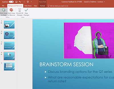
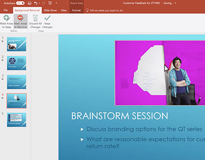
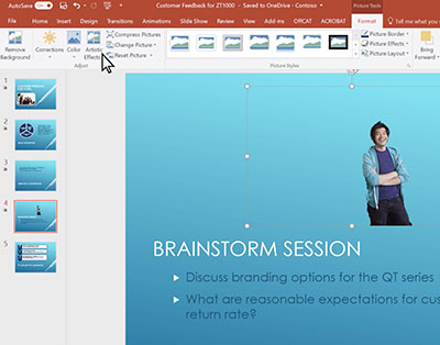
Removing Image Backgrounds in PowerPoint
So you want to remove the background of an image, but you don’t have Photoshop? No problem. With this new update from PowerPoint now you can. It’s all apart of the picture tools under the Background Removal tab. After selecting the tab, you can trace the person, place, or thing using your mouse and delete the rest! You can even save that image to your desktop as a PNG for future use.
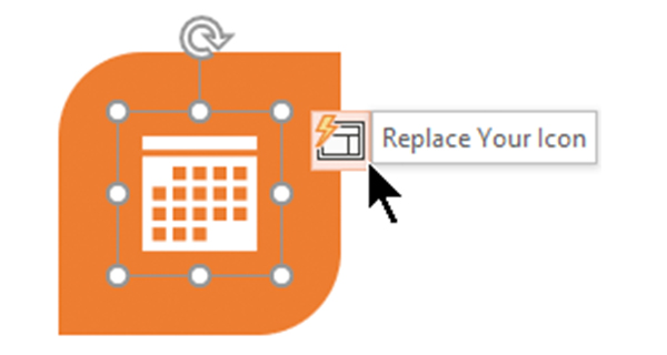
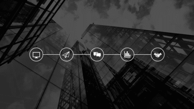
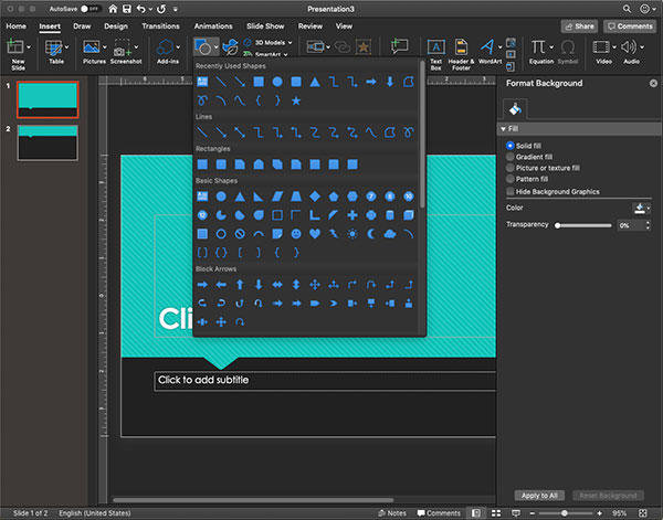
PowerPoint’s Improved Icon Library
So, you don’t have Illustrator and you want to avoid paying for graphics? Don’t worry, PowerPoint has a built in Icon Library. This is not clip art, these aren’t basic shapes, this is a library of well curated icons that not only match aesthetically, but are filterable. The icons are ordered in the library by category, searchable, and has a jump menu in the sidebar. Don’t think you can find the right icon? The library has hundreds of different options and dozens of categories.
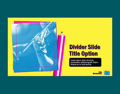
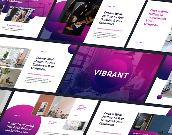
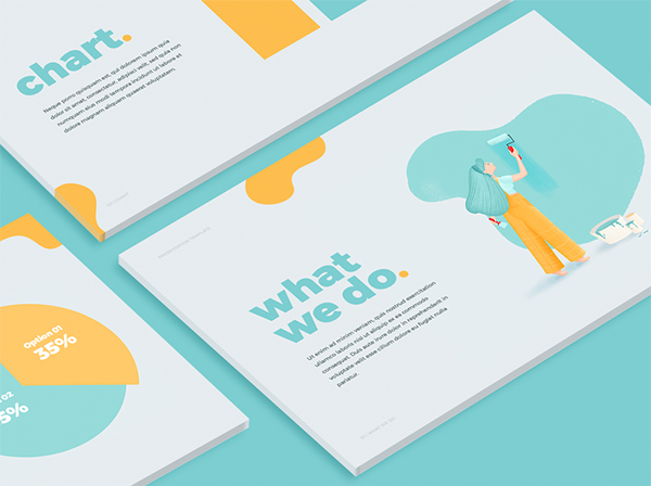
Vibrant Color
Some people say the world isn’t black and white, and here at Cubicle Ninas we agree! Especially when it comes to presentation slides. Not only does your messaging have to be streamlined, but your slides need to have some personality as well. No visual element elicits an emotional connection faster than color. Quickly standout by using colors that are bold and breathtaking—your audience will thank you!
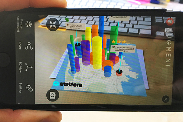
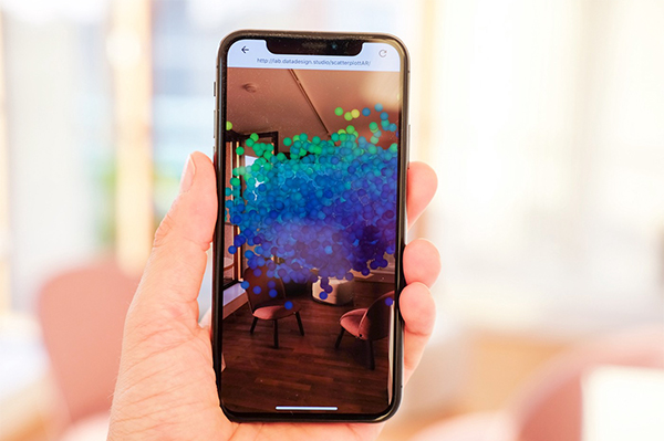
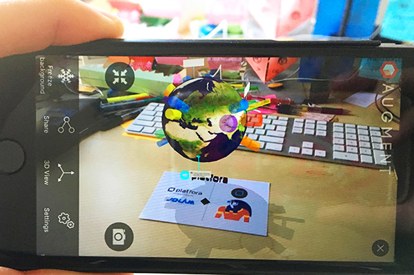
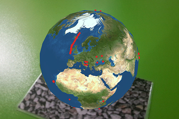
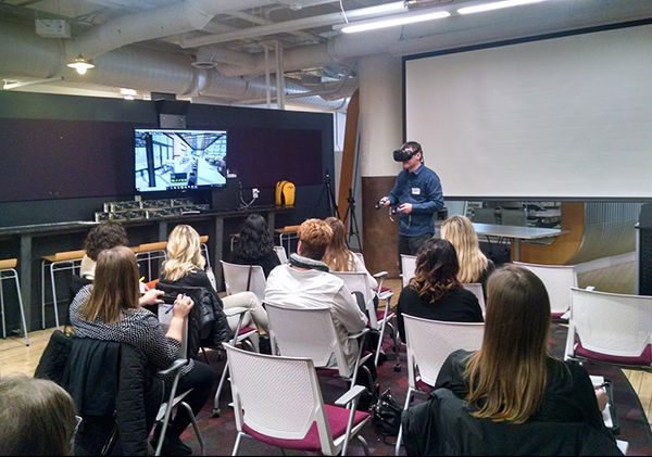
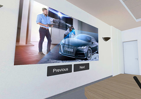
AR Data Visualization
People are always looking for neat ways to incorporate interactivity into their presentation, and with technology becoming more sophisticated it’s never been easier. Utilizing Augmented Reality is a great way to bring your slides to life. Whether you want to emphasize data or add some flare to your time on the podium, AR visualization is a strong solution.
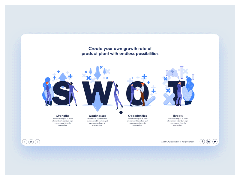
Clear Hierarchy
We all know to keep our messaging simple and streamlined, but you can’t have a clear message without clear hierarchy. Hierarchy is the structure of your content and their order of importance. It is created by the contrast of your content as you cannot emphasize without deemphasizing. Having everything the same hierarchy leaves the slide feeling heavy or unfinished. To sound philosophical, “everything is and nothing isn’t” does not work.
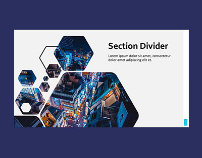
Plenty of Negative Space
We have all seen it, a slide so crammed with content it makes makes a jar of olives look spacious. You can try to add hierarchy all you want, but no one is going to read all of that copy. If you aren’t making concise points in digestible chunks of information your audience’s attention span will crash and burn. One thing to remember is that negative space doesn’t need to white, but rather space between content. Go ahead, add some color!


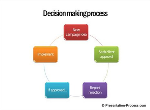
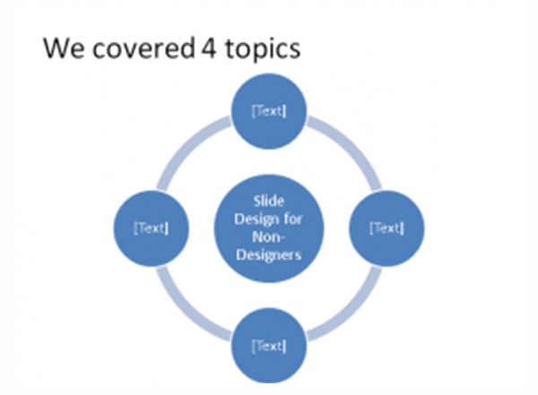
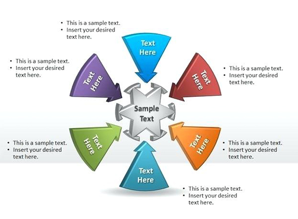
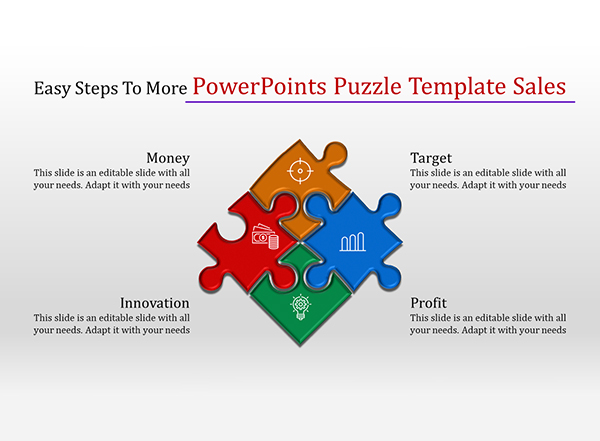
Boring System Smart Art
Maybe procrastination got the best you and your team didn’t have the time to put together a graphic so you clicked on “Smart Art” and went with the least terrible. We have all been there, so we forgive. Smart Art is tricky, because the application has to look like the same level of effort was put into that slide as the rest of the presentation. If the smart art looks uninspired so will the rest of the slide.
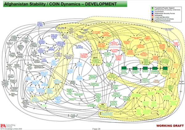
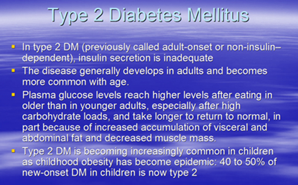
Too Much Complex Data
You’ve seen it—a diagram so complex that when you see it your brain automatically shuts off and the presenter starts sounding like a grown up from Peanuts. Or maybe the slide has so many charts and graphics that the data is unrecognizable. You may think that adding another slide will only add time to your presentation, but break the data into multiple slides if necessary. The amount or complexity of the data should not be limited to a chart or slide.
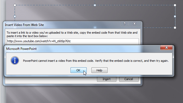
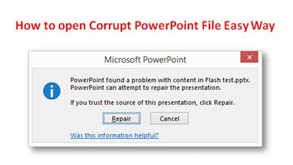
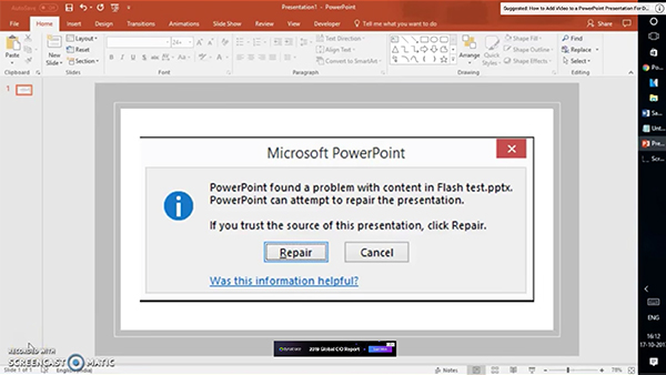
Broken Functionality (animation/videos)
You hate to see it happen, the thing that was meant to do one thing doesn’t do the thing. Whether it’s “a video that was just working” or another hyperlink function that doesn’t work like it’s supposed to, these distractions stall your momentum and cause a massive disconnect with your audience. Then the only thing to stop your presentation from spiraling out of control is to make a joke about how Kyle from Marketing is fired.
Unbranded Slides
Whether your company is a start up making its first pitch or a globally recognized brand, nothing says unpolished or unprepared like a deck that lacks the consistency and order of a branded template. When you come to a presentation with branded slides it tells your audience you put time into this and you know what you are talking about.
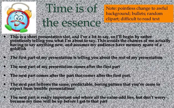
Unreadable Background Photos
You see this cardinal design sin far too often. Nothing quite muddies up a slide while simultaneously destroying readability like a poor treated background image. There are a lot of ways you can add visual interest to a slide without sacrificing your negative space and readability. For example, adding a color overlay over the image or picking a lightly textured image can give you the flare without causing your audience to squint at the slide.

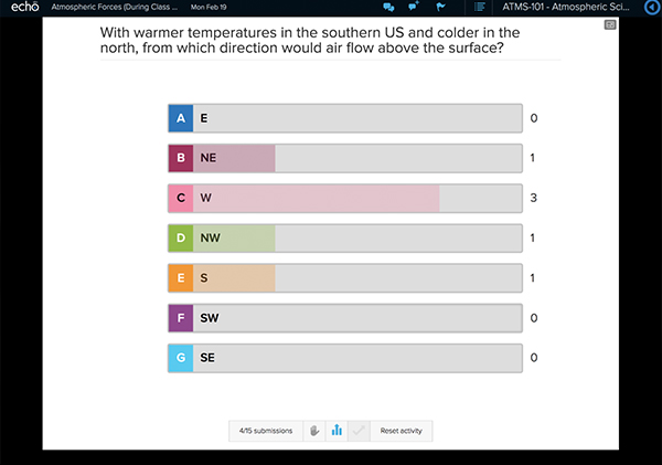
Delivering the Unexpected
At this point, we have all seen the same presentation given over and over again. But with the technology we have available these days, it has never been easier to breaking away from a predictable presentation and engage your audience. Using SMS texting to create real-time polling, testing, or for a Q&A is a cool way to integrate technology into your next pitch. Not only is it cool, but it gets your audience engaged and invested to the content.

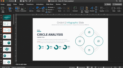
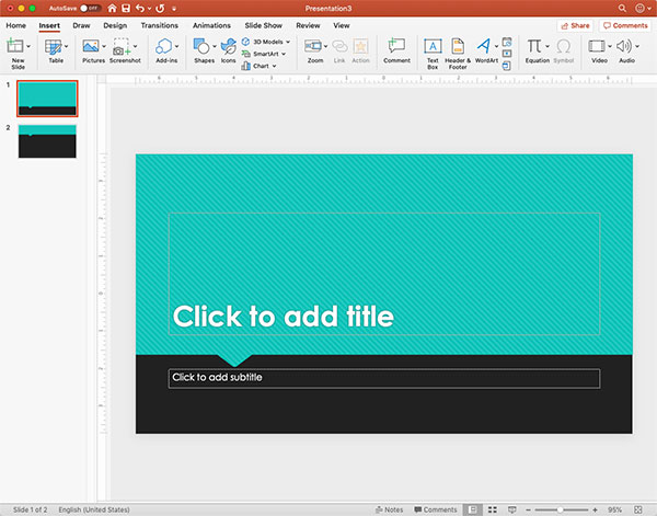
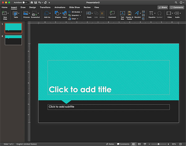
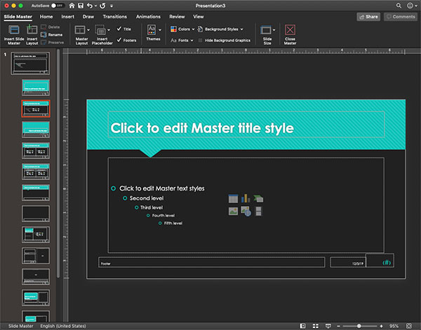
Darkmode
Have you noticed that most applications, operating systems, and programs have been using a dark background on their user-interface? Office 365 has—and they have jumped on the Darkmode bandwagon! Now your PowerPoint interface can have a dark, sleek aesthetic. Darkmode has been said to save your eyes from strain and increase battery life on devices. Try it out and see if it makes a difference for you!
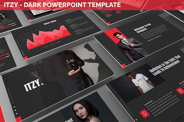
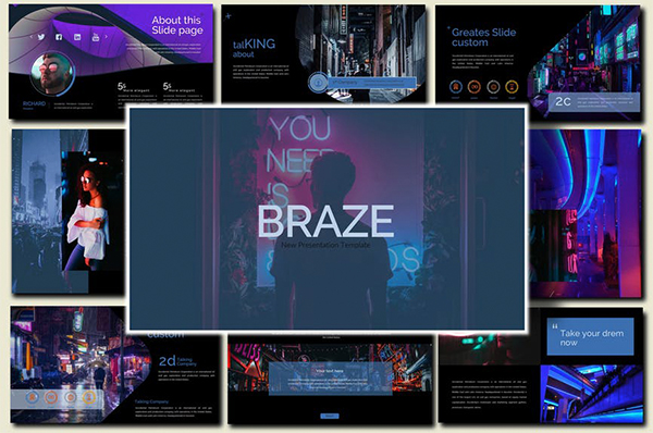
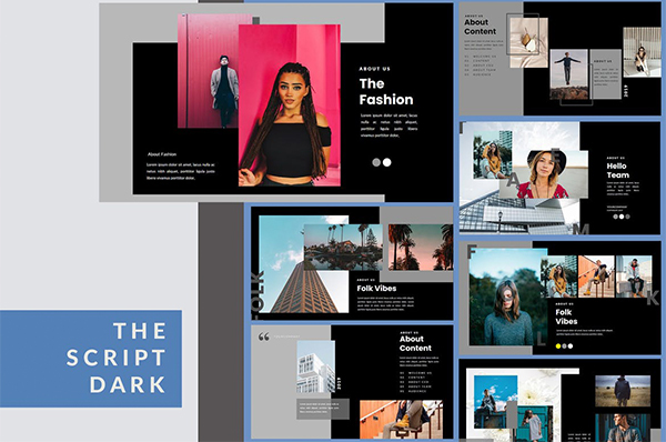
Dark Full Color Backgrounds
From applications to operating systems, “darkmode” has become more and more popular, and presentations are no exceptions. Sure, black will always be sleek, but this aesthetic treatment of heavy, dark backgrounds with reversed type has become trendy beyond just a classic look. If you jump into this into this trend make sure your type is readable, as reverse text is hard to read.
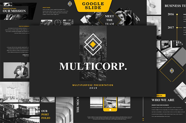
Monochromatic
Monochromatic themes are becoming more and more common. By having one color, these monochromatic treatments are optimized for legibility by the contrast created by that pop of color. When used correctly, this pop of color can be easily be used for lead the eye throughout the slide, call-to-actions, or a simple design element that adds some flare to the layout.