


2020 Web Design Trends – Ninjawards
Each year, Cubicle Ninjas’ reviews the industry’s creative highs and lows to publish a curated list of notable efforts in each specialty. Think of it as a highlights reel of the years’ best and brightest, along with some cautionary tales.
One of the core ninja principles is to always question the status quo. The Ninjawards provides a platform for inspiration, constructive criticism, and ultimately, recognition of bright new areas of design or technology. We hope our thinking unlocks new perspectives about the future of your creative in Web Design!
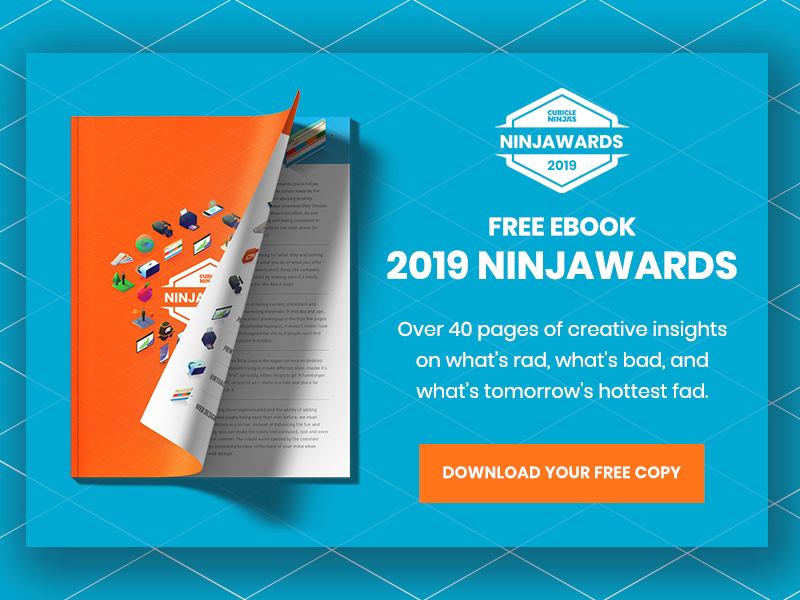
Want to download all of the 2020 Ninjawards?
Our 2020 Ninajwards eBook is 100% free!
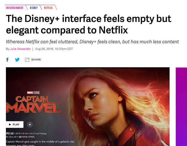
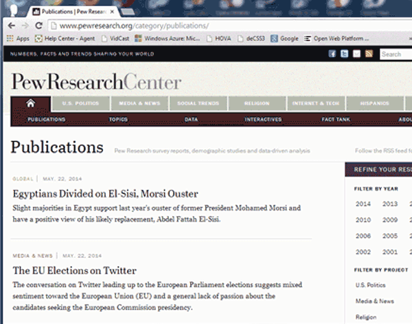
Public Consciousness of Good UX
Over the past year, we’ve seen UX break into the public conscious and now, more than ever, users are more aware of what makes or breaks their experiences with websites and products alike. Whether it’s headline news, podcasts, or parody games, this awareness raises the bar for designers to provide top-tier experiences as falling short can be a detriment to your success.
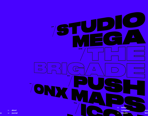
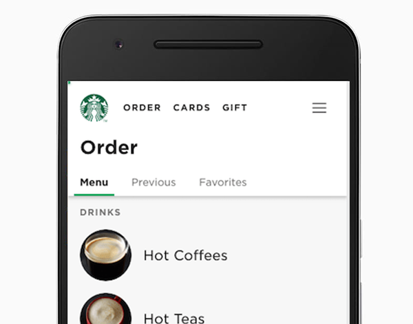
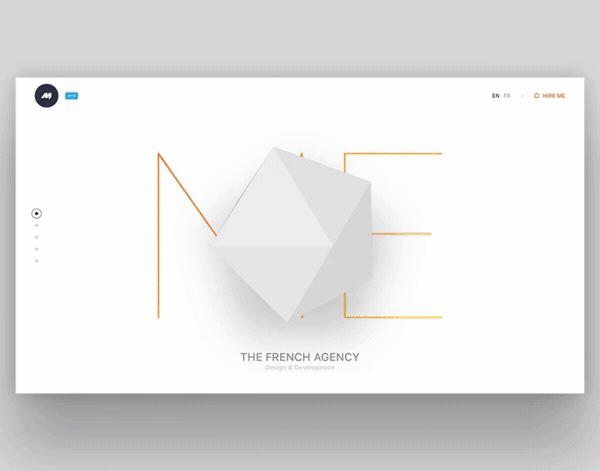
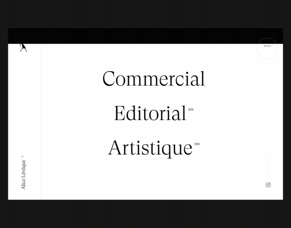
The Hero Menu We Deserve
With the mobile-first movement came the hero menu: a large, bold, typographic element that typically takes up a majority of your homepage and functions as your main navigation element. Not only do they ease the transition from mobile to desktop, but they offer the opportunity to further establish your brand through display type.
Progressive Web Apps
For those not in the know, progressive web applications are essentially websites that act like apps. The perk of building a site that functions like an app is that you don’t have to worry about deployments and other headaches you typically associate with application development but allow for users to have a singular experience across web and mobile alike.
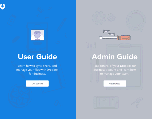
Relevant, Curated Content
It’s becoming easier than ever to provide your users with valuable, curated experiences every time they visit your site. Whether it’s tracking products viewed, topics commonly explored, or suggestions based on previous visits, take advantage of this data to keep your web presence refreshed and relevant with each click.
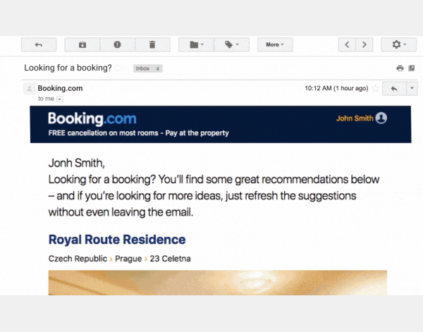
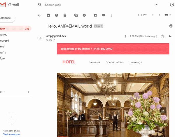
AMP Emails
When AMP technology is paired with email, recipients are greeted with engaging, animated, and interactive email that sets itself apart from the spam and monotonous updates. Think of it as a mini application in your inbox!
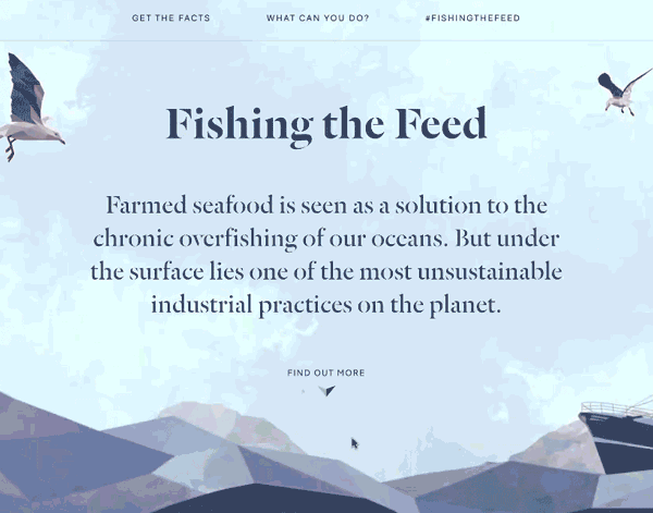
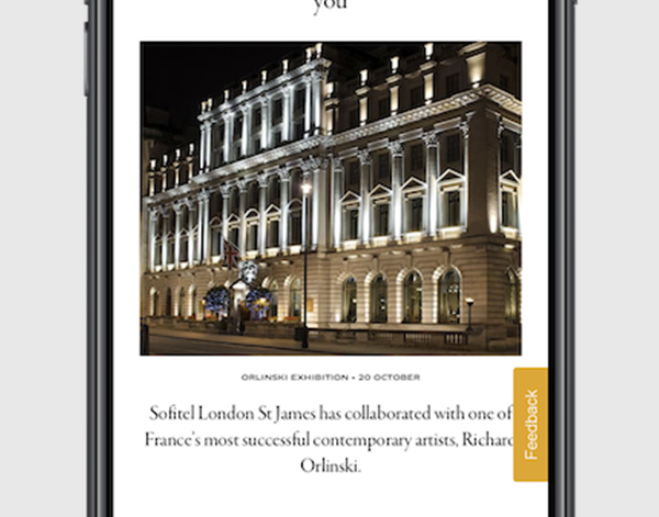
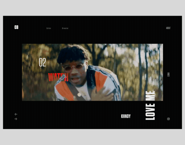
Storytelling Through Scrolling
One seldom-mentioned aspect of web design is storytelling. By creating a flow throughout your website that both guides and engages, you are able to tell a story in a unique way. In 2019, we saw this trend go even further as long-form webpages employed parallax and other animated elements to tell a cohesive story as the user scrolls down the page.

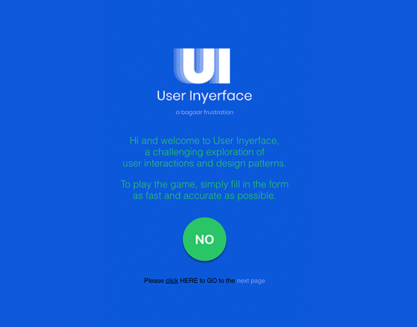
Too Many Sticky Elements on Mobile
Although phone screens are larger than ever, design real estate on mobile devices is still limited compared to desktop experiences. That’s why it’s extremely important not to crowd users with too many sticky elements on mobile. All this does is block valuable content and create frustration for users who may not even be interested in the sticky information.
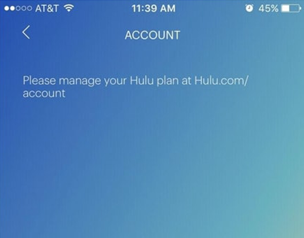
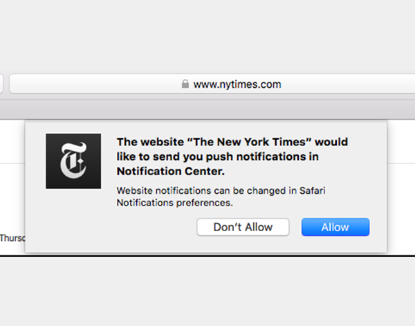
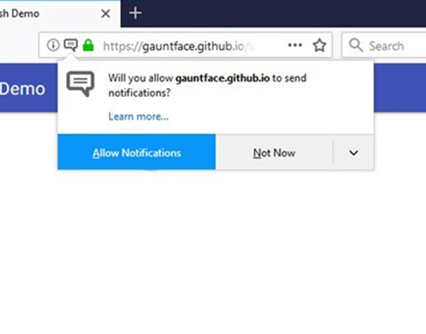
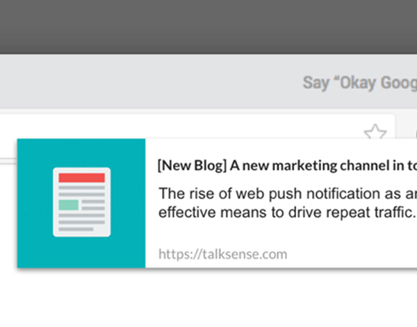
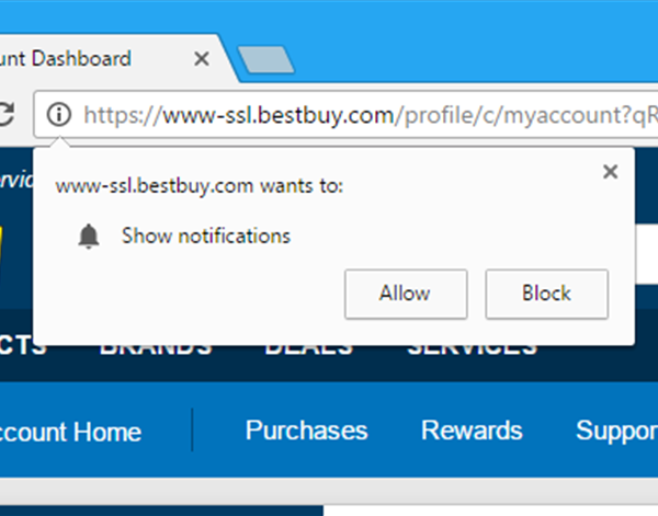
Website Notifications
We have enough applications and sources of distraction without websites asking for permission to send us notifications. It’s spammy and doesn’t add value to your user’s experience.
Wait, You’re Still Not Mobile-Optimized in 2020?
Believe it or not, there are still sites out there without responsive design implemented well, or at all in some cases. It’s 2020 – mobile-optimized sites are a fundamental user expectation. Brands that don’t get on board can expect to be left behind in favor of competitors that offer a cohesive, user-friendly experience across multiple channels.
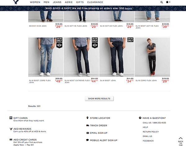
Over-Templatized Layouts
Content management systems like WordPress have made web design and development more accessible to the masses – no experience required. While this is great for empowering organizations to take greater control of their online presence, it has led to an abundance of stripe-y look-a-likes born from the same old templates. This lack of unique branding strips companies of the opportunity to differentiate their organization and really shine in the digital space.
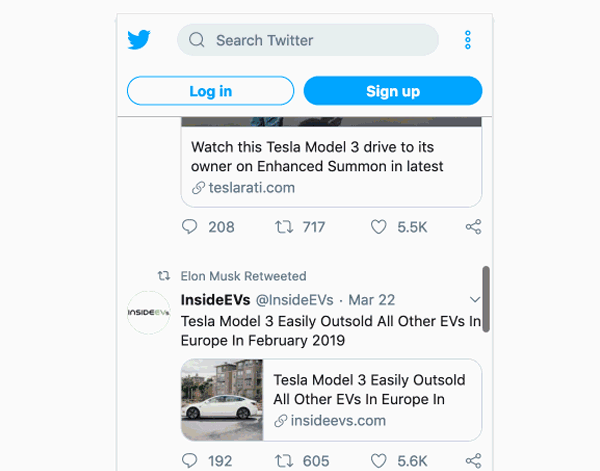
Just Keep Scrolling, Scrolling, Scrolling
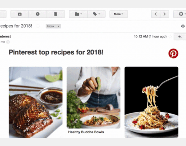
Infinite scrolling is a hugely popular functionality popularized largely by social media interfaces. While this strategy can be effective for platforms like Pinterest and Twitter, organizations outside of the punchy content-creation space should tread carefully here. Drawbacks of infinite scrolling include performance degradation, less targeted analytics data, difficulty navigating back to specific items, and a negative impact on SEO.
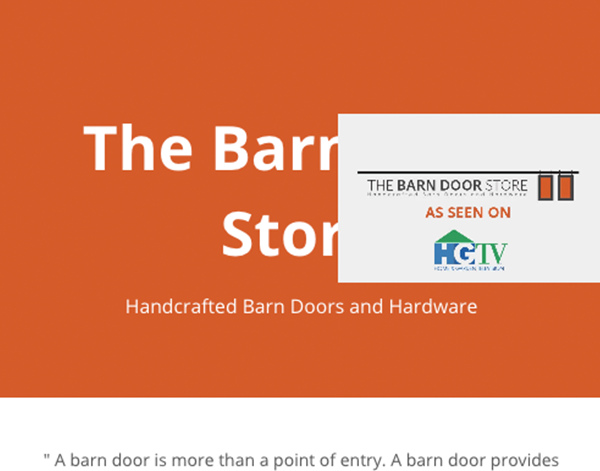
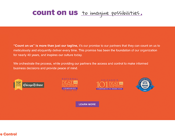
Tacky Badges and Awards
We’ve all seen it – homepages cluttered with logos accrediting the company with some title or achievement. It’s increasingly common across industries. The issue with these “awards”, however, is that they aren’t earned – they’re bought. The organizations offering these badges charge companies in order to display them, and users are wising up to the scheme. Brand credibility is important, but there are better ways to prove one’s abilities than paying for awards.
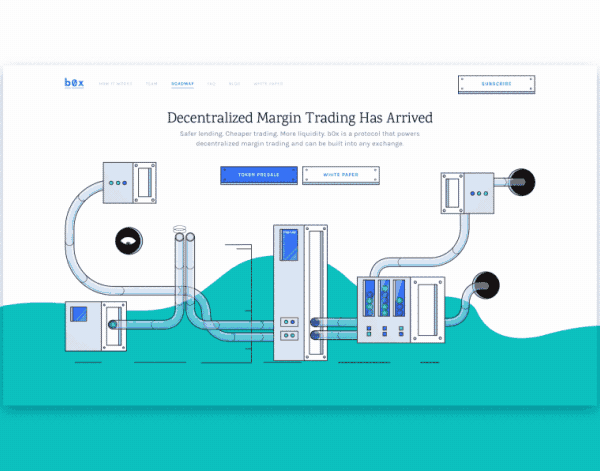
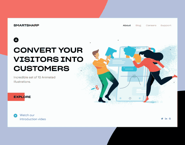
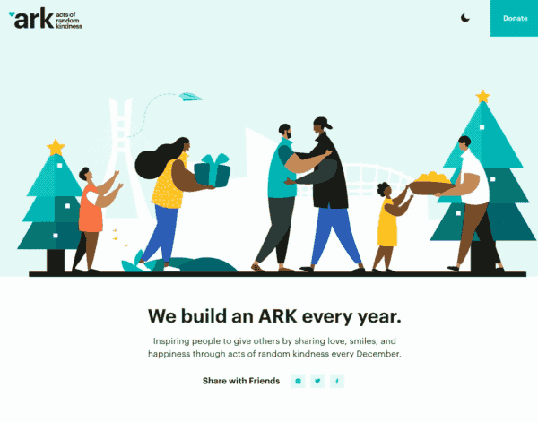
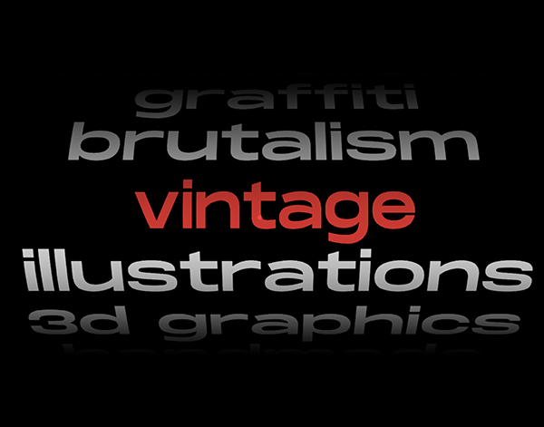
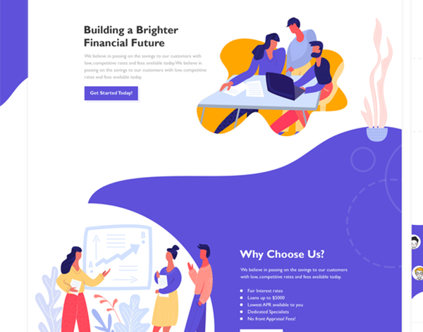
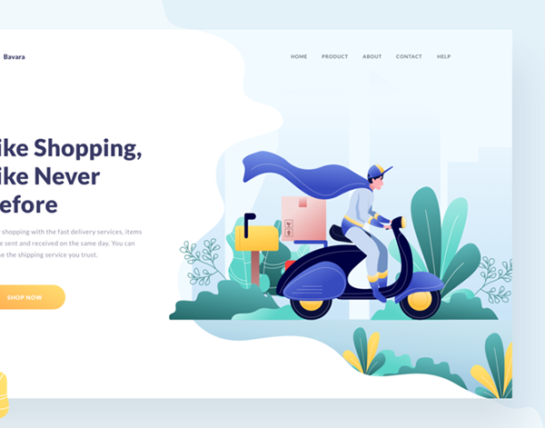
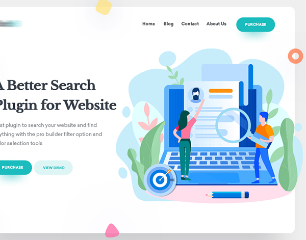
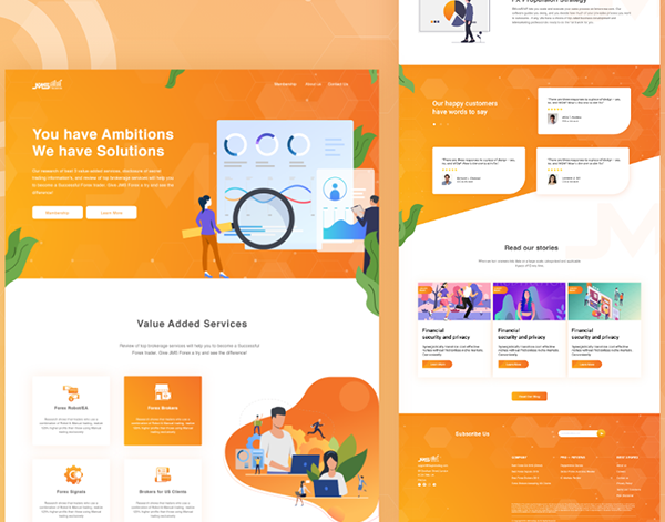
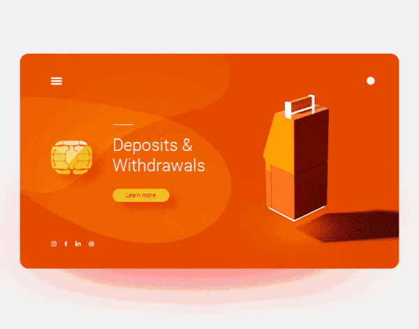
Lack of Branded Illustration
Illustration is a fantastic way to differentiate a brand and create a cohesive ecosystem of visual elements across channels. However, style is key. When illustration looks like stock rather than custom work, the result is a generic aesthetic that blends in with the competition and misses the opportunity to create a unique, personalized brand experience.
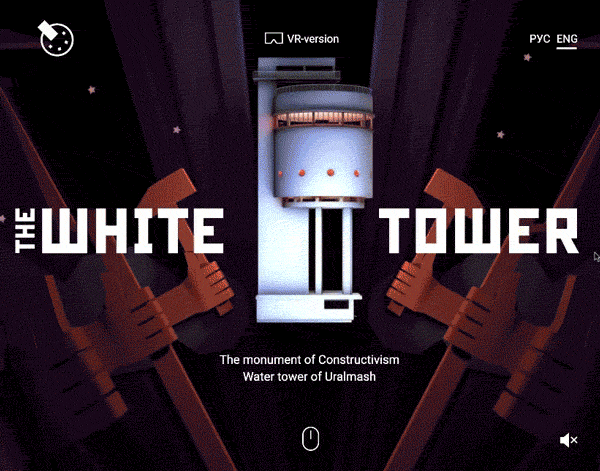
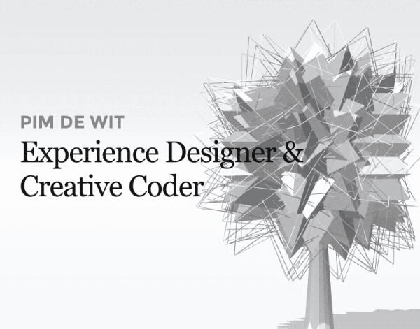
WebGL
WebGL stands for web graphics library and is defined as “a JavaScript API for rendering interactive 2D and 3D graphics within any compatible web browser without the use of plug-ins.” In short, WebGL enables the use of real-time 3D graphics on websites, giving designers and developers alike more flexibility than ever to create one-of-a-kind user experiences.
Custom Cursors
As a fundamental indicator of page functions, the traditional arrow cursor is one audiences are accustomed to. However, in 2020, we expect to see more designers tap into the power of the cursor as a flexible design element that can further enhance and customize the user experience.
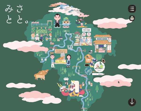
Scalable Vector Graphics
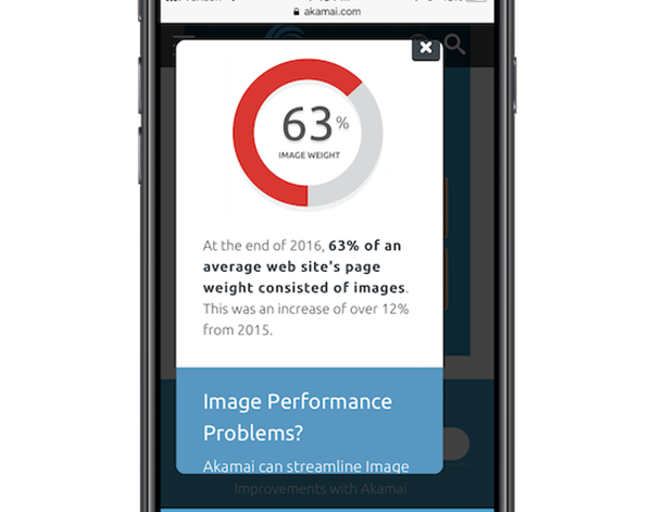
With the advent of HD monitors came dissatisfaction with now-visible fuzziness in traditional JPEG and PNG images on the web. Not anymore! With scalable vector graphics, web pages can now display crystal clear graphics that are perfectly crisp on even the most high-definition screens. Even better – these vectors are smaller in file size than traditional image files, lowering overall page size for faster loading time.