
If you’re trying to exude professionalism in your PowerPoint presentation, it probably feels like you’re pretty limited in your font selection. At the same time, you don’t want to be just another presenter by playing it safe with Times New Roman- widely (and falsely) believed to be the best font for PowerPoint. Where is the creativity, people?!
Now, we’re certainly not advocating for anyone to use Comic Sans- oh, the horror! But, we do feel that a well thought-out, intentionally selected font can take your presentation to the next level. If you’re feeling adventurous (or at least bored to tears from seeing Arial), allow us to introduce you to fifteen new fonts you’ll be itching to use in your next presentation. Please don’t use them all at once. That would just be a disgrace to these beautiful typefaces!
We promise you that these fonts are clean, sharp, and highly professional. Give them all a try and let us know which one you think is the best font for PowerPoint!
15 Amazing Fonts for PowerPoint
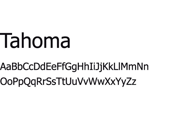
1. Tahoma
This font was designed by Matthew Carter for Microsoft for the initial release of Windows 95. In other words, it’s an oldie but a goodie. This font boasts tight letter spacing and a narrow body. Our favorite part of this typeface is that it distinguishes the uppercase “I” from the lowercase “l”- it’s a pet peeve of ours when l… arrgh, we mean “I”… can’t tell the difference! When you don’t have any room for error in getting your message across to your audience, this might be the best font for PowerPoint.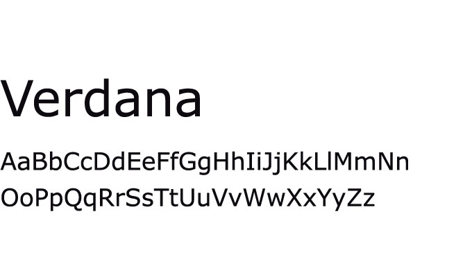
2. Verdana
Verdana is another Matthew Carter design for Microsoft that has lasted through the ages- although not without some hiccups. In 2009, IKEA changed its catalog typeface to Verdana which caused a surprisingly large amount of controversy. To be honest, we consider any controversy over a font change surprising. You can google Verdanagate for all the juicy details. Anyways, this font is intended for use in body text, as it features tall lower-case characters, wide proportions, and loose letter-spacing, or “kerning”.
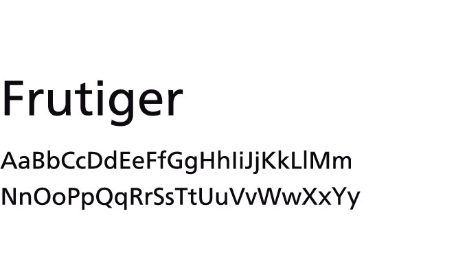
3. Frutiger
Frutiger is about as close as you can get to font fame, as several world-renowned type designers have praised its legibility and versatility. This font excels in small text sizes and has a truly classic feel. It’s been featured by American Airlines, American Eagle, Emirates, Panda Express, RadioShack, State Farm Insurance, TD Bank, and more. Recently it’s been most popular with education, health, and finance related topics, so if your presentation is related to any of those areas, this might be the best font for PowerPoint.
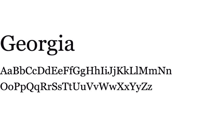
4. Georgia
This font is frequently praised for its elegance, likely due to its alternation of thick and thin strokes, tall lower-case letters, and thick serif. Georgia is arguably the most similar font to Times New Roman (at least as compared to this list), so if you’re more traditional in your font preferences you might appreciate this font most of all. It’s difficult to go wrong with such a classic look.
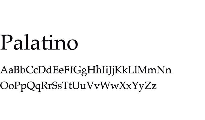
5. Palatino
Released in 1949, Palatino was originally intended for trade use on poor-quality paper. As a result, it has a solid, wide structure and ample negative space for maximum readability at a distance or in minuscule sizes. It definitely gives off a vintage vibe, which we think is super neat. Just make sure that this complements your presentation topic instead of clashing with it or distracting from it.
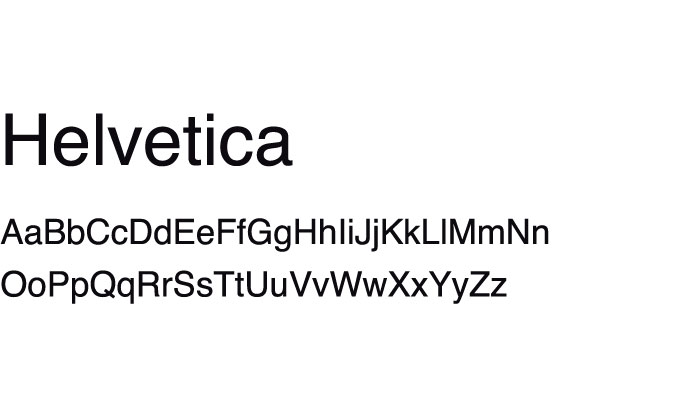
6. Helvetica
Helvetica is commonly referred to as the chameleon of the font world because it has a very neutral energy and can fit into any style. It has a lot of variants available if you like the general look but aren’t totally sold on the original style. Check out Helvetica Inserat, Helvetica Compressed, Neue Helvetica, and Helvetica Now- there are a handful of others in case you want even more options.
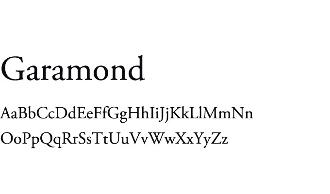
7. Garamond
This is actually a style of font, but nevertheless its character is commanding, mature, and structured. Distinctively, Garamond’s “e” has a small eye and the “a” has a sharp hook upwards. The true reason why we’re a sucker for any Garamond font is because weI know that the entire Harry Potter series is printed in it… and we are total Harry Potter nerds.
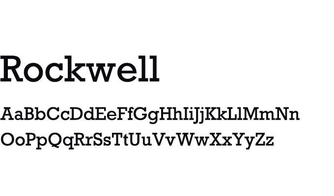
8. Rockwell
Geometric and monoline, Rockwell is a favorite for display text- meaning it’s designed to be impactful, whether to create a mood or to make an important announcement. This is a strong and sturdy font, so it’s definitely not the best font for PowerPoint body text. Stick to titles and headings for best results.
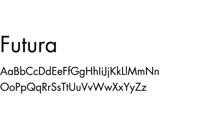
9. Futura
Designed to project a feeling of efficiency and forwardness, this font is intended to showcase modernity. As such, as time has passed there have been many variants. Futura can be used for both headline and body text and has remained incredibly popular since its creation in 1927 precisely because of this versatility. Remember when we mentioned Verdanagate? Futura was the font that IKEA replaced with Verdana, plunging their catalog lovers into chaos.
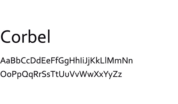
10. Corbel
Corbel was created specifically for LCD monitor use, so it’s very clean and clear on-screen. It is a “softer” font, with flowy, curvy letter forms, although it still is assertive. Interestingly, this font’s numbers follow the “lowercase” – aka “old-style” – numerals, because they don’t line up exactly. It’s not necessarily a bad look, it just comes down to personal preference.
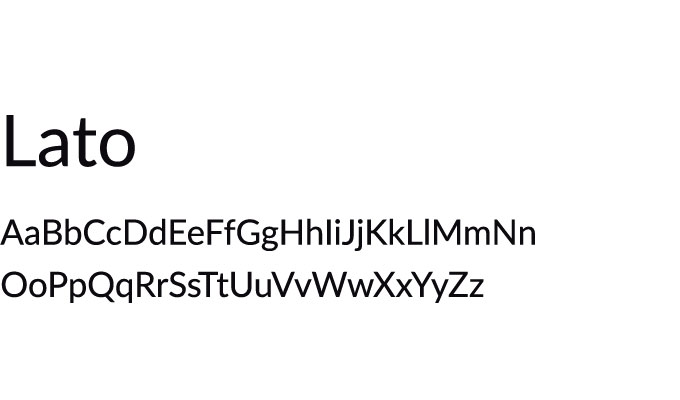
11. Lato
This is the third most used web font according to Google Fonts, which means it’s incredibly versatile. You can be assured that this is definitely a safe bet for your next presentation. It’s available in nine weights (thicknesses) from hairline to black, so you’re bound to find one that suits your purposes.
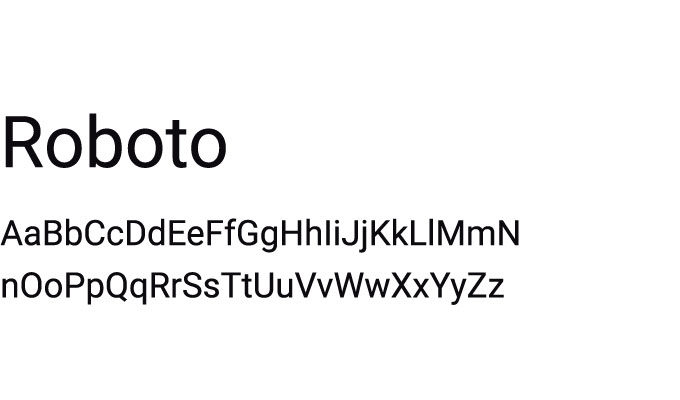
12. Roboto
If you own an Android device, use YouTube, or have a Google+ account, you’ll probably recognize this font, as it’s used within each one of those. Roboto is modern, approachable, and clean, which makes it perfect for most use cases. I mean, if it’s good enough for Google, it’s probably good enough for you, right?
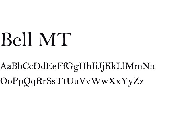
13. Bell MT
Bell MT is a go-to for subheadings in its normal form, but it’s also excellent when used for quotes and testimonials in its italic form. Personally, I find the italic version the most beautiful, as this showcases the fonts cursive influence while remaining completely legible and clear. If you’d like to incorporate testimonials into your presentation, use Bell MT!
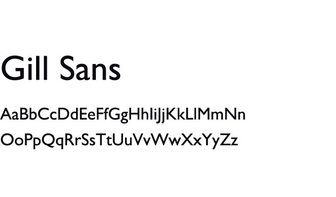
14. Gill Sans
This font is the friendliest and warmest of the batch, without seeming unprofessional. Gill Sans is designed to be legible from a distance and small sizes, which is great for any presentation. Overall, if you’re looking to create a connection with your audience, this is a great choice!
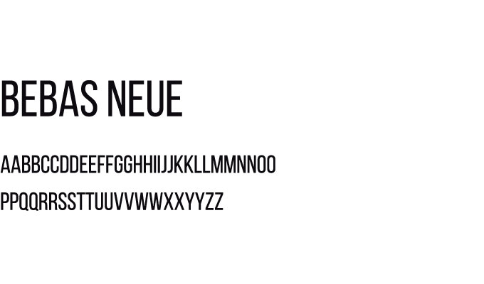
15. Bebas Neue
We really like the light version of this font because it’s graceful, elegant, and approachable. It also meshes really well with other fonts, including Helvetica (as described above). Bebas Neue is super versatile, so feel free to play around with your slide design. If you’re easy going, you’ll probably appreciate the simplicity and no-nonsense nature of this font.
Looking for more presentation insights?
Check out our 16 Strategies Used by Pitch Deck Designers or 8 PowerPoint Presentation Tips That are Pure Gold.
Need more helping making your next presentation sing? Get in touch today!