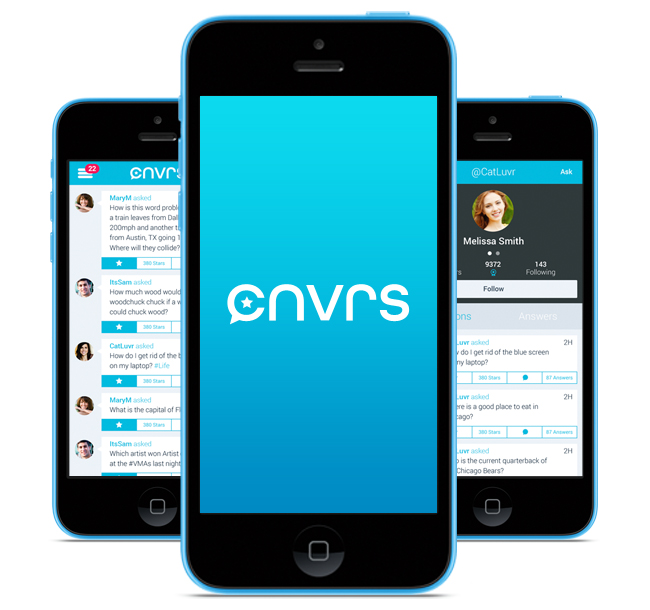
When looking for answers to your questions across social media, it can be difficult to find reliable resources to point you in the right direction. Sure, you could turn to a forum or a service like Yahoo Answers, but sifting through all of the spam and noise can be a waste of time and leave you empty handed.
Introducing CNVRS: The New Q&A Mobile Application
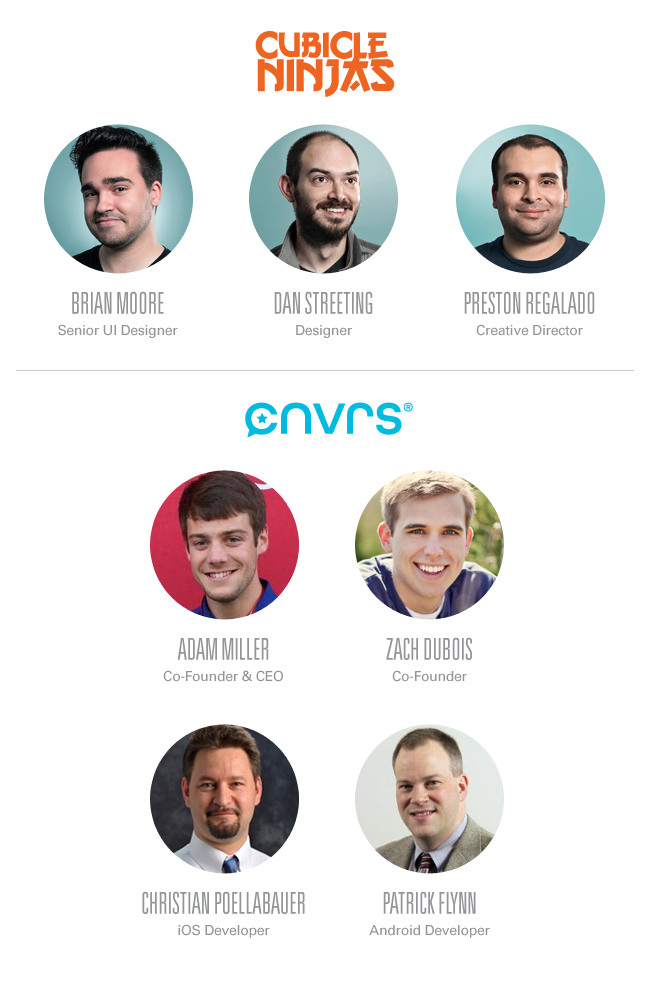
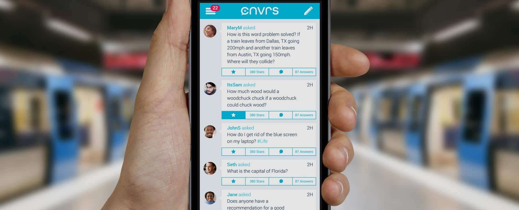
CNVRS is aiming to change the face of the online Q&A landscape. The brainchild of Adam Miller and Zach DuBois, this mobile application’s creative development proved so interesting we couldn’t help but converse about CNVRS.
Download the CNVRS app here.
A Big Idea with Even Bigger Impact
Adam and Zach’s partnership with us began earlier this year. The two Notre Dame students ventured from Indiana to the Cubicle Ninjas dojo in the western suburbs of Chicago to discuss their idea for a mobile application. Now known as CNVRS, this platform for conversation focuses on rewarding users who provide helpful responses. Their dream was to establish CNVRS to become the go-to Q&A mobile application.
With a history of intuitive web application interfaces, Cubicle Ninjas leveraged our mobile design knowledge for their fresh canvas. Designer Dan Streeting and I jumped at the chance to create a standout product that is as visually pleasing as it is enjoyable to experience.
Kick-off meetings are always an unknown quantity. No matter the client expectations going into it, the challenge is to transform a shared dream into tangible deliverables. Five minutes into the meeting it was clear that Adam and Zach had a vision and were determined to make it a reality. From themes of outer space and astronomy to competitor studies (and the clearest wireframes to ever come through our doors) they had definitely done their legwork. While they had a thoroughly defined outlook for their product, they were open to any idea that would make CNVRS a success.
With direction in mind, and the backing of Adam and Zach, we were ready to move forward.
A Flatter World
It was late April and rumors of a new, flatter iOS were a popular topic of conversation. With an expected announcement of the updated operating system looming, our team had to be proactive when designing CNVRS keeping in mind the possibility of a drastic change in design language from Apple in the coming months. Whatever we built had to be future-proof, or as close to it as possible short of being able to see ahead in time.
Adam and Zach had provided concise wireframes of the app they had envisioned. When we see wireframes they tend to reaffirm our career choice, but these were works of art. We’re talking fridge-worthy masterpieces. They had clearly put a lot of thought and time into the user experience and we weren’t about to throw that away. Dan and I met with Creative Director, Preston Regalado, to analyze the provided mock-ups, and decided to focus on refining the following areas:
• Asking a question needs to be easy and readily available no matter where the user is in the application.
• Finding the most reliable answer should be intuitive and, in large part, handled by the application.
• Implementation of hashtags to quickly locate related questions and answers.
• A question/answer rating system.
The main benefit to wireframes in mobile application design is being able to quickly plan out a user’s path through the app and identify any redundant or extraneous steps that could be eliminated or simplified. This leads to a more streamlined and unified user experience. Typically Cubicle Ninjas’ strays away from client-facing wireframes, especially before a brand is established. We feel, more often than not, they add to the confusion and stress that a new client may feel when partnering with a creative design agency for the first time. Instead Cubicle Ninjas tends to create high-fidelity mock-ups to provide both UI and UX within context of the larger brand. That said, we took full advantage of exploring these in wireframe form with the CNVRS team to solidify the interaction.
Parts of a Whole
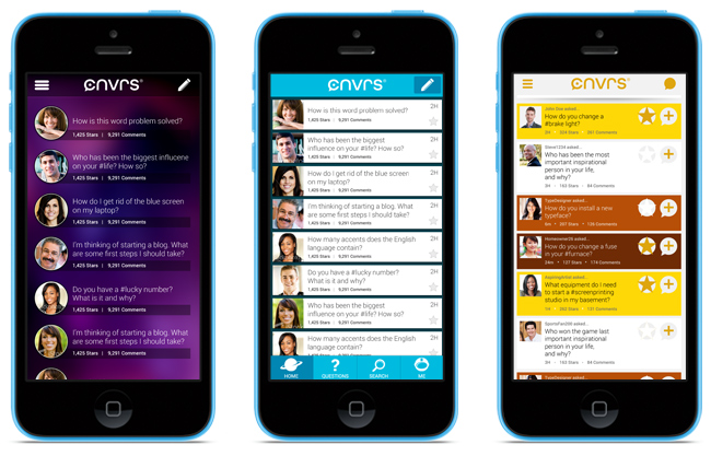
During the first round of designs, we started conceptualizing at the foundation level, focusing on nailing down a solid structure for the app to be built on top of. To us, this meant starting with the menu navigation. Our concepts ran the gamut from hidden sidebar menus, dropdowns, and tab bars. In the end it was decided that a sliding sidebar menu would be the best solution for CNVRS. It allowed us to maximize screen real estate dedicated to the questions and answers while making it easy for a user to quickly navigate to another section of the application.
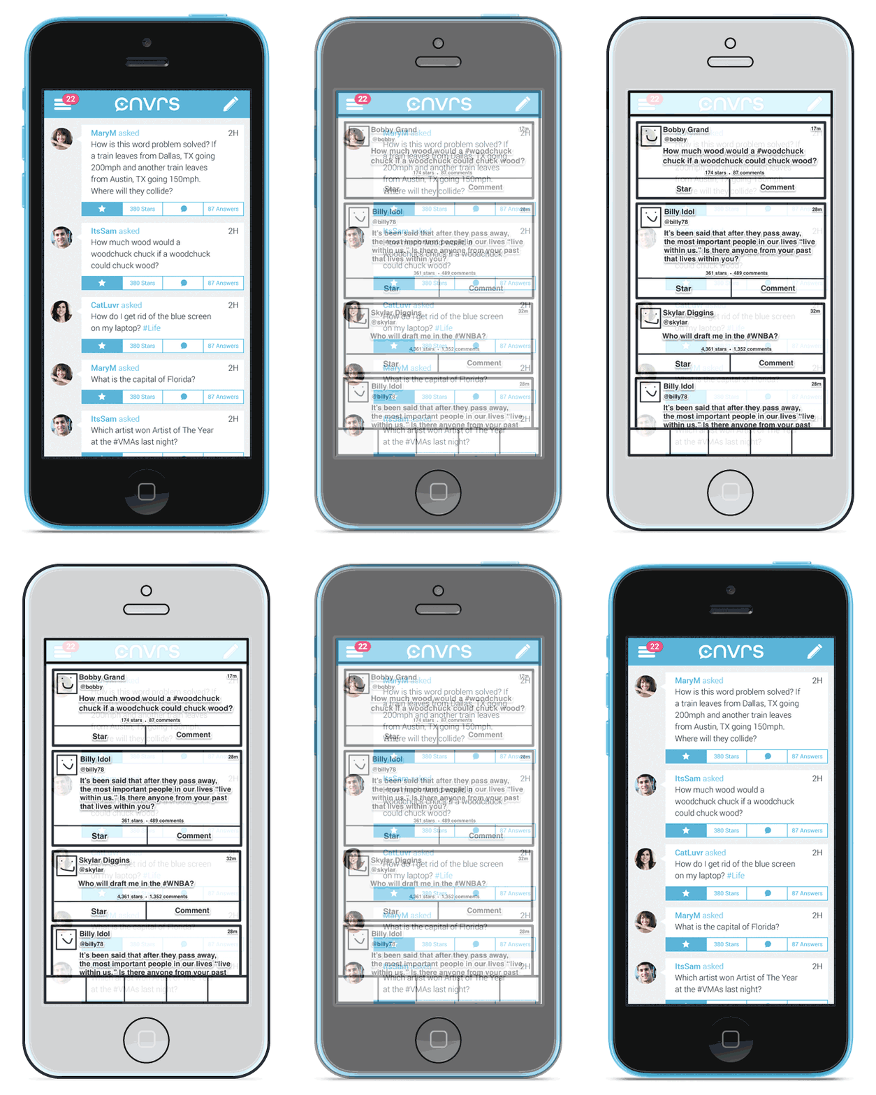
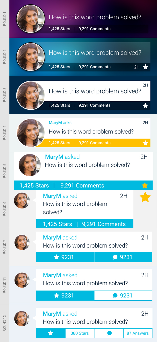
In addition, the question “cells”, the bread and butter of the application, needed to match the intuitive nature of the menu and could either make or break the experience. While the main structure didn’t vary much between rounds, sometimes it’s the smaller tweaks that make all of the difference.
Below you can see the progression of the CNVRS question cell design:
A Platform Community for Conversation
All of the work we were doing on CNVRS would have been for nothing if the app didn’t feel like a living community full of people willing to help and engage in constructive conversation. The app needed to spotlight its users and give them as much attention as they give their posts. It was this need that led us to the circular avatar design across the mobile application. Because the question cells and the interface were blocky in nature, we felt that rounded profile pictures gave visual contrast. This allowed them to remain secondary to the conversation they were a part of and let the content really shine.
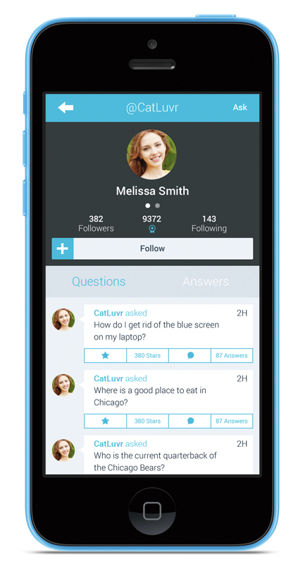
It was important to give each user a unique profile page, adding a human element to the experience and giving us the opportunity to design an effective social network. The inclusion of profiles also added the element of private messaging, which created another tier of questions and answers to the interface.
Hurdles Along the Way
After working on CNVRS for a month the holes in the experience were beginning to show. Screens that seem rather obvious in retrospect were easily overlooked because of the focus on the core experience. I worked with Preston to flesh out a definitive process flow and identify these missing pieces.
This is part of why our unlimited creative design methodology exists. We partner with clients to help them solve their problems within a set period of time. Had we only been able to assist in rounds, we couldn’t have really added holistic value.
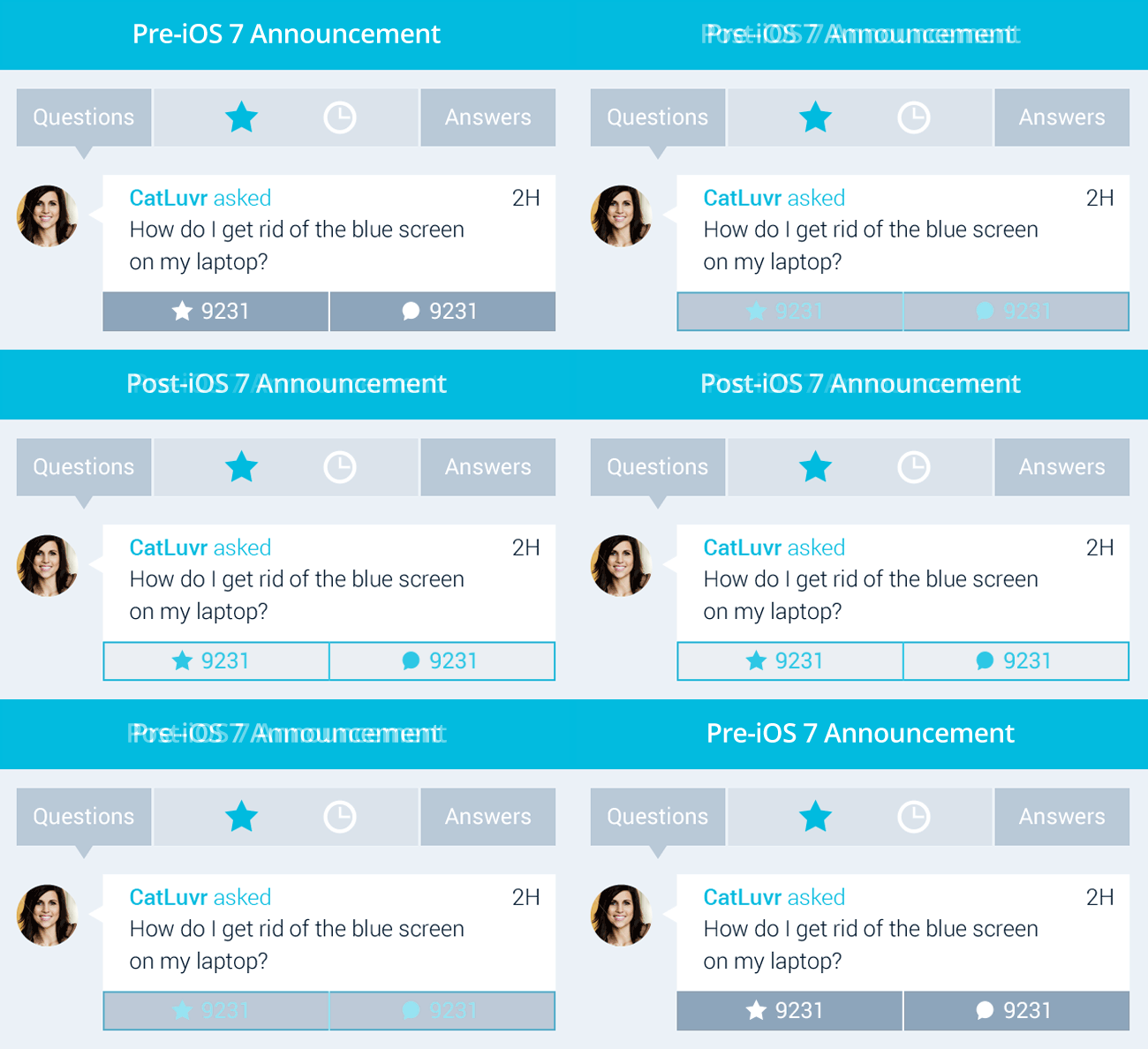
Towards the end of the design phase, Apple officially unveiled iOS 7. While we had kept this update in mind all along, there were elements of the new design that we hadn’t foreseen. Minutes after the press conference, Adam called and we discussed the update and made note of elements that needed to be tweaked to fall in line with the new OS design. Buttons that had been solid for multiple rounds were now changing to outlined boxes, leaving us with a hierarchal challenge.
Interactive elements that had been called out in previous rounds were now falling into the background. To solve this, we employed the use of icons to call attention to buttons. We had already been using icons elsewhere in the app, so there wasn’t a need to break standards in order to accommodate the new design.
The Result
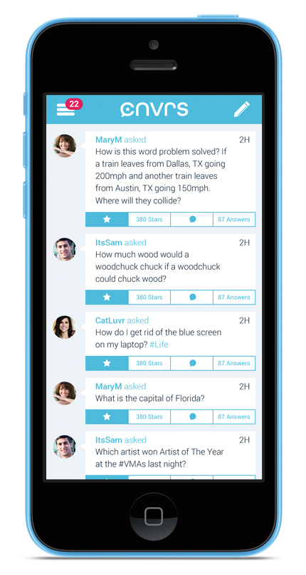
CNVRS launched in the iOS App Store this November and it is already being used by people worldwide. While CNVRS works wonderfully in achieving their goal, it took hundreds of hours of behind-the-scenes conversations to make that happen. We hope this look at the design process shares just a taste of this wonderful, challenging, and ultimately rewarding experience.
Congrats again to the team at CNVRS for a successful product launch. We can’t wait to see what’s in store for this amazing app in the future!
Do you have a mobile app design success story to share with us? Be sure to leave a comment below.
Drop us a line and let us make your application dream a reality.
About the Author: Brian Moore is the Senior Designer at Cubicle Ninjas. You can follow him on Twitter.
