

Rad, Bad, And The Next Fad – 2014 Email Design Trends
Past Ninjawards: Branding | Web | App | Print
Email marketing should have it’s own reality show. Think about it. There would be a judge for content, execution, and of course — design. It all boils down to the best of the best to win over the judges, or in this case, the recipients.
Ready to design a winning email? Take a look at this inspiring collection of rad, bad, and the next fad in email design.
We’d hate to see your emails sent home, or to the trash bin!
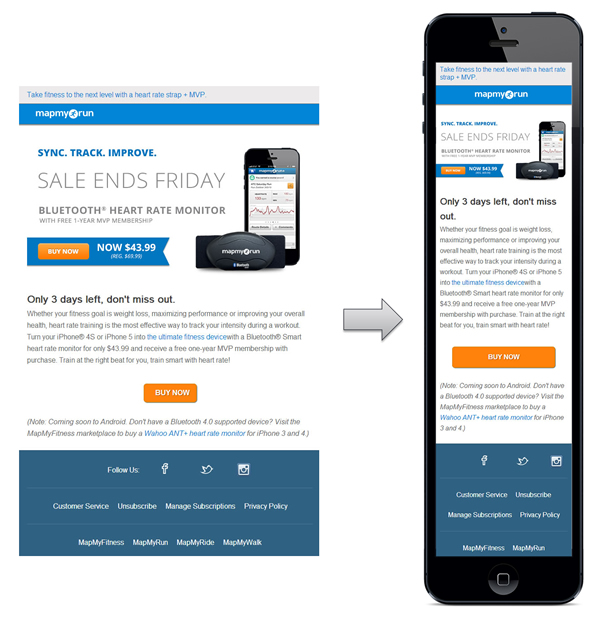
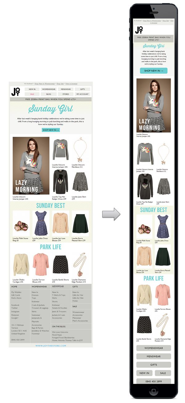
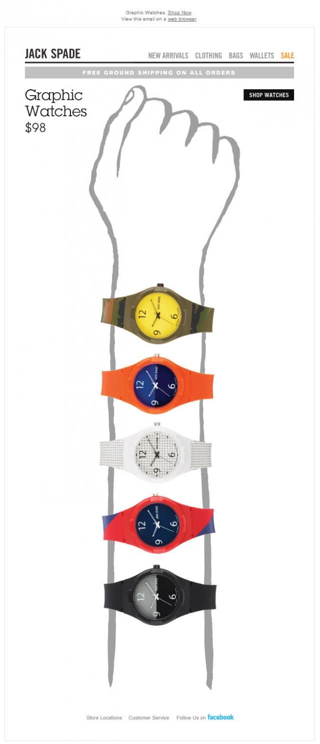
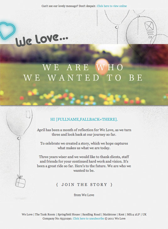
Responsive
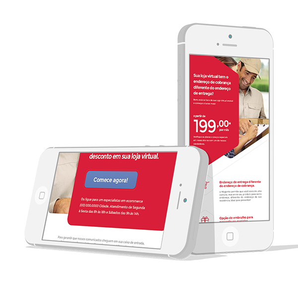
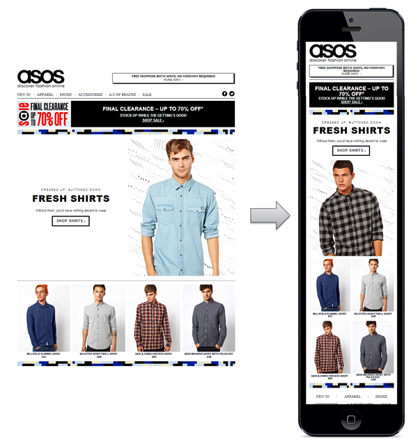
“From my experience, the most successful campaigns, which have multiple open rates, are optimized for a few common multiple devices – as such I think 2014 will be the year that email marketing finally embraces responsive design.” – Rhys Wynne, WordPress Developer
51% of emails are opened on mobile devices. Responsive emails are a necessity. If an email isn’t mobile-friendly, chances are click-through and open rates will be significantly low.

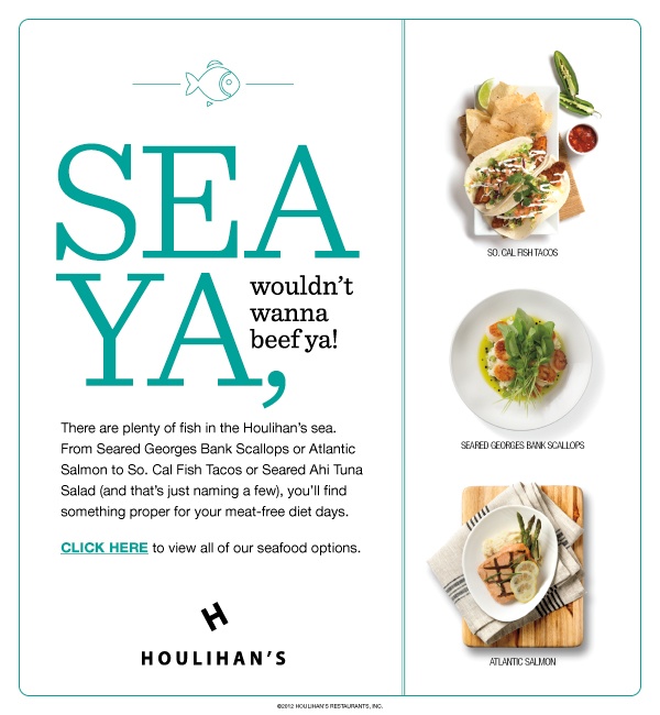
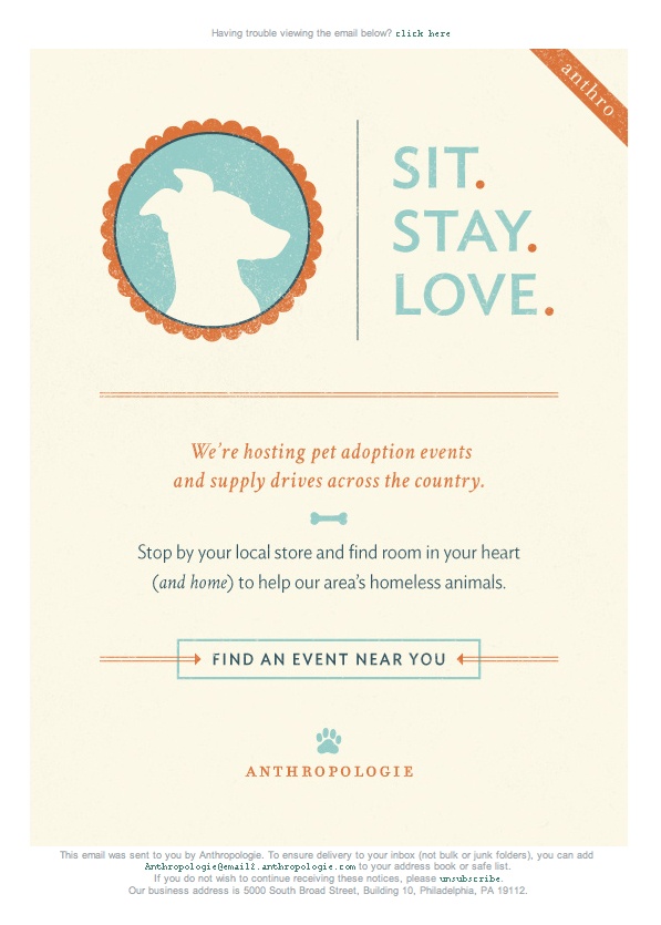
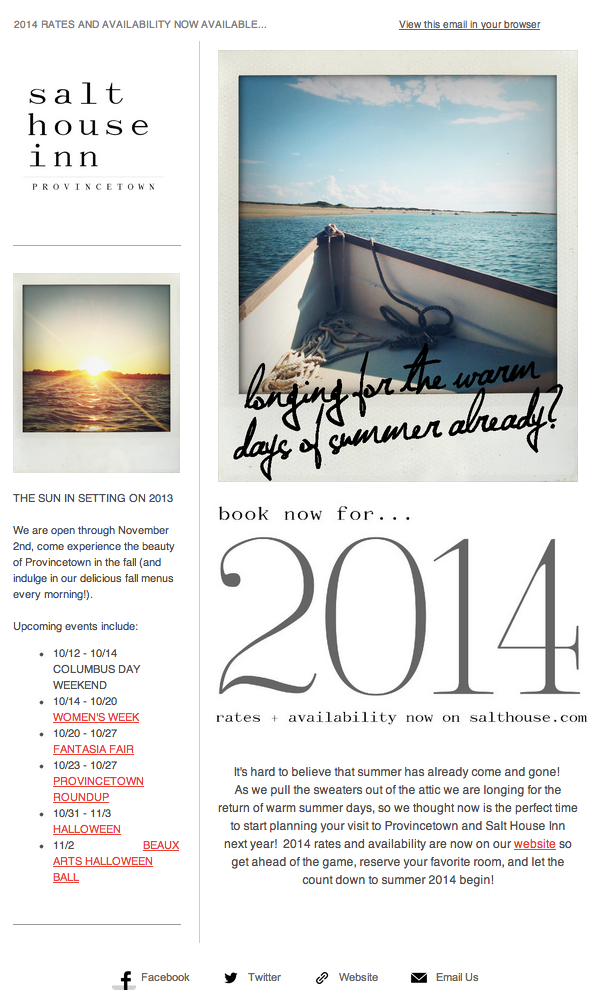
Simplicity
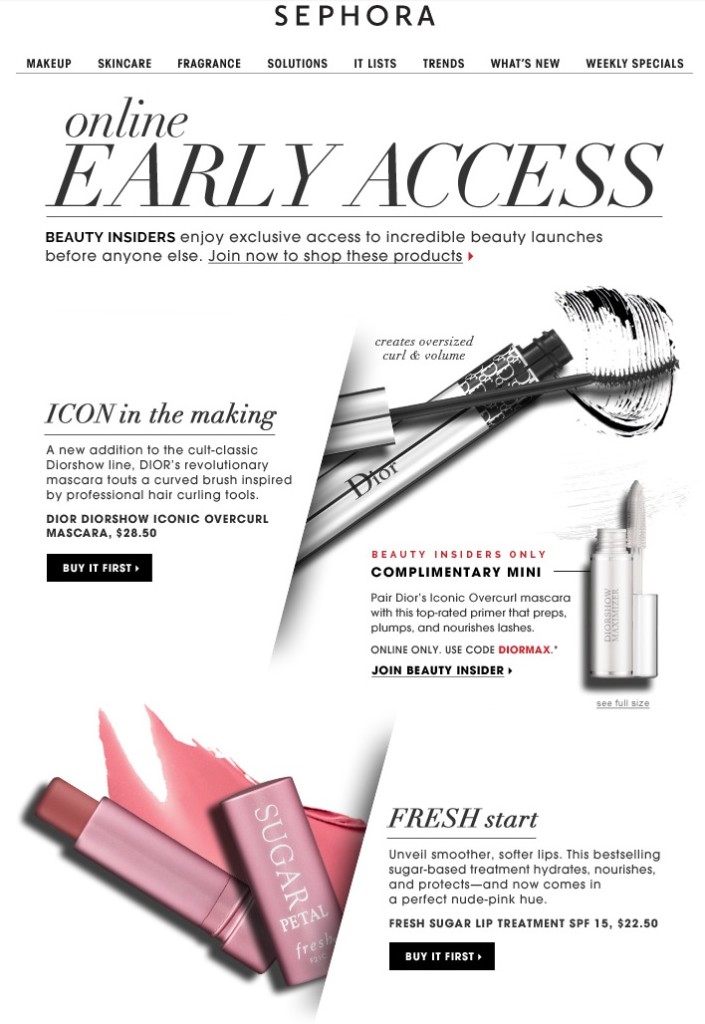
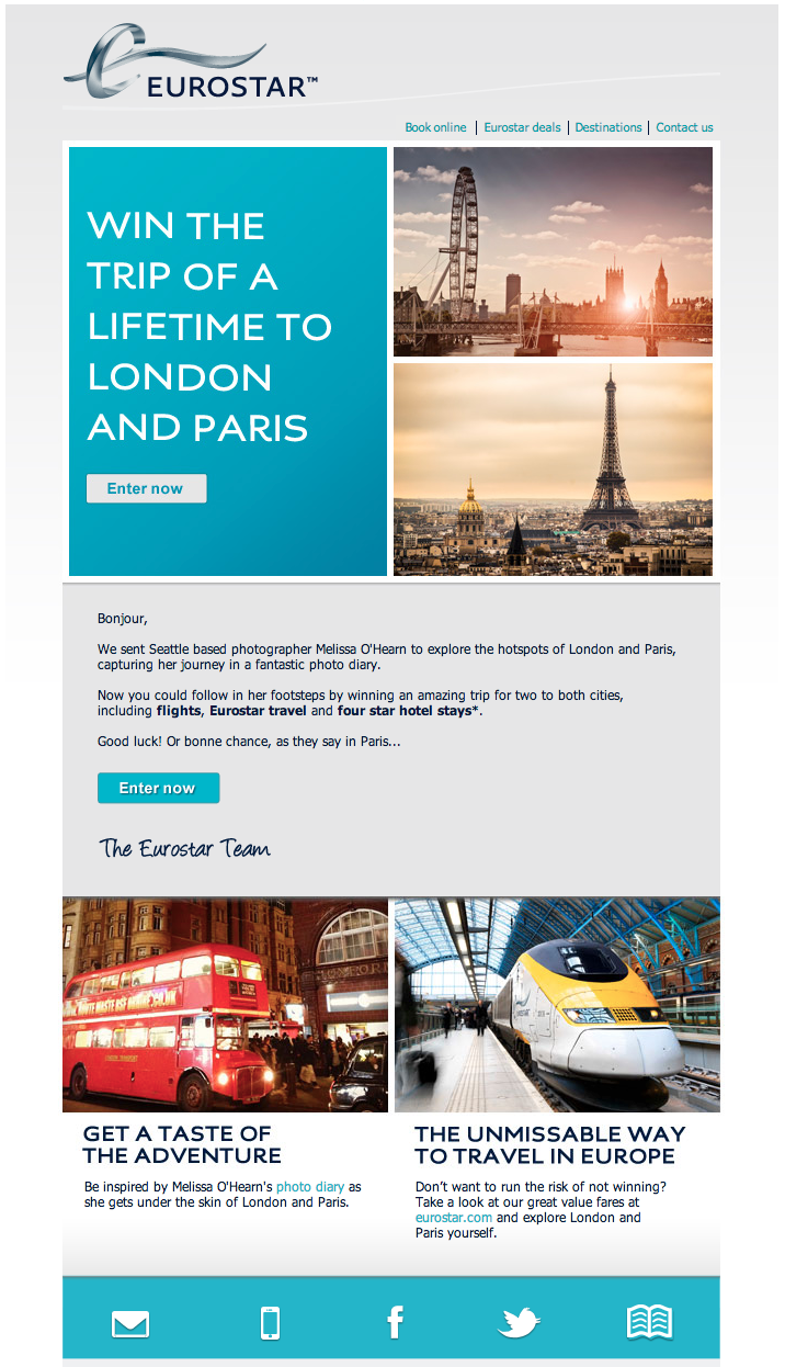
Emails with only 1 or 2 calls-to-actions with less clutter are more desirable to open and click-through. Why? Because recipients are overloaded with emails everyday. They’ll appreciate an email that’s straight forward and to the point.
Animated GIFs
Much like for web design, animated GIFs are making a big comeback! You’ll start to see them in emails more than ever before. They give emails movement and catch the attention of the recipient.
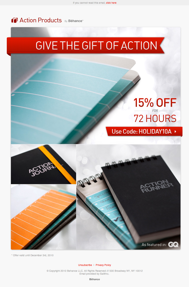
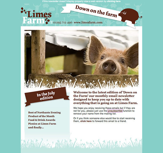
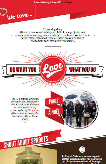
Ribbons
Ribbons in email design is something of the past. If you want your emails to be taken seriously, ditch the ribbons and go for a design concept that’s more modern and new.
No Call-To-Action
Emails without a specific call-to-action will always have lower click-through rate than emails containing significant CTAs. Always be sure that an email design layout is set up in a way that the CTAs are specific and easy to find.
Clutter
Opening an email that’s nothing but clutter is the equivalent to walking into Wal-Mart on Black Friday. Sure, the email might be packed with great deals, or other types of valuable information. But if it’s hard to navigate, then what’s the point?
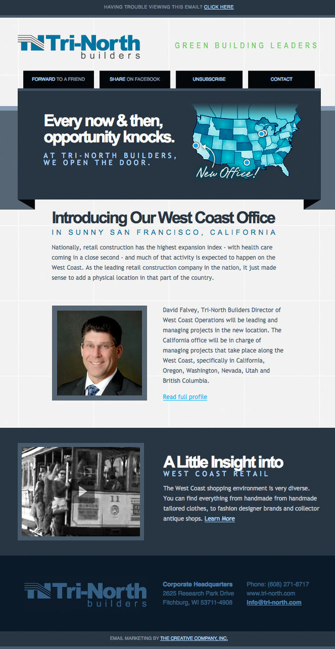
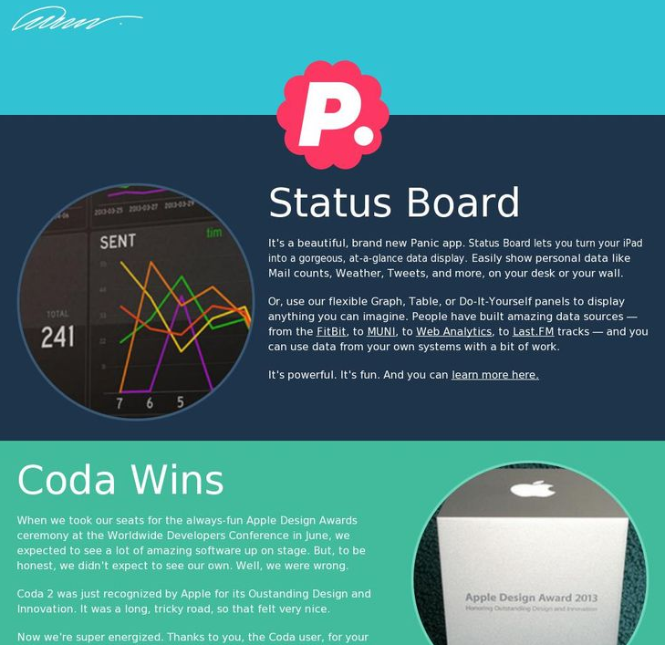
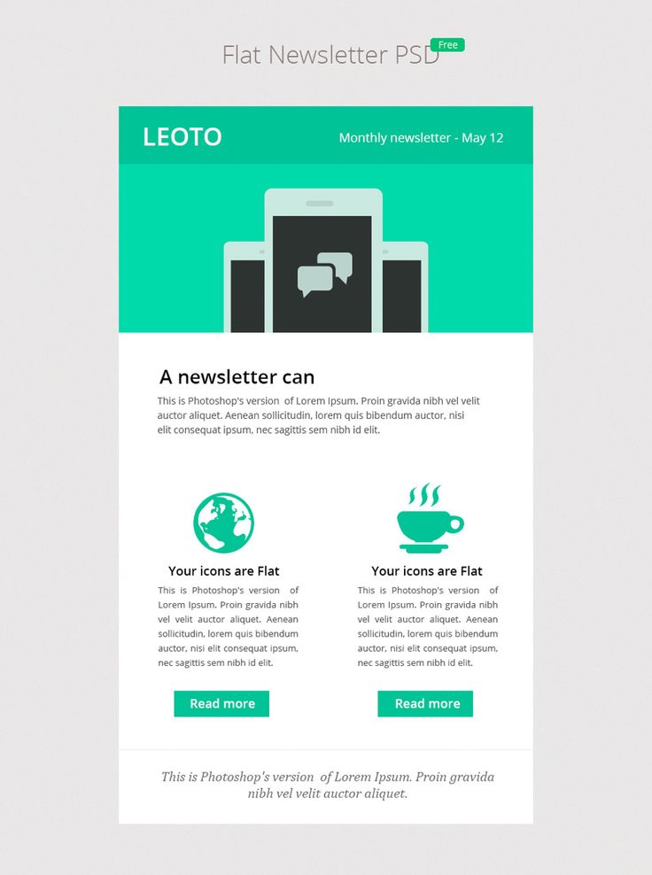
Flat UI
Flat UI design is a streamline interface emails can benefit from due to it’s simplicity and less cluttered layout. The simplicity of the design will create a better user experience for the recipient.


Most of these designs are awesome, I just came in here because I need to make one for us and got some pretty good ideas.
Cheers!