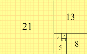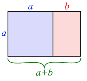
The golden ratio in design, which you also might know as the golden mean, occurs when a line is divided into two parts, such that the total length divided by the longer portion is equal to the longer part divided by the shorter part. Here’s a good visual representation if you’re having a hard time picturing it.
The Golden Ratio in Presentation Design
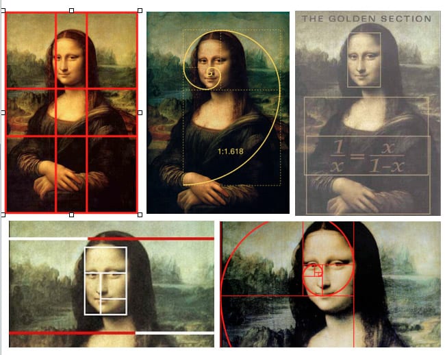
The golden ratio is notable because of the vast (and vastly different) number of contexts in which it occurs. Closely related to the Fibonacci Number, the golden ratio makes an appearance in the Egyptian pyramids, ancient Greek architecture, Da Vinci’s Mona Lisa, and countless other instances, as well as in the natural world.
The golden ratio has had a natural visual appeal and proportional allure for millennia. But art and architecture aren’t the only realms of human existence to make use of proportions. It turns out they can be just as impactful on a presentation screen!
1. The Relationship Between Headline and Body Text
Effectively implementing the golden ratio in design is always a matter of proportionality. Although we gave the technical definition above, there’s a much quicker way to establish a golden mean relationship between various parts of your presentation.
Let’s assume you’ve decided to incorporate the golden mean between your headline and body text in a presentation. Sounds complicated, but it’s actually quite simple.
The operative value of the golden ratio, represented as the Greek symbol “phi”, comes out to 1.61. So let’s say your headline text is a size 20 (for the people in the back, because you’re thoughtful). All you have to do is divide 20 by 1.61, to arrive at a body font size of 12.42, which you would presumably notch up to a tight 12.5. And voila, you have the 4,000 year old golden ratio at your service. All done!
If you’re trying to arrive at the lower value (using a known text size to find a golden ratio pairing, as we’ve just done), you divide by 1.61. When attempting to find the larger value, you’d multiply by 1.61. So if you were trying to find a larger headline size (from, say, a 13pt body font), you would multiply 13 by 1.61 for a golden headline font of 20.93, which you’d round up to 21.
Just remember: if you’re searching for a smaller value, divide by 1.61. If you need to find a larger value via the golden ratio, multiply by 1.61.
2. The Golden Ratio and the Rule of Thirds
Relative to photographs (which should comprise the brunt of your presentation), the rule of thirds applies to both relative photo sizes, and image placement within photographs. Simply put, imagine a three-part interlocking grid laid over your photo. The points at which the grid lines connect are known as “power points”—cutely relevant for our use case.
To attract your audience’s maximum visual interest, it’s best to position your main image directly over one of these power points (or grid intersections).
This is counterintuitive, certainly. Maximum visual interest would surely be generated by positioning your image square in the middle, no? Nope…like most things in life, you’ll be rewarded for digging a bit deeper here.
PresentationZen.com has the right idea:
“Abundance of vacant space allows for the clear existence of a focal point, and the participation of the viewer to complete what has been left incomplete or that which is only suggested.”
You know what else that’s known as? Playing off your audience’s ingrained visual tendencies so skillfully that they have no idea you’re even doing it.
3. The Golden Rectangle for Presentation Images
Another way to make an image or multiple images on a slide work well together is by cropping using the Golden Rectangle.
This magic Golden Rectangle is exactly like it sounds: it has the proportions that mirror the Golden Ratio.
In terms of implementation, however, you’re not looking at anything too involved. Simply divide the length by the width (or vice versa) and aim to get 1.6.
If you have multiple images, you can place them side by side to fit within this eye pleasing ratio. Or if you have copy, you can make the a or b sections to the right be text with an happy little image on the side.
When applying these ideas to images, however, you’re going to need to analyze the image’s content, and your own objectives. Are you presenting on a new massage chair your company’s rolling out this year? For one of your intro slides, you might consider pairing a larger image of the chair itself, with a smaller golden ratio image of the remote control (but enhanced for visual clarity, despite its smaller size). This is just one of countless possibilities, but hopefully you get the picture.
Summing Up the Golden Ratio in Design
If you put in the effort to apply the golden ratio in design in original, impactful ways, odds are good that you’ll be richly rewarded for your efforts. (In audience attention and aesthetic value, if nothing else.)
And here’s a stellar online tool to help you apply the golden ratio to your next presentation.
Looking for more ways to enhance your presentation?
Check out our absolute necessities for marketing presentations or read up on effective presentation techniques.
