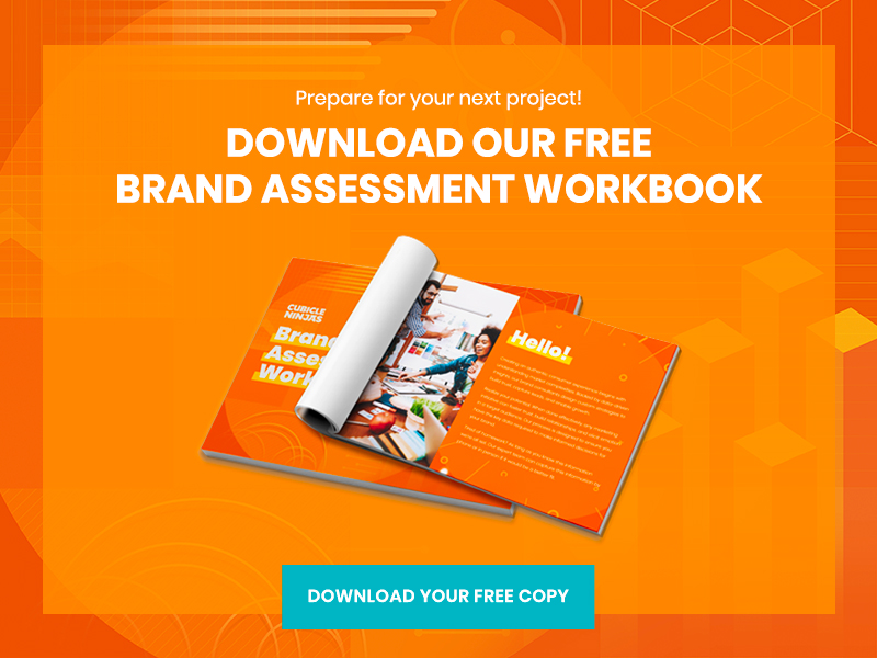

Ultimate Guide to Call to Action Buttons
The Call to Action (CTA) button is arguably the most important aspect of any website, and there are a lot of subtle things you can do to increase the conversion rate. Want to know more? Then read on for our Ultimate Guide to Call To Action Buttons!
First of all, if you aren’t using a CTA button, start doing so! After all, when you make a copy-based CTA look like a button, the conversion rate can increase by 45%. That’s because a button looks more clickable — and clicks lead to sales. Furthermore, 9 out of 10 visitors that read the headline will also take a look at the CTA copy, which means it’s one of the most important aspects of the page. Adding a CTA button can increase the revenue of your landing page, blog, or website by as much as 83% according to Brafton.
In this guide to call to action buttons, we will cover a number of aspects that can help increase your conversion rate. This includes placement, color, size, and special effects. Consider each of these characteristics to get a complete understanding of how to optimize CTA buttons.
Our Guide Explores:
- Where Should You Place A CTA Button?
- Which Words Are The Most Effective?
- Which CTA Button Colors Encourage Action?
- Does Button Size Matter?
- Should You Draw Attention With Special Effects?
- Should Exit CTA Buttons Be Handled Differently?

Where Should You Place A CTA Button?
While our guide to call to action buttons will focus on factors like typography, size, color, and copy – location is just as important! It will determine the user experience, which in turn affects the likelihood that the lead will click the button.
As a general rule of thumb, the CTA button should be located where it’s most likely to stand out. Other page elements like navigation, pictures, and strong colors should be avoided in close proximity to the button. Once the visitor lands on your page, they should notice the CTA button within the first few moments. This indicates that there is an offer on the page and directs the user to where they can click to take advantage of it.
Placing CTA buttons in alluring places can increase the clickthrough rate and aid impulse purchases!
It’s like how gum and chocolate get a boost in sales because they are strategically located next to the cashier at the supermarket.
Above the fold or below: one of the key location-based decisions you’ll need to make is if the CTA button should be above or below the fold. “Above the fold” refers to the area of the page that is instantly visible once the page loads up, and “below the fold” is the area that is visible once you scroll down.
Kissmetrics found that the decision should be based on how complicated your page is. A long and complicated page that requires more time to read will naturally cause the potential lead to scroll down. Therefore, if the CTA button is located towards the bottom of the page, they’ll be more likely to see it.
However, if you have a landing page page or eCommerce product page that’s short and sweet, locating the button above the fold is more beneficial. This ensures that the visitor will see the button alongside the most important information regarding the offer. Therefore, once they are persuaded to buy, the button will be in the right place to help them do so.
Left or right: the evidence shows that you should locate the CTA button on the right hand side, because that area receives an overwhelming amount of attention. The Gutenberg Diagram depicts the typical heat map of where the attention is focused on a page. Based on this diagram, it makes sense to give the details of the offer on the left hand side and place the CTA button alongside it on the right.
Across the internet, you’ll notice that the majority of product pages have the “Buy” button on the right hand side, which means buyers are trained to scan that area of a page. You should take advantage of this and implement this format for your product pages to create a positive user experience for your customers.

Which Words Are The Most Effective for CTAs?
In our Ultimate Guide to Call to Action Phases our ninjas highlighted the four categories of words that equal effective CTAs, listing over 100 call to action phrases. Whew!
In summary, limit the CTA button to only a few words, which means that each word must be strategically chosen. You must create an emotion that you feel will help entice the user to click. Some of the top options that you can go with include increasing urgency, imply exclusivity, raising interest, and persuasion. Options like: free, money-back, no risk, best-selling, certified, and official are to make the risk worth the reward.
The use of these words makes the audience feel safe, which is a key consideration when buying online. Other power words such as “instant” and “limited time only” create a sense of urgency. People are more likely to click if they are under the illusion that the offer might not exist the next time they visit the page.

Which CTA Button Colors Encourage Action?
The right combination of colors will help increase the conversion rate. The psychology of colors tells us that different colors bring out different emotions, which means you can match the color with the emotions you’re trying to create.
Before deciding on the color of the CTA button the background color scheme should be chosen, and ideally it should not stand out so that the button has a better chance of doing so. Sticking with white as a background color may seem bland to some, but it’s a safe bet that your CTA button will stand out.
Choosing red for the CTA button is controversial because it’s typically associated with danger, but a study found that it also indicates dominance. Red outperformed green by 21% when with a sample size of 2,000 visits.
If you have been paying attention, you may have noticed that orange is frequently used for the font of a CTA button. That’s because it combines well when white is used for the words within the button and it stands out on a white background. You could say that it stands out just like red, but without the strong “danger” connotation.
Orange CTAs have the potential to increase the conversion rate by up to 32.5%.
Finally, consider leaving a significant amount of whitespace around your CTA button. Whitespace helps a page element stand out, which reduces the need to compensate with size, supporting graphics, and over-attractive color schemes. Whitespace reduces the amount of clutter on a page, which means your offer will get noticed significantly easier. It’s a way of doing more by adding less.

Does Button Size Matter?
It’s easy to understand that the bigger the object on the page, the more it will stand out. However, if it’s too large, it may not look like a button anymore. Ideally, the button should be in proportion to the other page elements. Therefore, there is no perfect size, but instead it is a matter of using your best judgement.
Keep in mind that the size is not the only characteristic of the button that makes it stand out. The color, space around it, and placement will also play a role. In the end, you should test using A/B split testing to see which size leads to the best conversion rate.
When considering the size, it’s not just how visible the button is overall on the page, but how easily the text within the button can be read. Ideally the font size should be bigger than text on the rest of the page so that it stands out.
When in doubt, err on the side of caution and make the button slightly bigger. It’s forgivable to have a button that’s a little too big, but if it’s too small then it may fail to get noticed and the conversion rate will plummet.

Should You Draw Attention With Special Effects?
There is a temptation to have every CTA be uniquely emphasized. It turns out that lower emphasis can actually have higher click through rates. As your guide to call to action buttons, graphics are a quirky way to increase the clickthrough rate by directing the attention to the button, but beware…
AWeber found some text links outperformed buttons 53%1
The key is keeping your CTA contextually appropriate. Want to encourage action? A button makes sense. Want to lead to additional information or resources? Text CTAs are your friend.
While you could add something simple like an arrow or a cartoon character that’s pointing in the direction of the CTA button, does that help build credibility for your product or service? Take care not to go too crazy with your special emphasis. The graphics should create positive emotions, which can be done by using something as simple as a happy face. 😋
Remember, the special effects should not replace copywriting, as that is your strongest asset to convert the lead. The graphics can be there to supplement the content and bring it to life. You could have a graphic that activates or animates visible once the user hovers over the CTA button. This is advantageous because it indicates that the page element is clickable, which naturally increases the clickthrough rate.

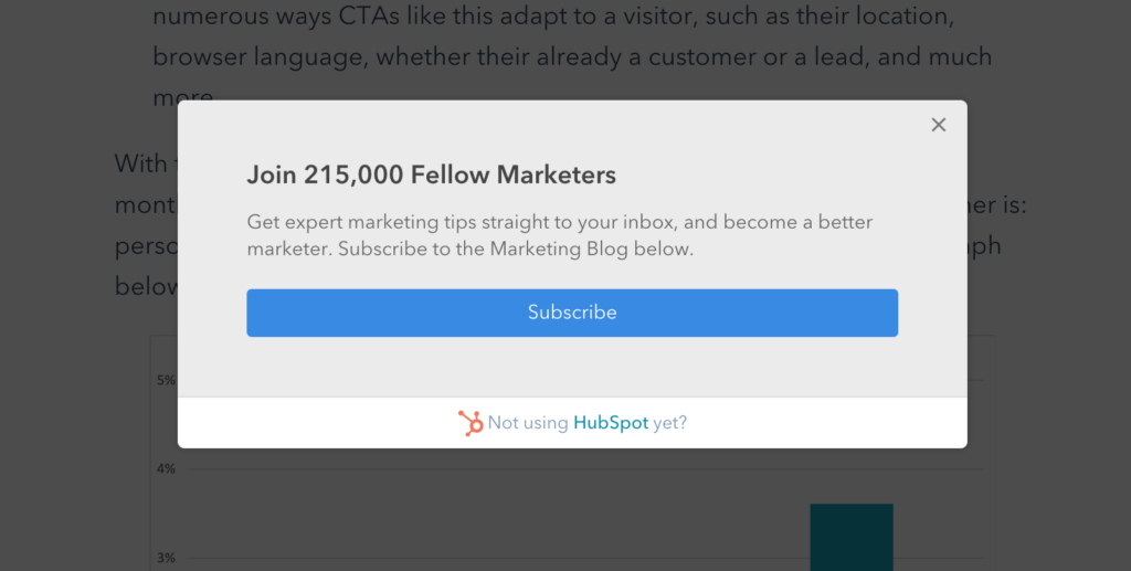
Should Exit CTA Buttons Be Handled Differently?
It’s estimated that once a visitor leaves your website, then there is a 70-90% chance that they will never return. Therefore, you need to have a last ditch attempt at capturing the lead, and an exit pop up is a controversial but effective way of getting it done.
Once the visitor clicks the back or “x” button on the browser, the exit popup will appear in window, which is typically a graphic combined with copywriting and a CTA button. At this point, it is best to capture the email address of the lead as opposed to going for the sale – after all, you failed to capture the interest of the lead using the landing page, so perhaps an email funnel will do a better job.
You may also choose to encourage an action if a user hesitates on a page for too long. By testing different in-browser offerings you can see which goodies are strong enough to entice them to learn more. This may involve giving away something you feel is valuable, as a visitor that engages with your work can start to see its true worth. Or it could be subscribing to your newsletter for ongoing insights. The key to either approach is that it allows the visitor to softly commit to saying “Yes” to your work.
The CTA button should be strategically chosen to create a sense of urgency and scarcity, especially with exit CTA buttons. Wording such as “limited time only” and “exclusive” should be used to increase the click-through rate. Finally, ensure that the benefits are clearly explained.

Are There Unique CTA Button Recommendations For Mobile?
Greater than 60% of all web traffic is now done on a mobile device. Treating these users the same as desktop is a formula for failure.
You need to consider the implementation of CTA buttons on the mobile platform due to the increasing number of users on smartphones. First of all, reduce the amount of copywriting on CTA buttons so that the user doesn’t have to squint to read small text. Large CTA buttons are typically not appropriate for the relatively small screen sizes of mobile devices.
Furthermore, you need to consider the thumb zone and place the button there. This allows the interaction with the button to be user friendly. The CTA button should be as big as possible, but stay within the screen size of the mobile device.
If possible, replace the mobile CTA with a click to call or chat option. According to Neil Patel and Kissmetrics, mobile phone conversion are 4x higher than on desktop. This means that targeting CTAs based on devices is worth the extra effort.
Wrapping Up
As you’ve seen in this Ultimate Guide to Call to Action Buttons, there are a lot of considerations that need to be made when integrating the CTA button into the page. It may seem overwhelming at first, but with practice it will become second nature to choose the right button on any given page.
The CTA button is the gateway from the landing page or website to the shopping cart. The good news is that you don’t have to get it right on your first try, because you can always make adjustments using data collected from testing. It will be an ongoing process of figuring out what works and what doesn’t. Launch is just the beginning!
Need A Partner to Put These Principles Into Practice?
Take a peek at some of our exciting Custom Web & App Development work or get lost in our ninja insights, like the 15 Things You Need to Know Before Designing A Website. Whether you’re looking to pinch-hit on a specific pain or solve the biggest obstacles ahead with a new partner, the Cubicle Ninjas team would love to hit the ground running to achieve your goals!