New trends in web development often yield both excitement and disappointment. They provide developers with new ideas and tools to experiment with, but often have very little browser support, which can render them virtually useless for cross-browser compatible websites. Fortunately, one such current trend avoids this fate: icon / symbol fonts.
In the past, icons and symbols on the web were often images. These small graphics were very cross-browser compatible, but needed to be designed, cropped, optimized, and loaded by the user. If a website changed branding this meant recreating these tiny images.
Icon / symbol fonts are a modern method of using iconography that is both more flexible and just as compatible as the traditional approach. Since fonts are inherently composed of a set of symbols (both letters and punctuation), they are essentially super sprites. They include all the benefits of CSS font properties, without sacrificing cross-browser compatibility. To see some of these benefits in action, check out this page on CSS Tricks.
Benefits of Icon Fonts
In addition to cross-browser compatibility and CSS font properties, the benefits of icon fonts include the following:
Performance. A single font file is typically very lightweight in size and means only one HTTP request on the server.
Aesthetics. Font symbols are vectors, and therefore appear smooth even on retina / high pixel-density displays.
Scalability. The size of font icons / symbols can be changed instantly with no Photoshop needed.
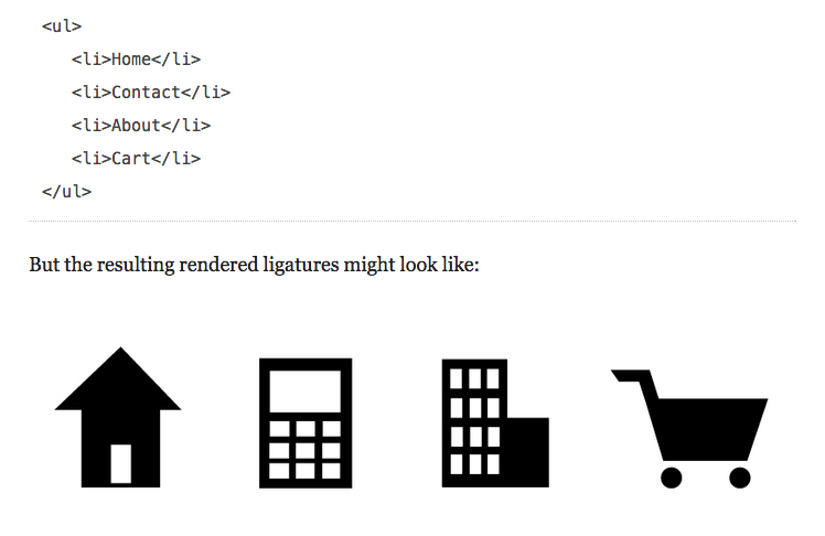
Accessibility. The ability to create ligatures within fonts allows symbols to be represented by text phrases. These phrases will make a lot more sense to those with impaired vision, as well as search engine spiders. Take a look at a great example from A List Apart.
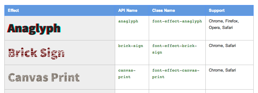
Effects. Any CSS effect that can be applied to fonts, such as text-shadows, can be applied to font icons. There are also new font effects on the horizon (Google font effects in beta).
Workflow Efficiency. Avoiding the process of generating sprites and manually positioning different sized images can save time and hassle.
Pitfalls of Icon Fonts
The pitfalls of icon fonts seem to be few and far between, but there are a couple worth mentioning:
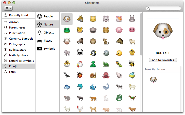
Single Color. Typically, fonts have the limitation of being a single color, though it is possible to work around that with font properties such as gradients. Companies like Apple Inc. have also been working to create and standardize multicolor fonts starting with Apple Color Emoji.
Single Design. Many symbols are designed with alternate versions at different sizes – for example, a 16px favicon will look different than a 200px logo in the header of the page. This can pose an issue for font symbols, since each symbol will have the same design regardless of size. Though there may be workarounds such as creating an additional font symbol set, using an image or image sprite may be a better option for alternate designs.
A great resource to find a slew of varying ready-made icon fonts is The Big List of Flat Icons & Icon Fonts, thanks to Chris Coyier. I recommend trying out Font Awesome, a large set of handy icons designed for Bootstrap. If you’re feeling a bit more audacious, you can look into creating your own font with Font Custom.
Examples of Font Awesome:
What’s your experience with icon fonts? Be sure to leave us a comment below.
Drop us a line and let us make your website dream a reality.
