
Impossibly Ugly Mobile App Designs
If you go onto your mobile app store, you’ll see an amazing array of beautiful, well-thought-out apps that are enjoyable and pleasant to use. You’ll also see…these apps. With bad colors, terrible interfaces, and confusing layouts, these are the 13 most impossibly ugly mobile app designs we’ve seen.
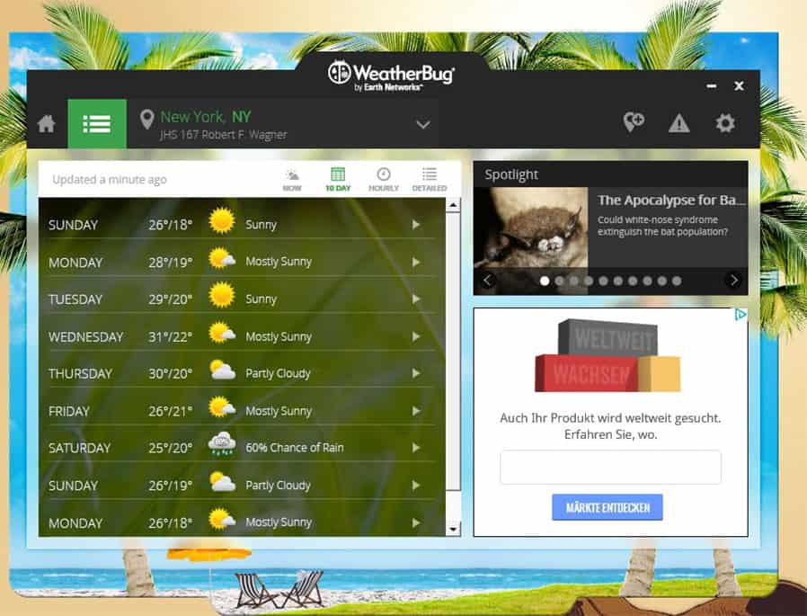
1. Weatherbug
At first glance there’s not too much wrong with the Weatherbug app design, but look closer. The main screen is way too busy, and with ads clustered on the side it creates a very negative user experience. People prefer something that is clean and sleek, especially in a single-purpose weather app like this one.
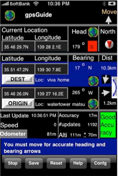
2. GPS Guide
This one is pretty self-explanatory, but let’s go through the top design flaws of this ugly app. The color scheme doesn’t work at all, and there is so much information that it’s impossible to make sense of what you are looking at. It’s information overload!
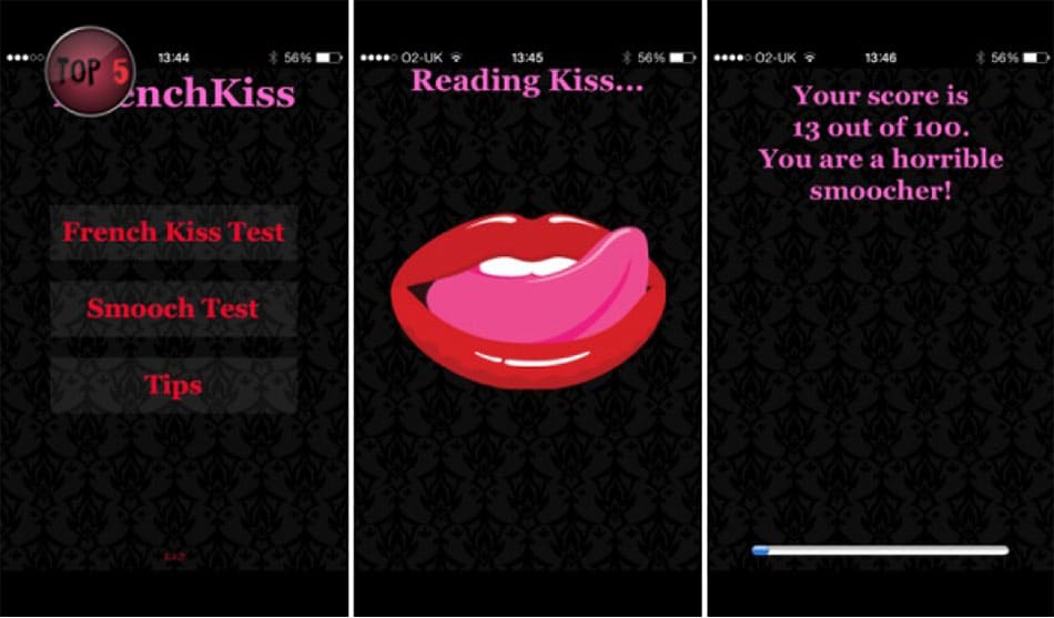
3. iFrenchkiss
Setting aside the hygiene issues of an app that rates your kissing by having you smooch your phone’s screen, iFrenchkiss also suffers from an ugly design that has poor color choice and even worse user interface.
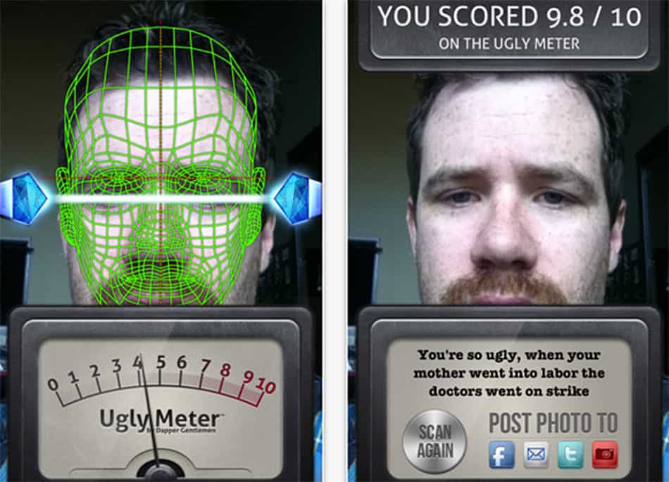
4. The Ugly Meter
Well at least this one is properly named. That said, the outdated design elements and completely incomprehensible user experience make this one of the most impossibly ugly mobile app designs.
5. Paint Calculator
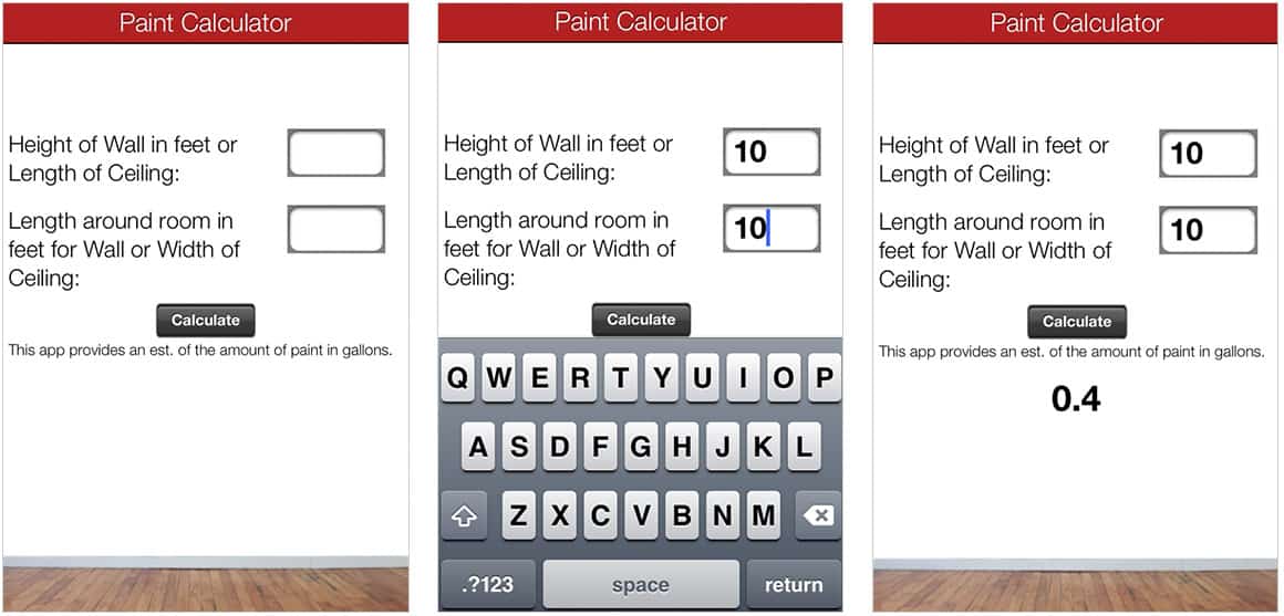
The designers of this Paint Calculator app have succeeded in the impossible: making an app that’s actually more boring than watching paint dry! Good luck trying to use this antiquated user interface during your next home project.
6. Scott Trade
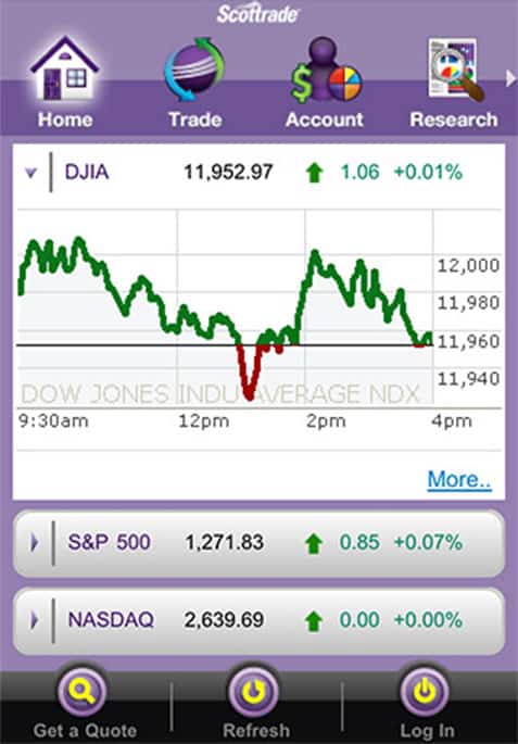
A common feature of impossibly ugly mobile app designs is a putrid color scheme, and this one is no exception. Even if you get past that, there’s still the layout with all of the information crushed up together on a single screen.
Curious where we go to find beautiful design inspiration? Check out our article on design inspiration sites.
7. Flooring Calculator
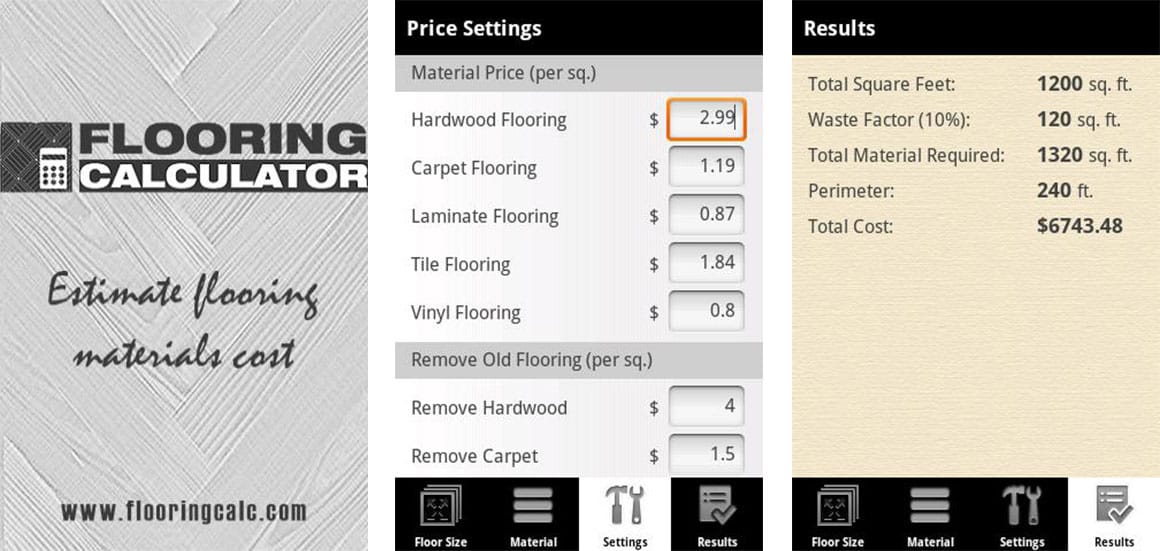
Simplicity can be beautiful, especially in an app that only has one specific job. But that also means there’s nowhere to hide your bad design! This app turns what should be a simple task (calculating how much flooring you need) into a nightmarish burden because of it’s bad layout and unappealing design.
8. A Drop Down Issue
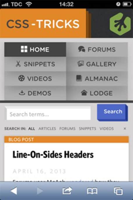
This is more of a general complaint that we’ve seen in several impossibly ugly mobile app designs. If you have a non-responsive drop down menu, it can quickly eat up your entire screen and make your app impossible to use. There are lots of ways to tuck away menus in the mobile environment, so make sure you’re using them!
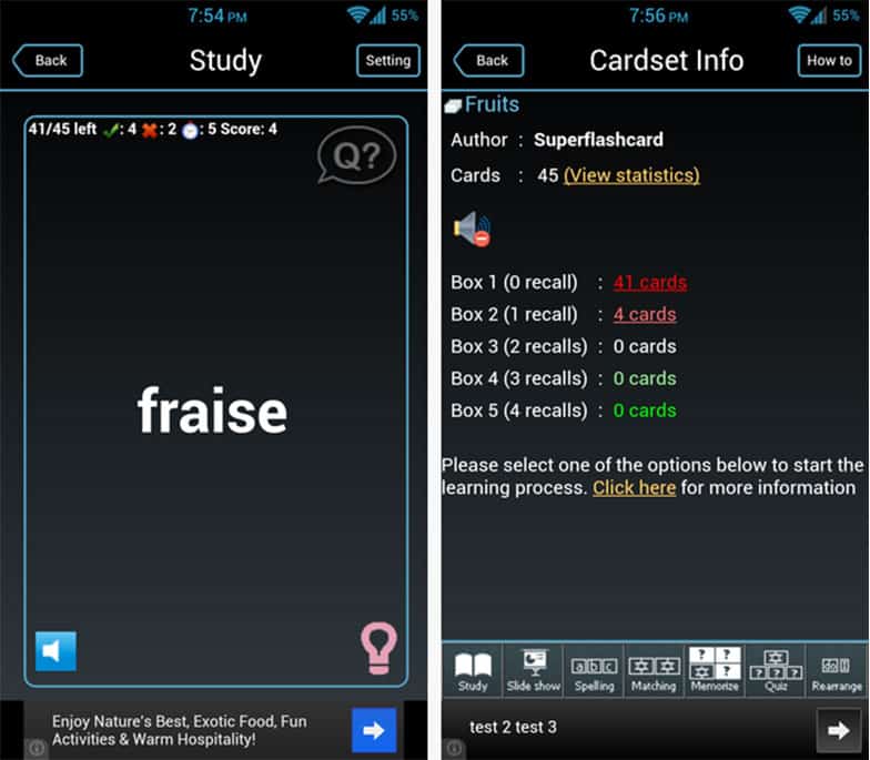
9. A Language App
This language app may help you learn French, but learning to navigate this interface is probably going to be an even bigger challenge! Combining tiny, unreadable icons with a garish interface, this truly is an example of conceptions d’applications mobiles incroyablement moche (impossibly ugly mobile app designs).
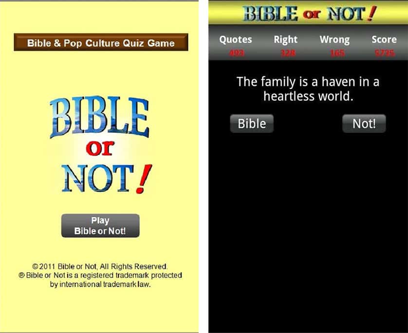
10. Bible or Not
This app offers you a chance to take a Bible quiz, but its clear that its creator didn’t spent any time on its design. Yes, having an app that is educational is great, but you have to at least try to make it look interesting!
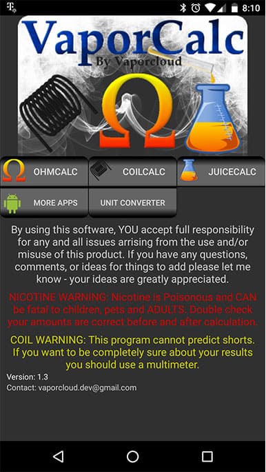
11. Vapor Calc
How much confidence do you have in this Vapor Calculator based on its design? Probably not much. Yes, it contains useful information, but everything looks thrown together and sloppy — not the look you want if you want your users to trust your content.
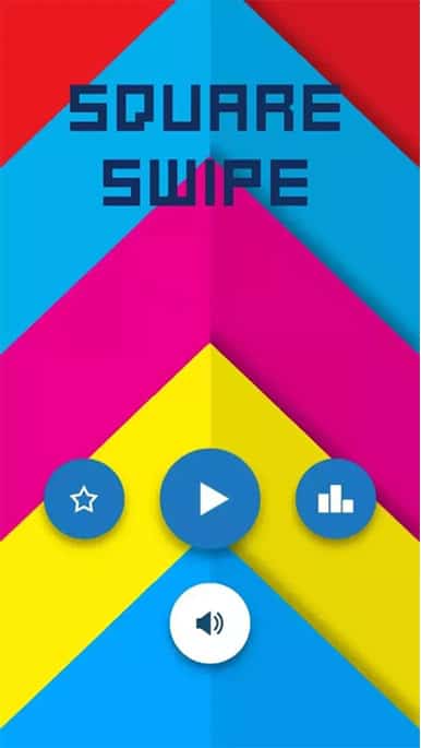
12. Square Swipe
Having vivid color can be nice for a game, but you have to make sure that your app is readable and doesn’t give people a headache from looking at it. This app fails both of those tests.
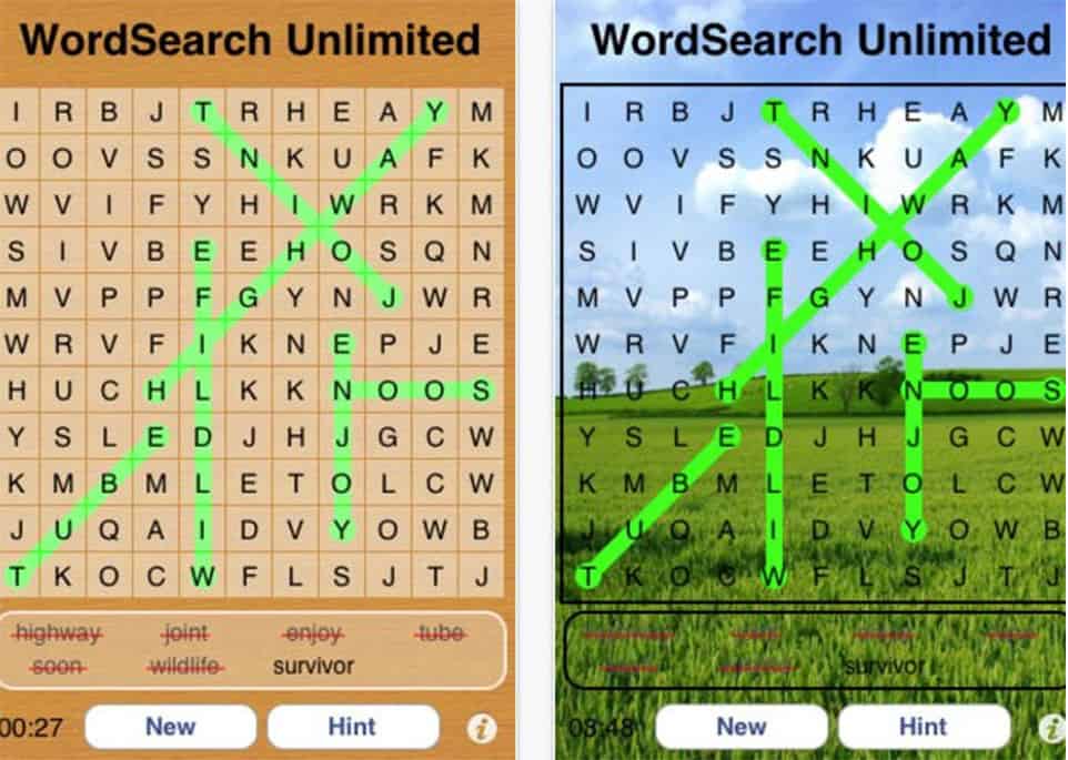
13. Wordsearch Unlimited
Good luck doing a word search when the letters are completely unreadable because the designer forgot to fade out the background image! Again, if your app is only going to do one thing, make sure it does it well.
Did those impossibly ugly mobile app designs increase your love for good design?
Whether you love using apps or manage the creation of your own, design is the window through which every app is experienced. Powerful functionality alone won’t mean anything without the visual style and user experience focus to ensure users can enjoy it.
Looking for more articles on app design? Boost your creativity with these inspiring creativity quotes or explore the latest trends and topics in app design in our 2018 NINJAWARDS.





This is so funny, thank you for this list!
We’ve explained some common fitness app design mistakes here: https://madappgang.com/blog/the-best-fitness-app-design-examples-and-typical-mistakes
Great article.
Talking about bad design though, the way the examples are displayed in this page can also be a bit confusing. It took me a few seconds to realize that the example title and description were actually about the image above it. Look how each image are much closer to the description of the previous example than to its own title. That can be confusing
You have no idea how great this is!