

Rad, Bad, And The Next Fad – Web Design Trends 2014
Like most things, trends in web design come and go. If you’re looking for a big change in 2014, you’ll be excited to see some new web design trends emerging. Whether it’s a site redesign or you’re starting fresh, we hope this guide helps in your travels to the land of beautiful, effective web design.
What’s rad, bad, and the next fad? Web Design Trends 2014.
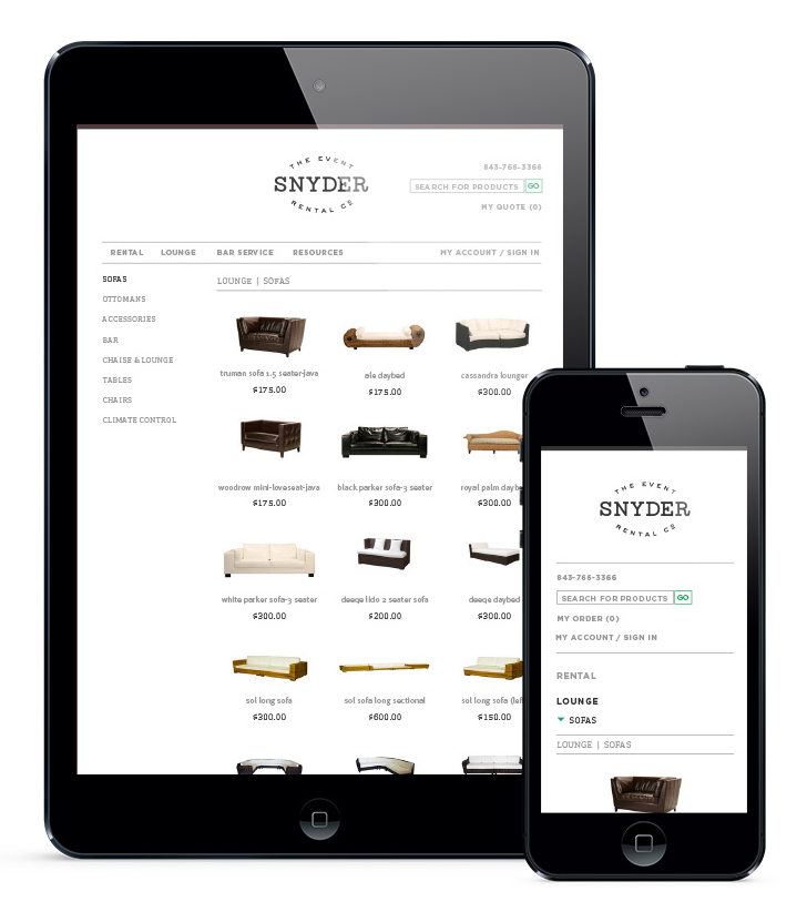
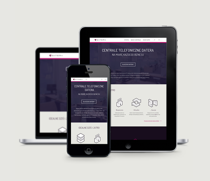
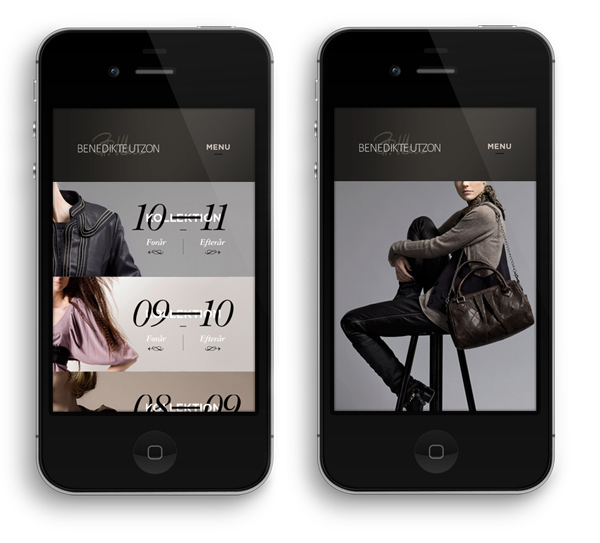
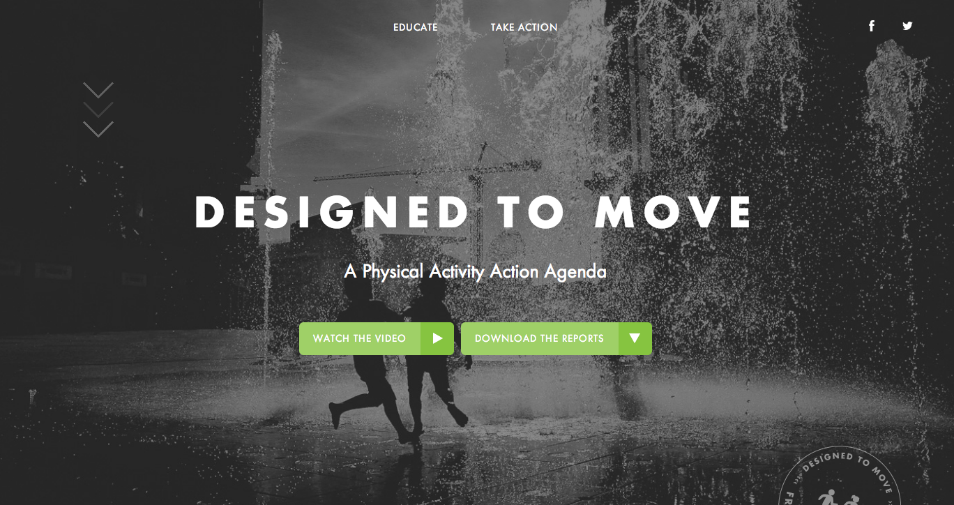
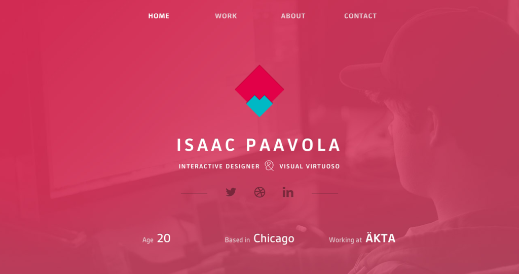
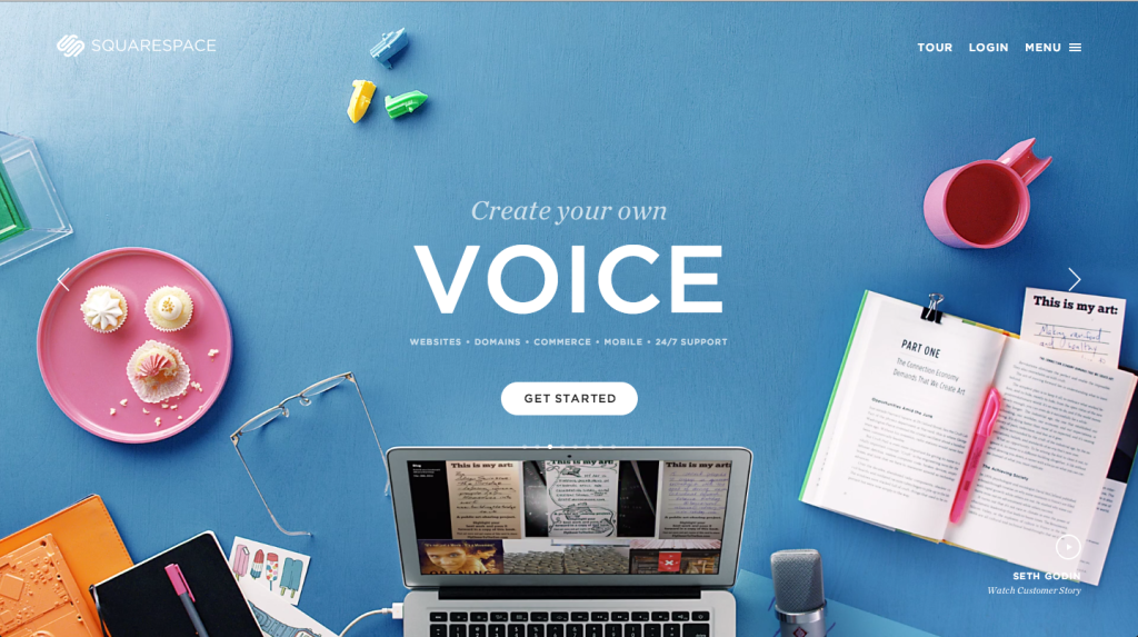
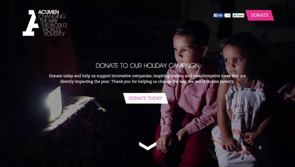
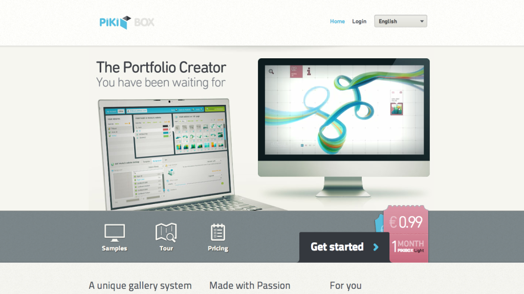
Responsive
Responsive design is not just a trend, it is a website necessity. It’s odd to think there was a focus on building apps for iPhones before we really considered how important it is to design sites that look beautiful on mobile. Data shows around 50% of web visitors are on mobile devices and tablets, so “we don’t need mobile” isn’t really accurate. Now that there’s so many sites that look remarkable on mobile, it wasn’t hard to find ones that everyone can admire.
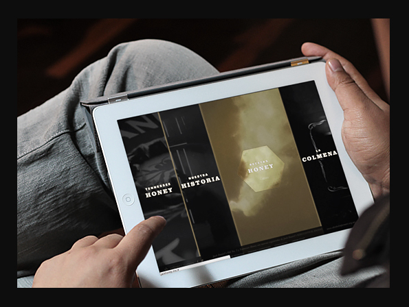
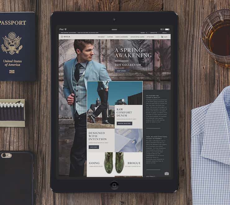
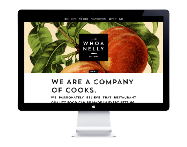
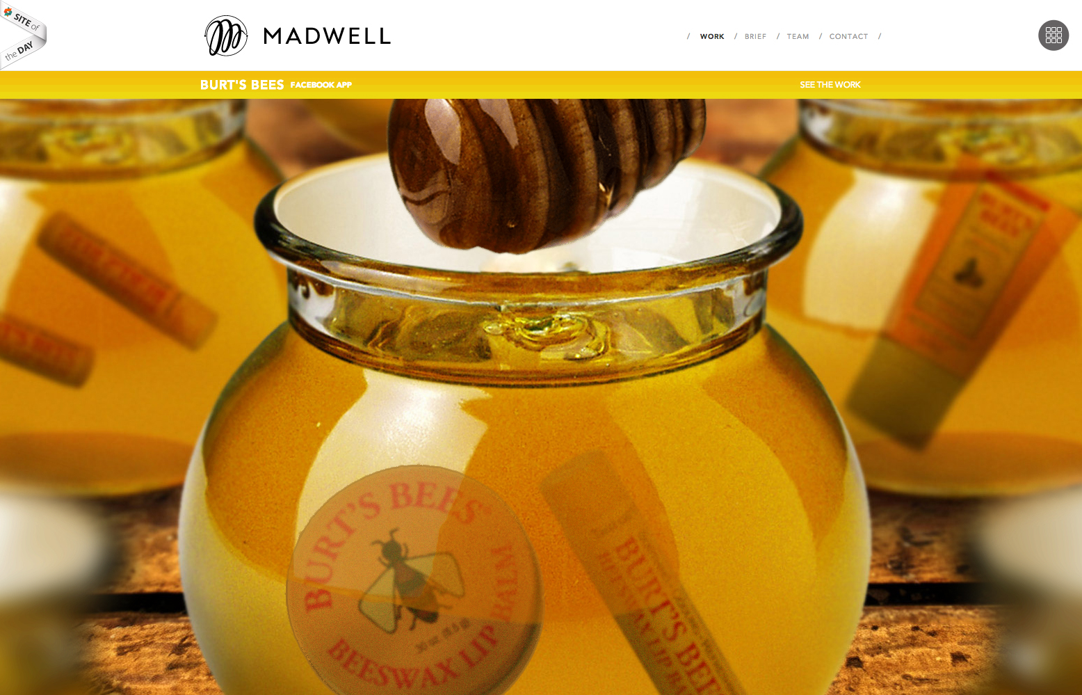
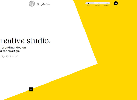
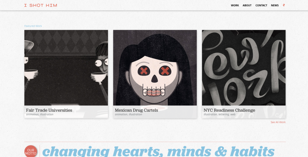
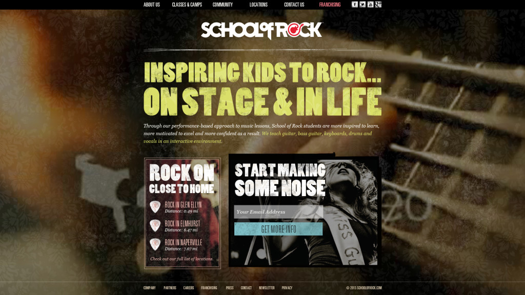
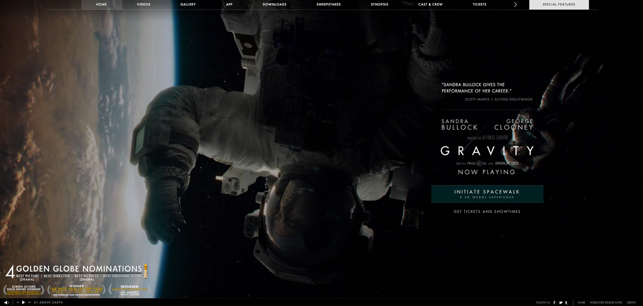
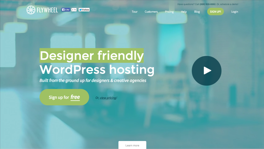
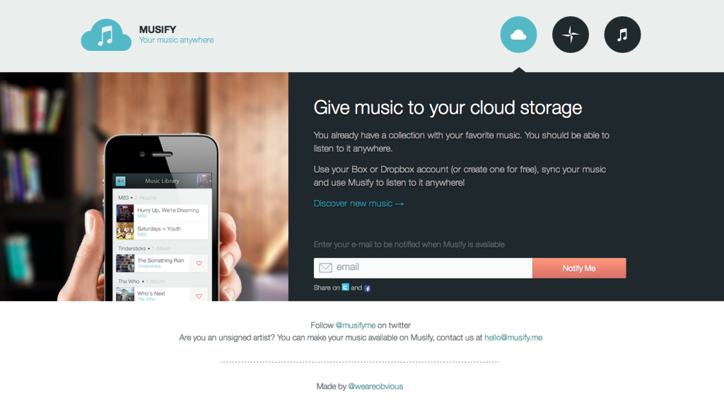
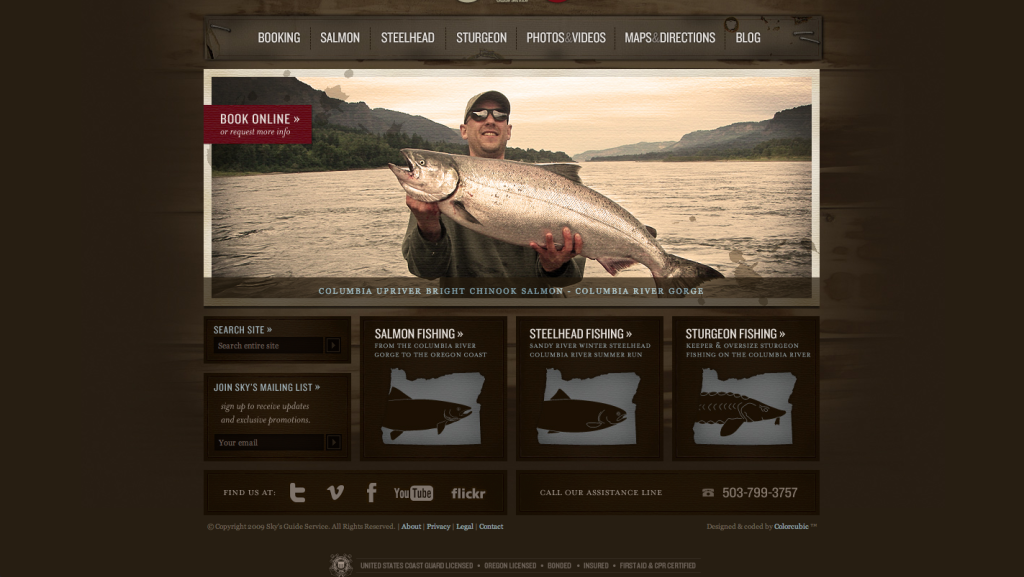
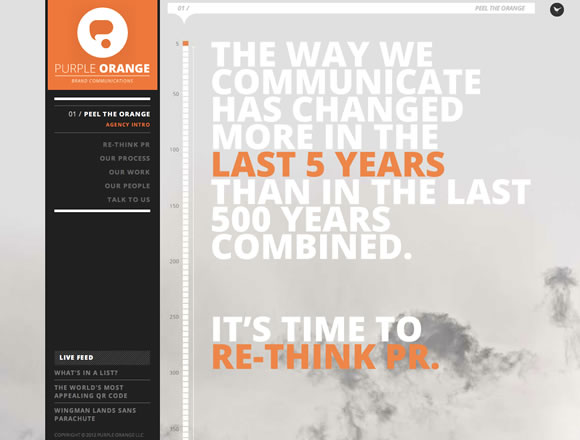
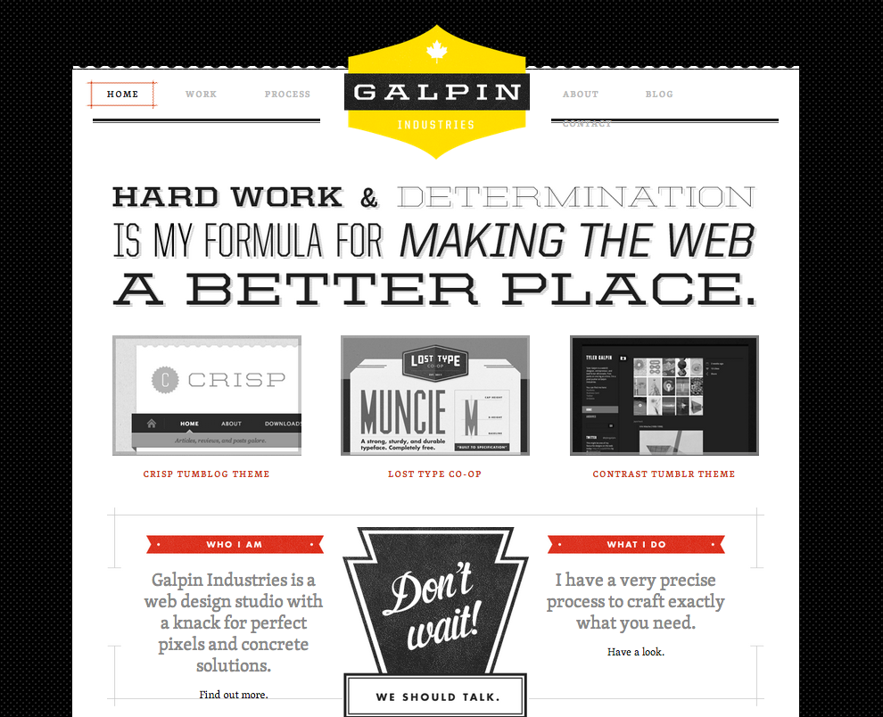
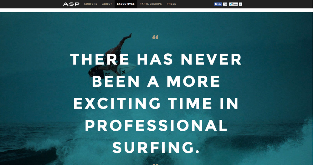
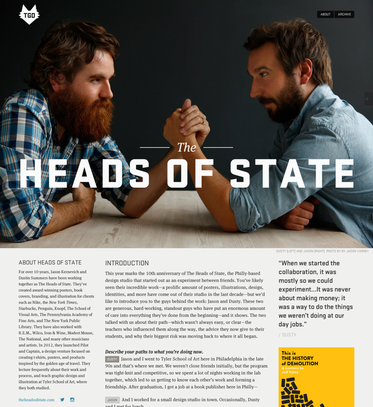
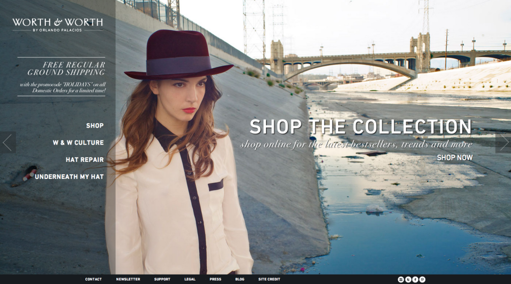
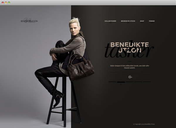
Large Images
When large images or illustrations take the lead in the overall layout, it helps keep the design clean. With a large image as the viewpoint, the need for embellishment and fluff disappears. Simple, direct, and powerful.
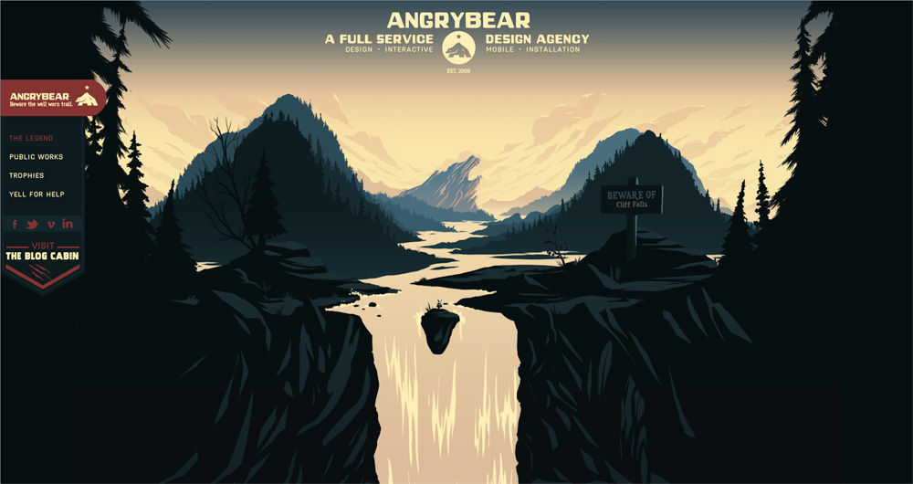
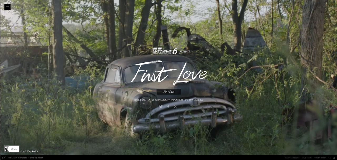
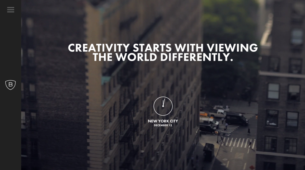
Parallax
Parallax scrolling sites showcase one of the hottest new trends in web design. Sites that use a parallax effect creates a 3D experience while scrolling down the page. With new technologies like HTML5, it’s possible to have a little bit more fun with browser effects.
But be careful! Sometimes parallax can be overwhelming. Below are inspiring, creative examples that don’t go too overboard in their effective use of this effect.
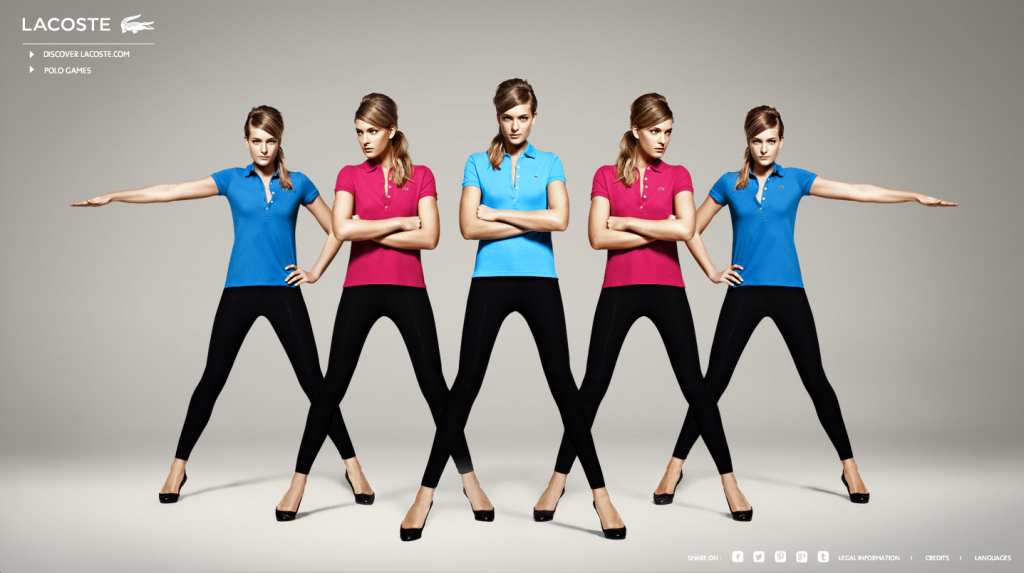
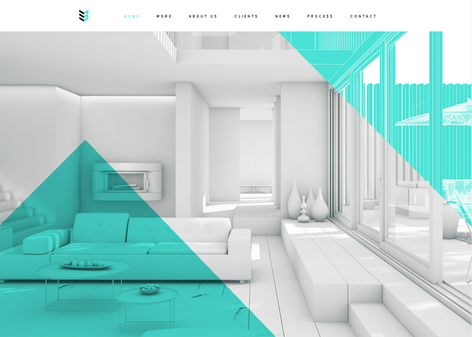
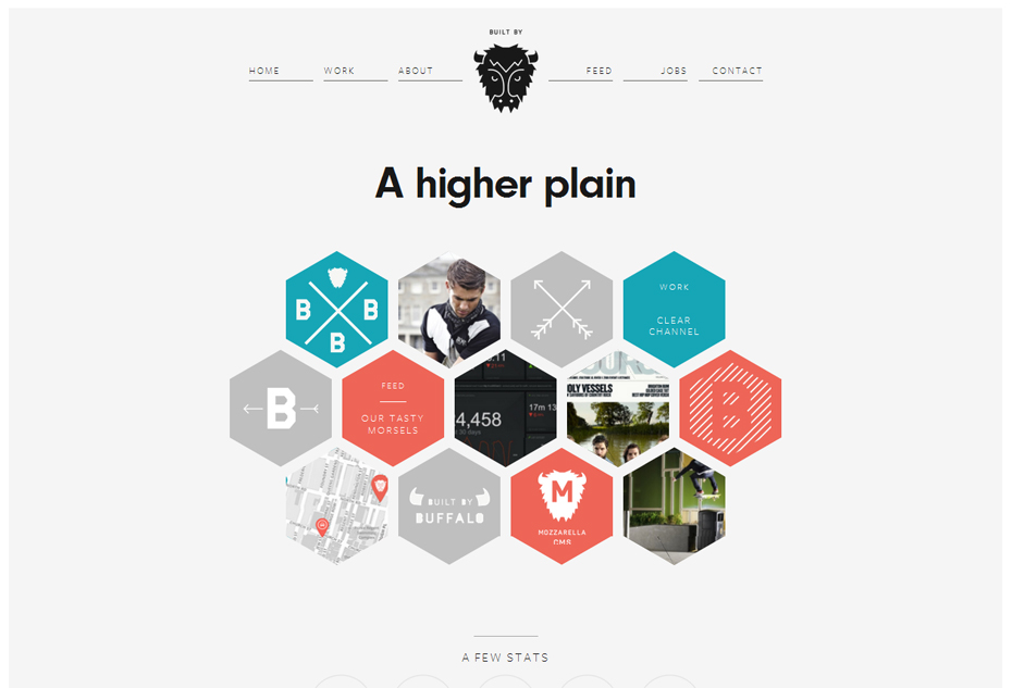
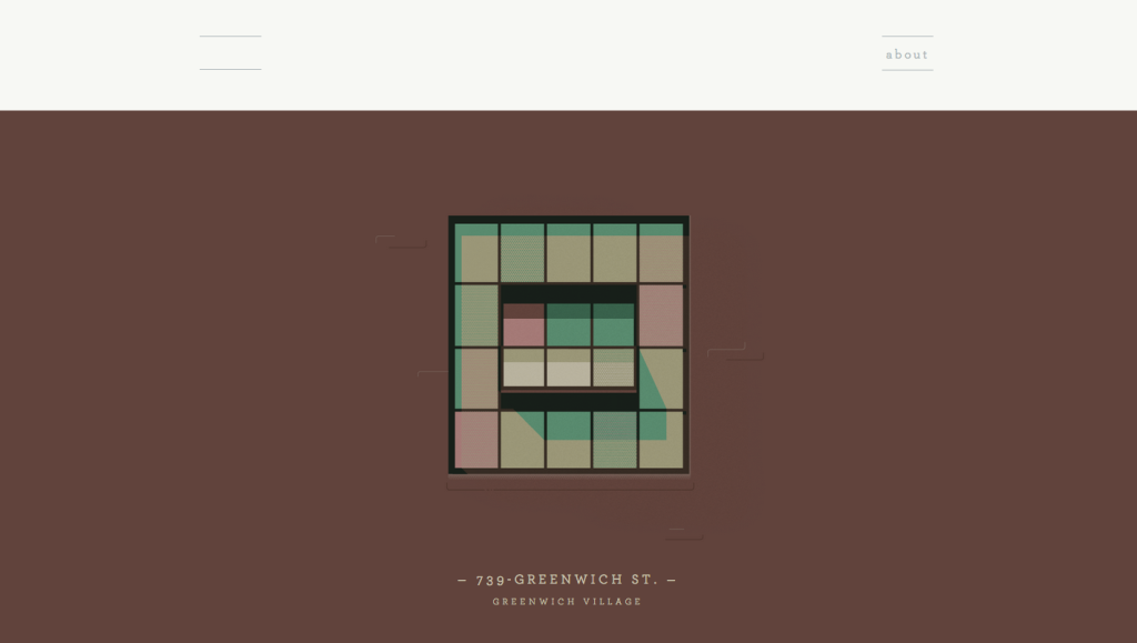
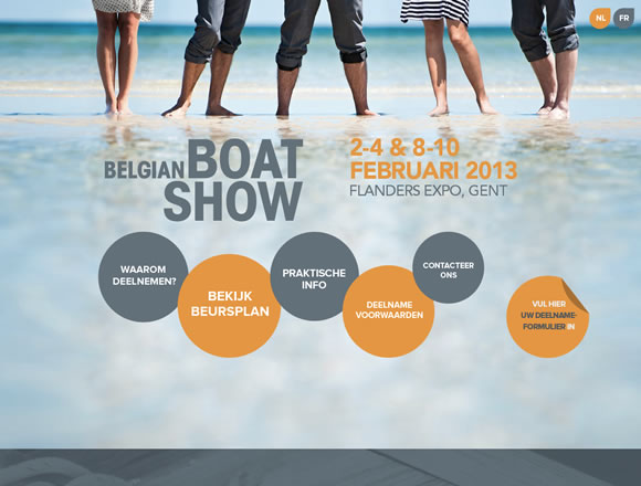
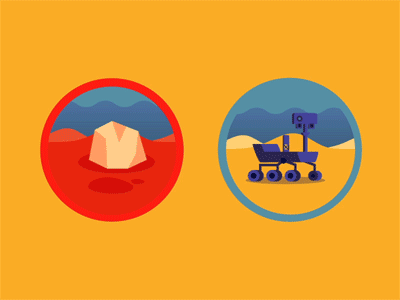
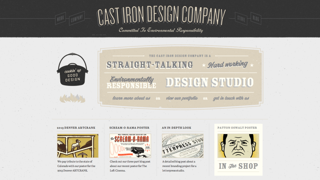
Geometric Design Elements
Using geometric elements provides a chance for a site to have fun with color and shapes, without taking away the simplicity of the overall design.
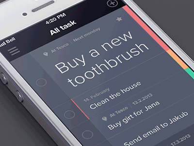
Flat UI
Flat UI is not just a trendy design concept, it is an ultra minimalist approach to content. Flat design elements can highlight specific calls-to-actions, allows easy navigation, and is free of noise.

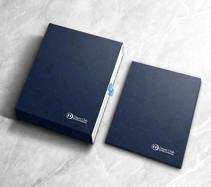
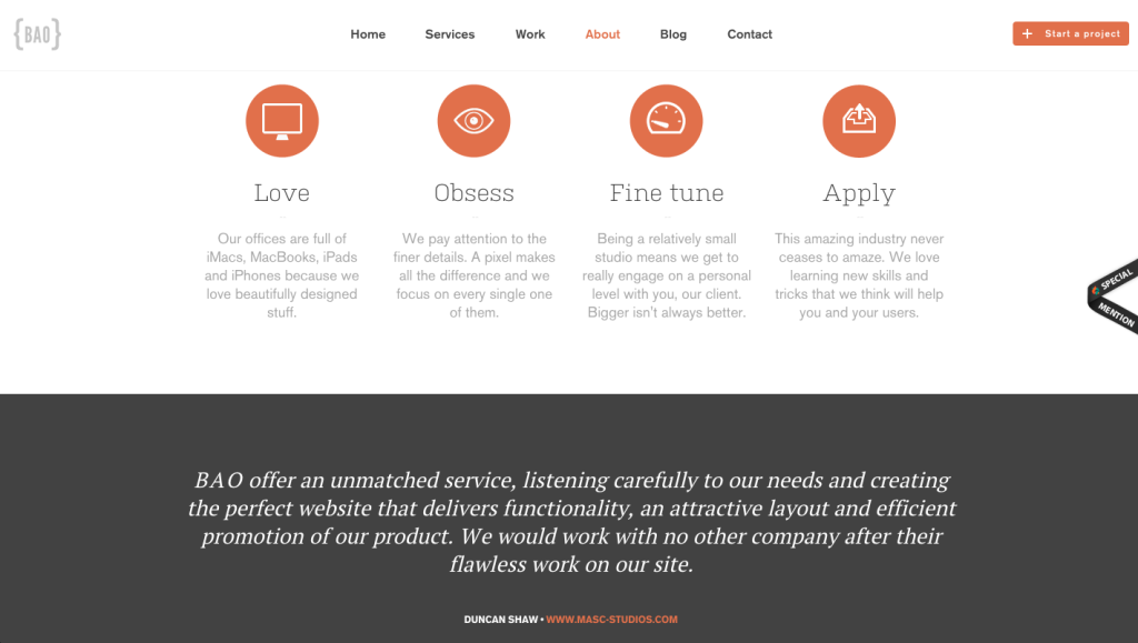
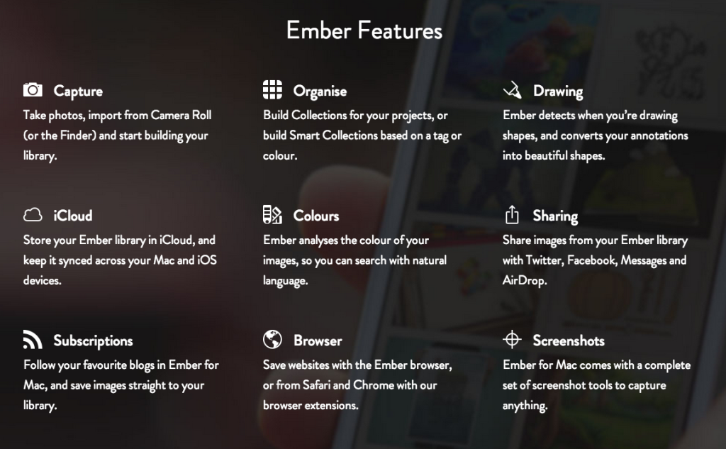
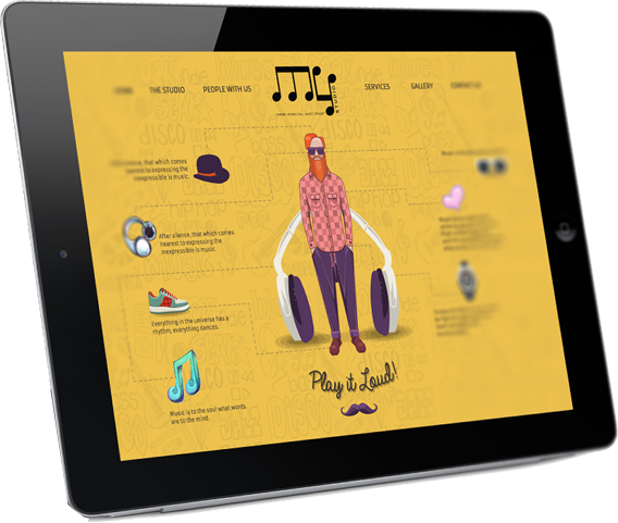
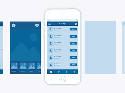
Iconography
Icons help strengthen communication on your site by adding images that have meaning. If used along great content, it helps visitors digest information more efficiently.
![]()
![]()
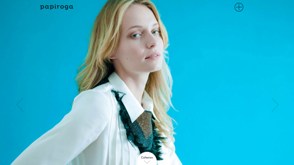
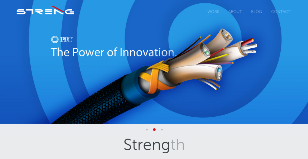
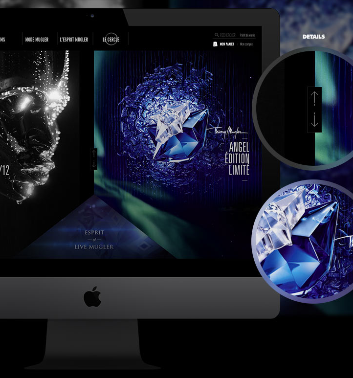
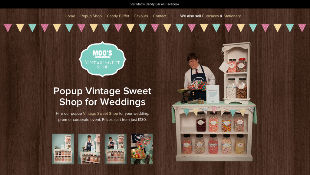
Color
Color is always important in design, but choosing the right color for a site today is more difficult. When there are hundreds of thousands of competitors sometimes a simple shade of the rainbow can make you memorable. So if you find that perfect color that makes your site shine, then don’t be afraid to let it lead the design.
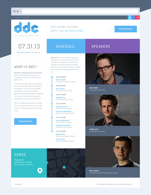
Fixed Navigation
Fixed navigation gives the visitor a chance to explore the site without losing track of the most important pages such as services, about us, or the contact page. As vistors scroll down to look at more information, the header bar follows, allowing them to click on links in the header at any given point of time.
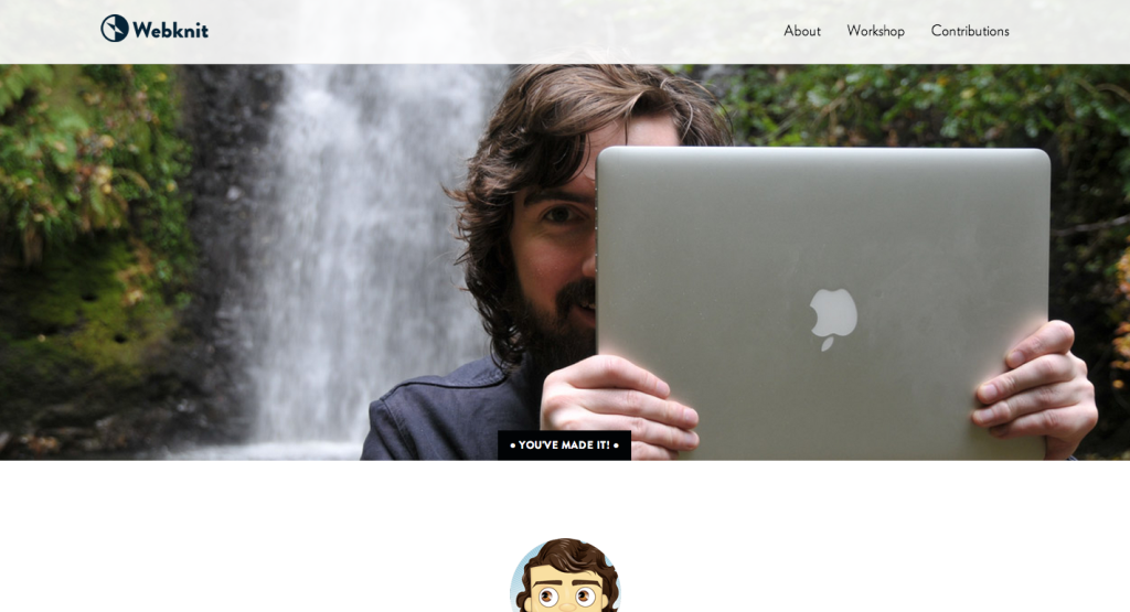
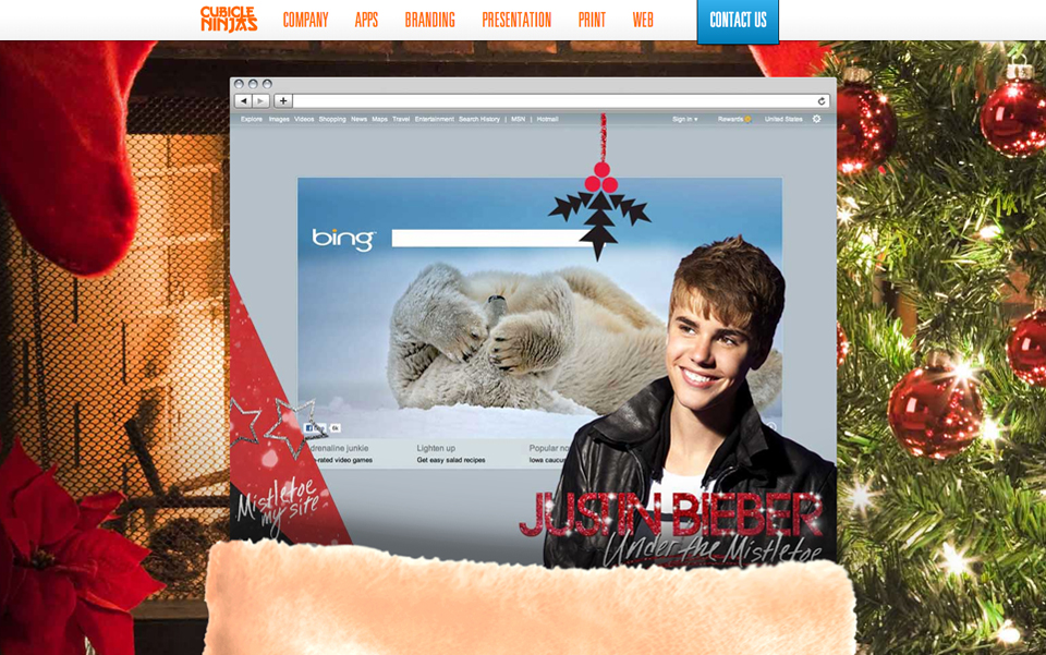
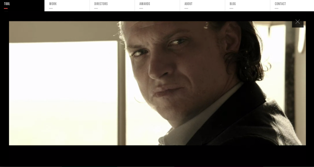
Video Backgrounds
Video background provides a stagnant site with some movement. It can really make a site stand out from the rest. Not to mention it can look striking, and engage visitors to want to stay on the site even longer.
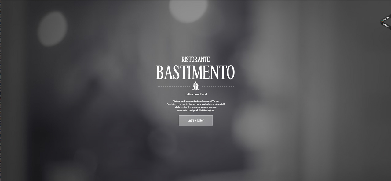
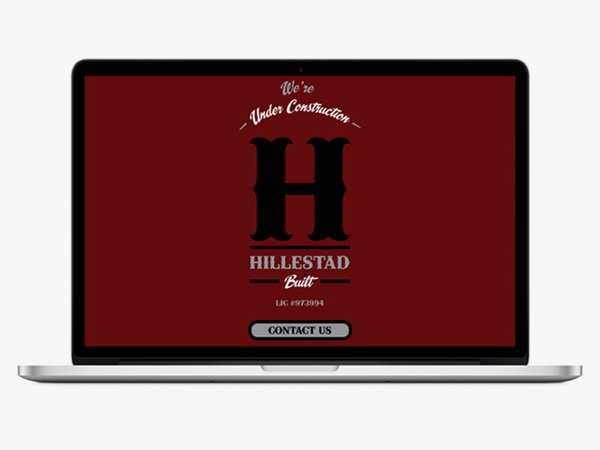
Splash Pages
A splash page surely has great potential. But the problem is, with the lack of text and information found on a splash page, Google has a hard time finding them. So when it comes to SEO real estate, you won’t see a splash page ranking high.
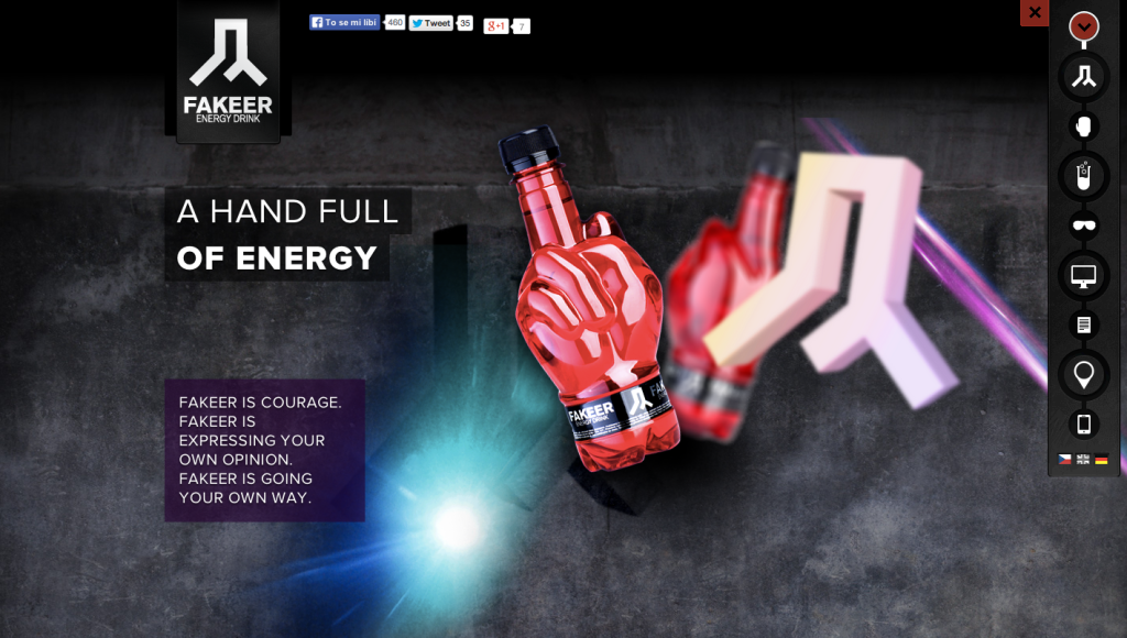
Iconography as Navigation
Sure it can look really sharp to use icons as navigation, but when thinking of the end user, it may not be the best idea. Navigation should be transparent and descriptive, especially since it’s part of your SEO. Icons are great alongside content, but the navigation should be clear and easy to understand.
Too Many Social Icons
Too many social icons can damage the homepage’s beautiful facade. You’re better of sticking to 3 social icons on your homepage, even if you have a bigger online presence.
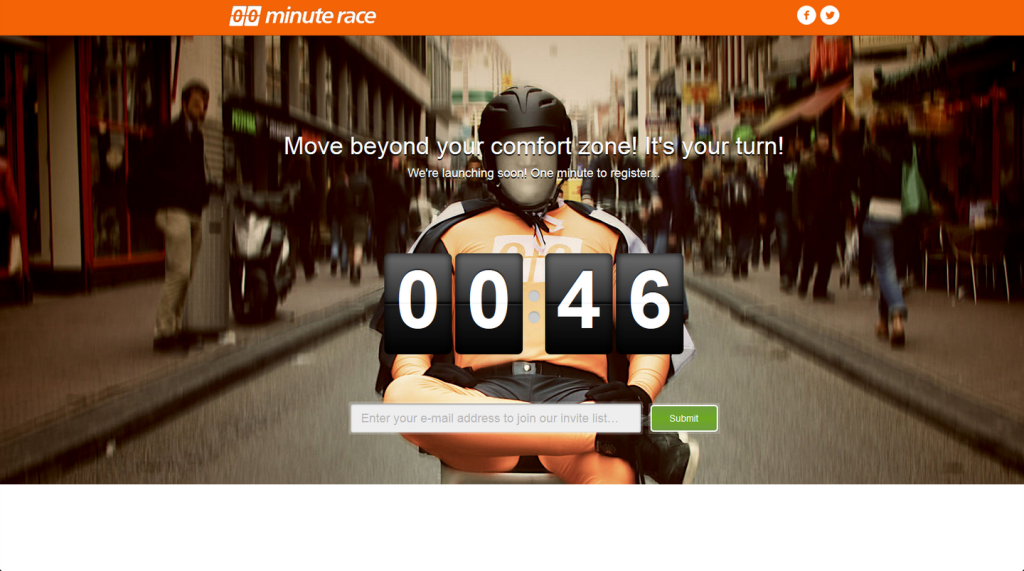
Single Page Sites
Although many of these single page sites are beautiful, they are horrible for SEO. Single page sites only allow the option to rank for one target keyword, and they also take more time to load. While they were originally created to make things simple for readers, the end results is too much scrolling, brevity, and frustration.
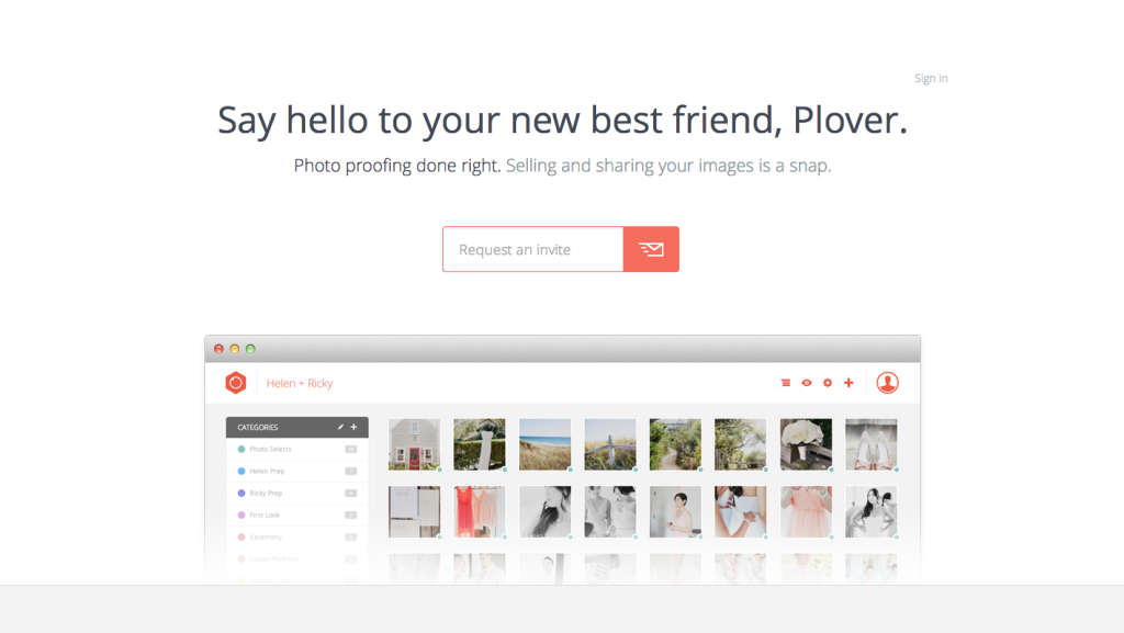
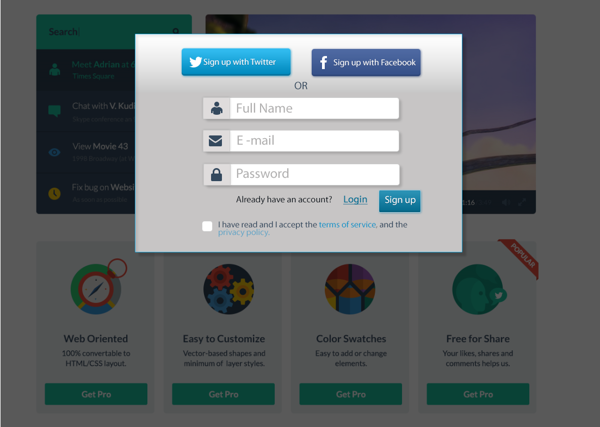
Modal Popups
There’s so many clever ways to capture more leads and gain followers. But when you reach a site and a modal popup is appears, have you ever jumped for joy? Especially when the modal popup isn’t set up to be smart, and no matter if you have filled it out once before, it will always come back to haunt you when you visit the page. Modals can be used effectively in many situations, but if they’re built to force users to interact with information then the best bet is to leave them behind.
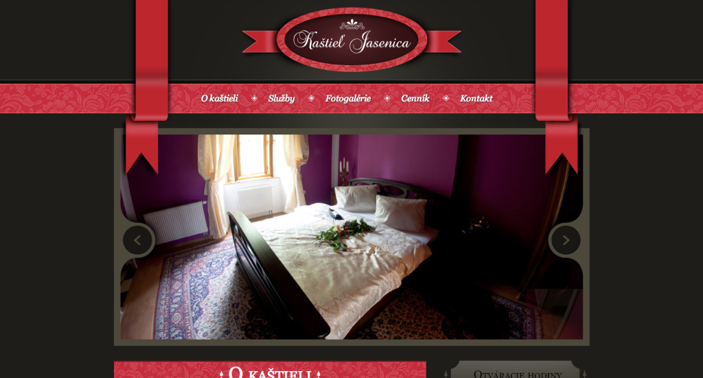
Ribbons
Ribbons in web design can give off the impression that the site is outdated, even if the content is fresh and new.
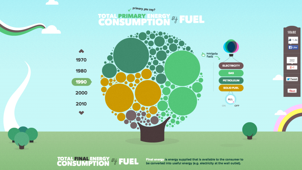
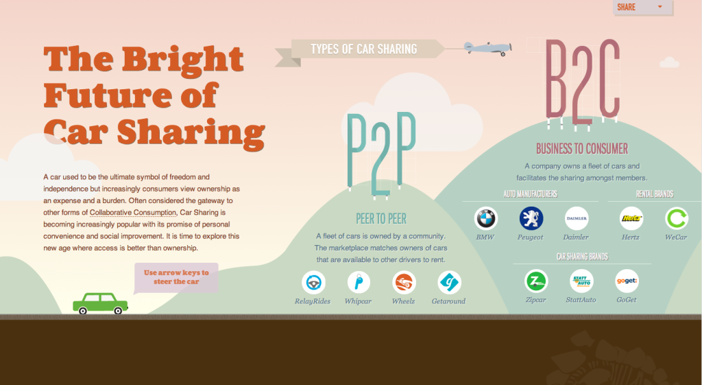
Interactive Infographics
Infographics are a hot trend right now, so why not create an infographic that viewers can interact with? This opens new possibilities on how to present useful information that relates to your product or service.
Even More Animated GIFs
Just like video backgrounds, Animated GIFs provides websites with movement and a simple bit of “wow”. They went out of vogue due to quality and file size, but with modern internet speeds we can make beautiful auto-playing animations. While GIFs have been on the return, we think 2014 will be their fanciest year yet.
![]()
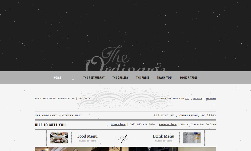
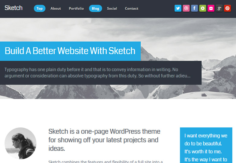
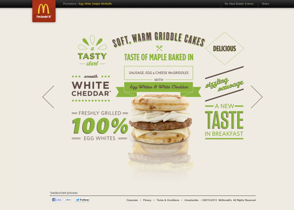
Mix and Match Typography
Mix and match typography can lead the overall web design layout. This is a great way to present a lot of information without causing clutter.
The Death of 960 (Wider Website Defaults)
We’ll start to see a decline in the 960 grid system. It’s a comfort zone for many, but make it a goal in 2014 to ditch the 960 grid and start keeping large screen dimensions in mind.
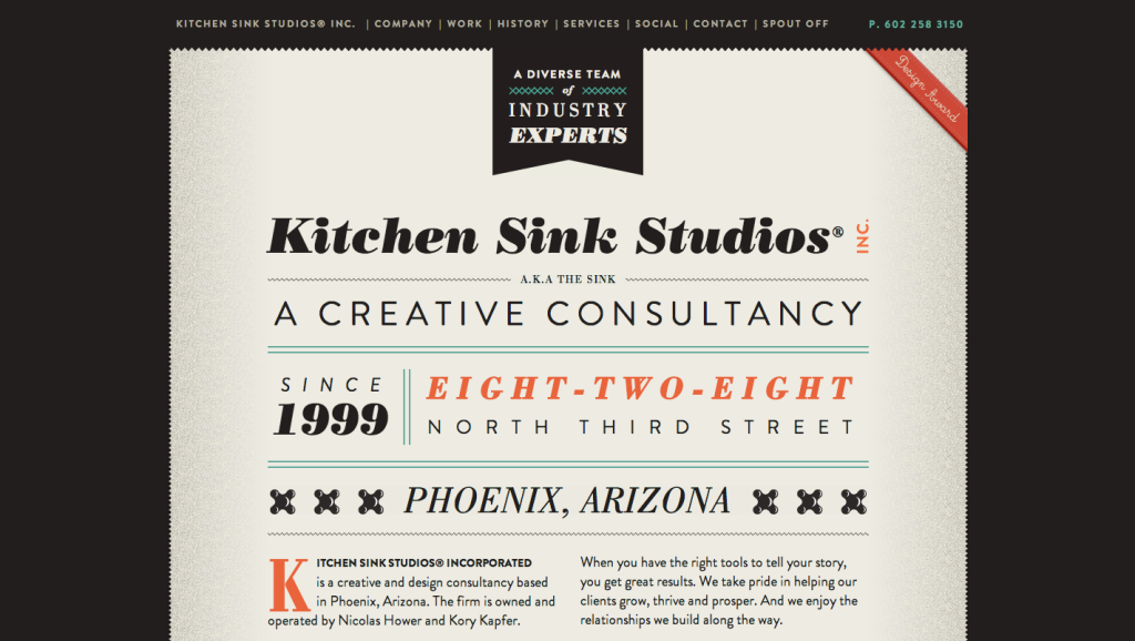
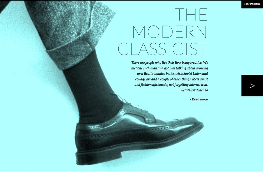
The Print Magazine Aesthetic
It’s no surprise publications and industries that once ruled the world of print are taking the print magazine aesthetics and transforming them digitally. 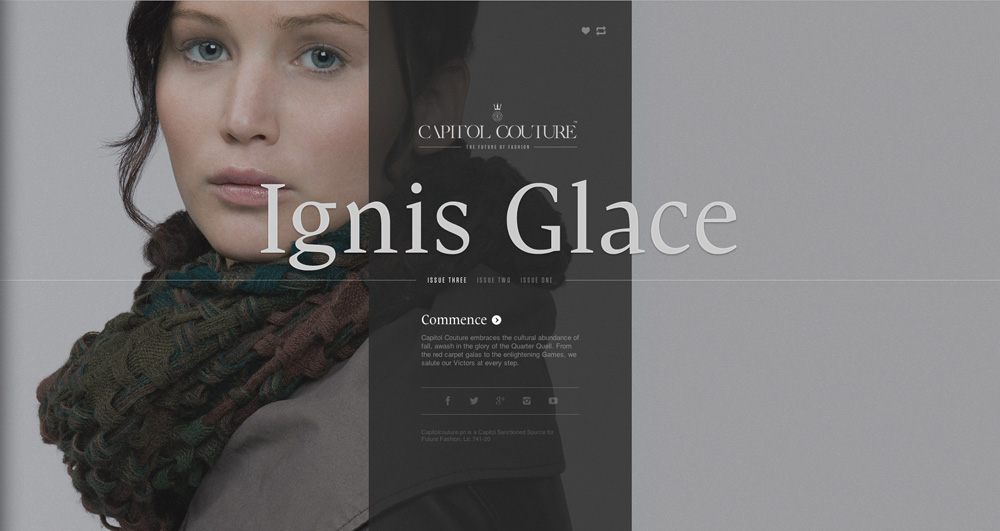


Very happy with your post. Thank you very much.