Print Design Trends 2014 – Rad, Bad, and The Next Fad
Past Ninjawards: Branding | Web | App
Behold the power of print, and all the good it has done for the world. Don’t believe me? Think about the last time you handed out a business card with confidence, or even picked out an awesome book because of its cover. That’s print design playing a role in human behavior.
Print design continues to be an important factor on how we communicate. So be sure to understand the latest trends, and use this collection as your “go-to” guide for everything print design!
Take a look at what’s rad, bad, and the next fad in print design 2014.
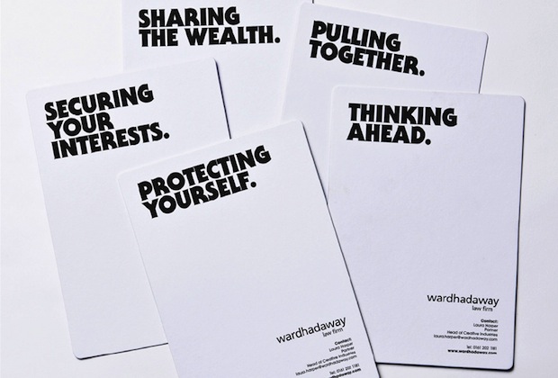
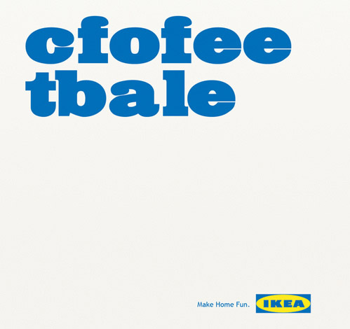
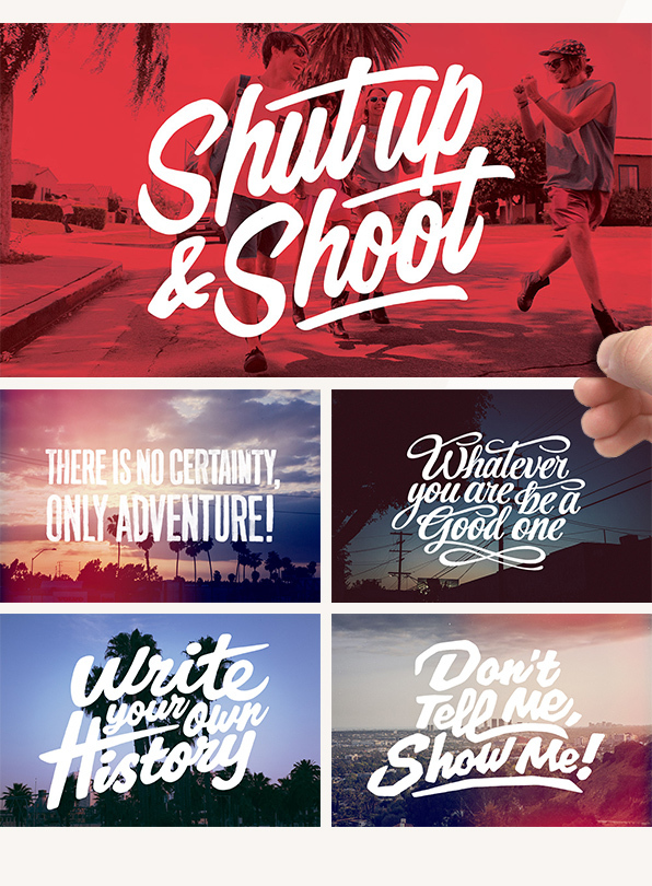
Type-Only Design
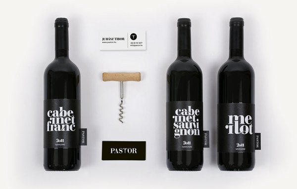
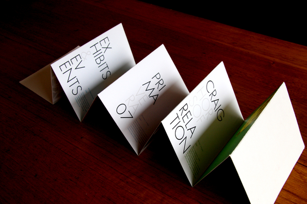
Type-only design is free of distractions, so the message is clear as ice. This trend calls for words to be powerful, and can be quite significant in special campaigns that promote a deeper message.
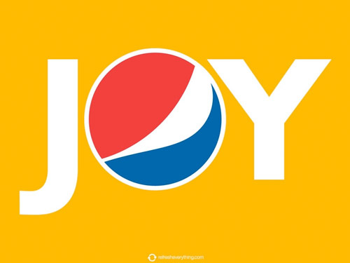
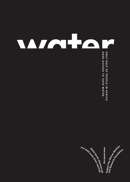
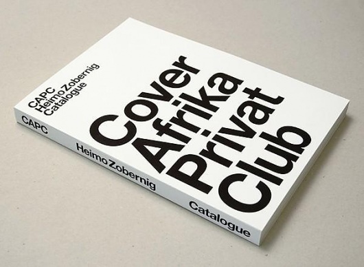
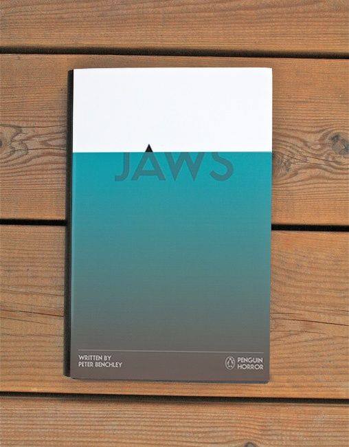
Image-Only Design
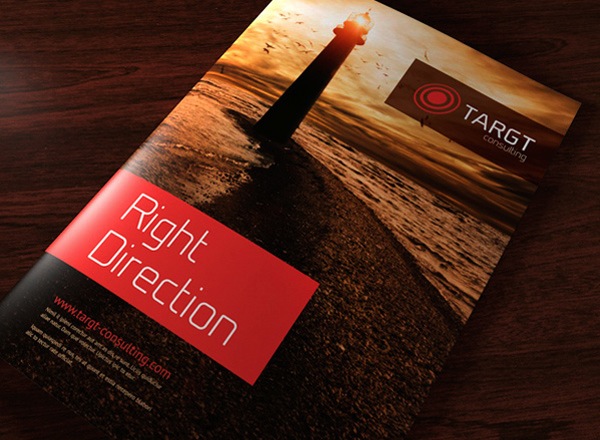
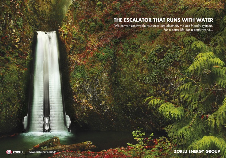
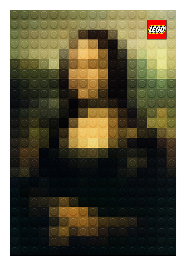
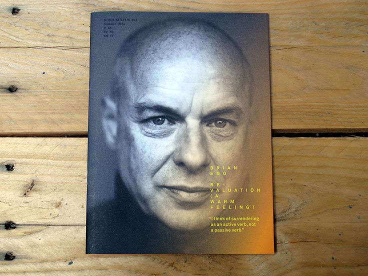
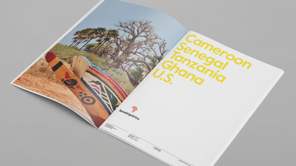
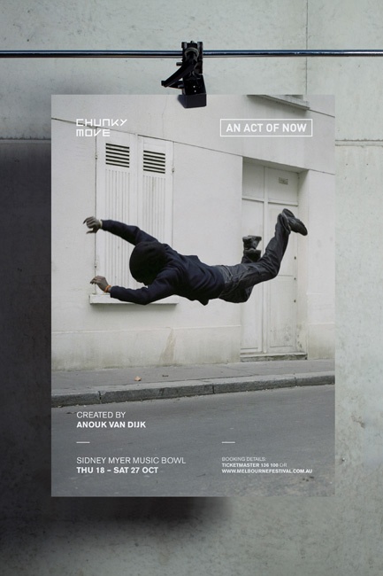
High-quality images have the power to speak for themselves. Image-only designs can express more meaning than words, and helps keep the overall layout free of clutter.
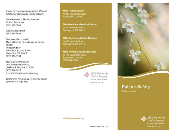
White Space
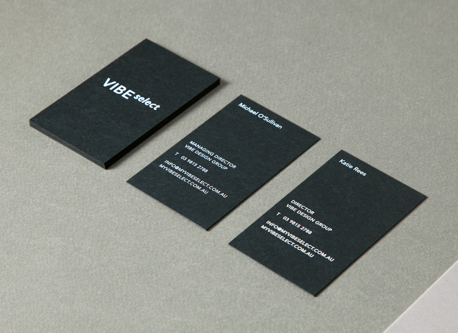
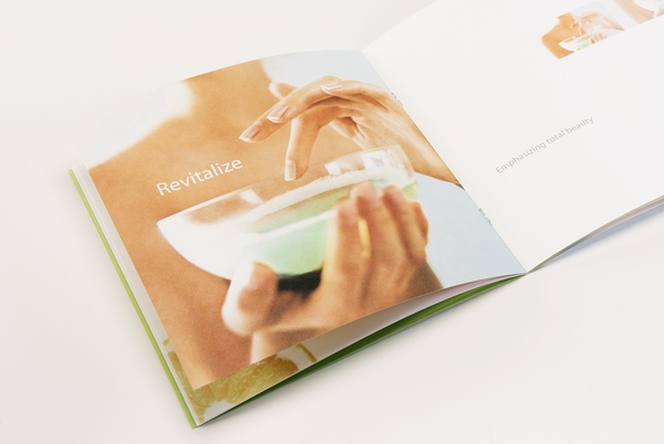
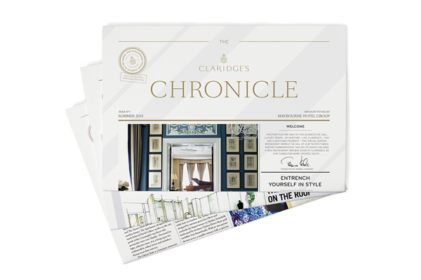
The images shown above highlighting some of the best in type-only and image-only designs take advantage of another trend we’re loving: white space. White space gives the finishing design piece some breathing room so that the intricate details in the overall design don’t get lost.
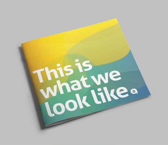
Full-Page Typographic “Lock-Ups”
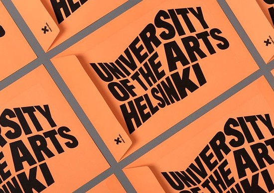
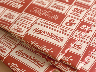
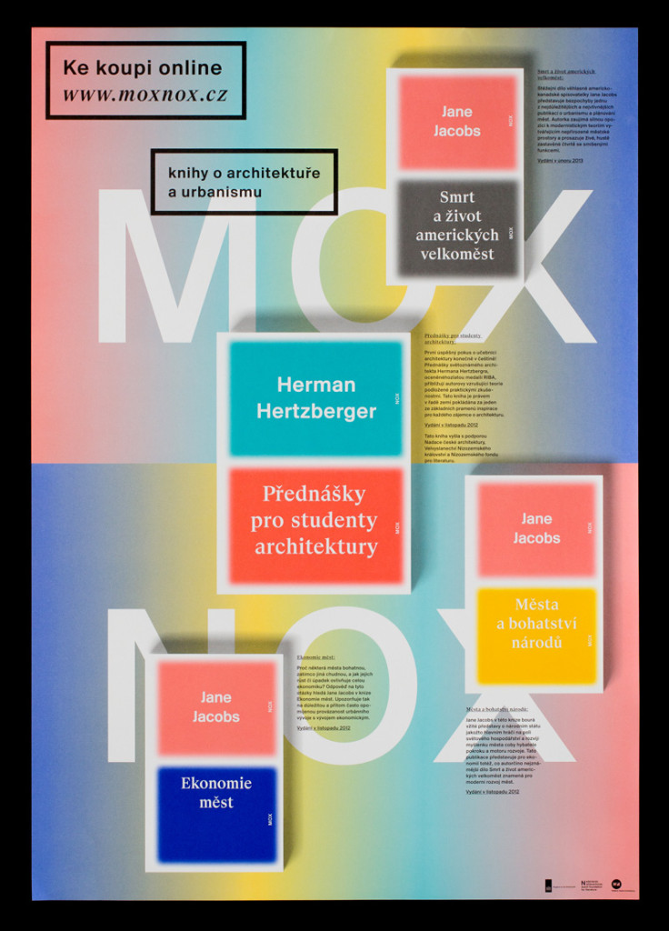
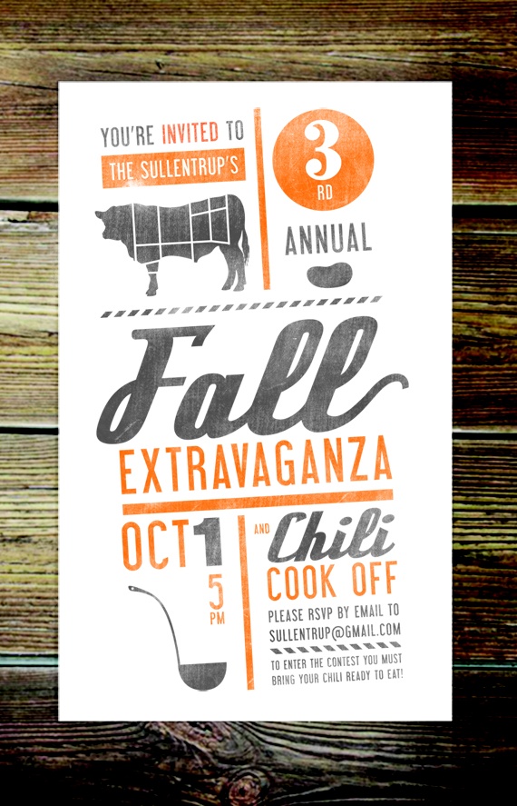
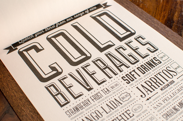
The typographic “lock-up” trend was a big win this year. We’ve seen it on the covers of books, menus, and brochures. When there’s a lot of type involved, the typographic “lock-up” design helps the layout look clean and organized.
QR Codes
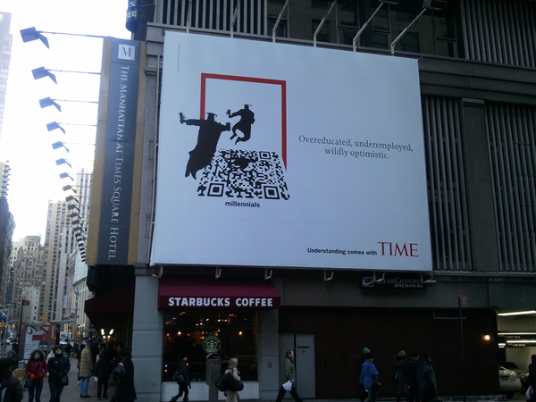
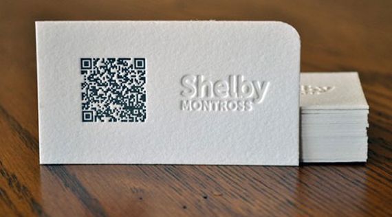
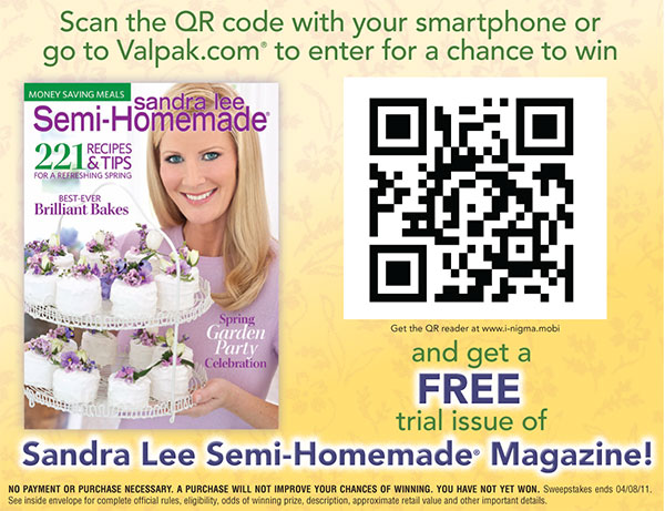
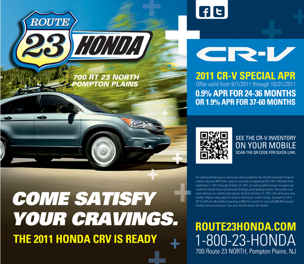
In order to scan this QR code found on a large banner (see below), you’d have to take a picture of it and upload the photo to your computer. Personally, I don’t know anyone who enjoys taking pictures and scanning QR codes during their free time.
Social Media Icons
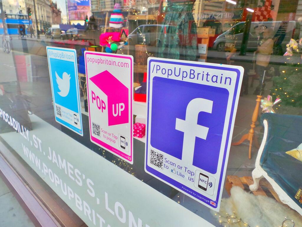
Few argue that social media icons used in print is okay as long as there is a strong call-to-action, such as “follow us on Facebook.” The truth is social icons in print are pretty much worthless. The problem with using social media icons on ads or even in the windows of storefronts, is once someone starts to look up your name or company online, who knows where they’ll end up. Social media is for digital marketing only, and should not sneak its way into print.

![]()
Drop Shadows
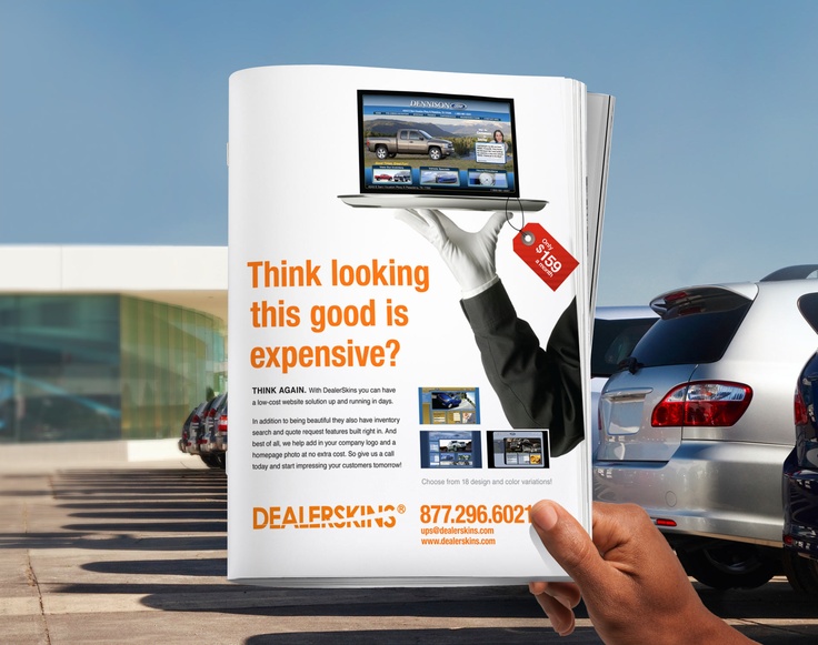
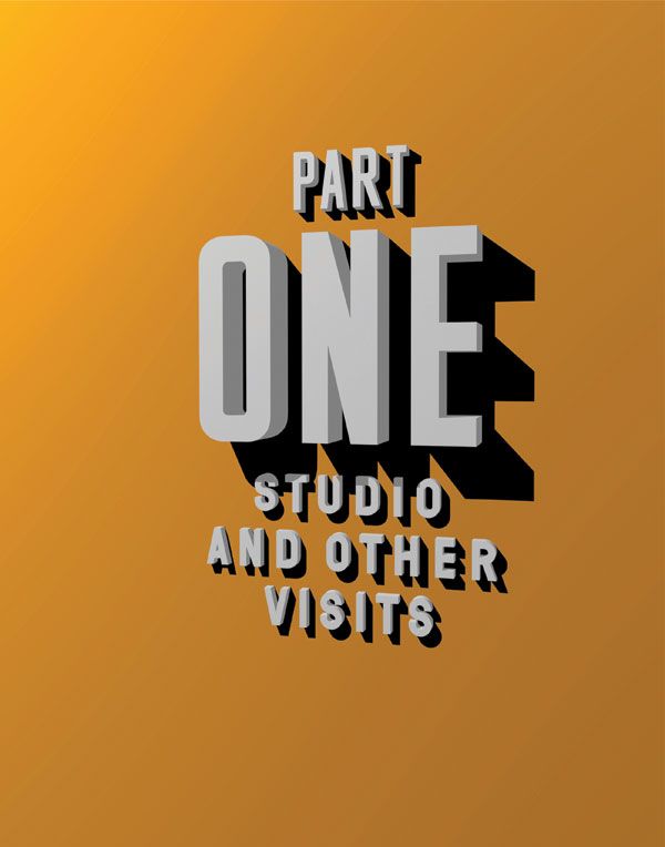
Drop shadows can cause a print layout to look tacky. It’s a big sign the designer is an amateur.
Luxury Printing
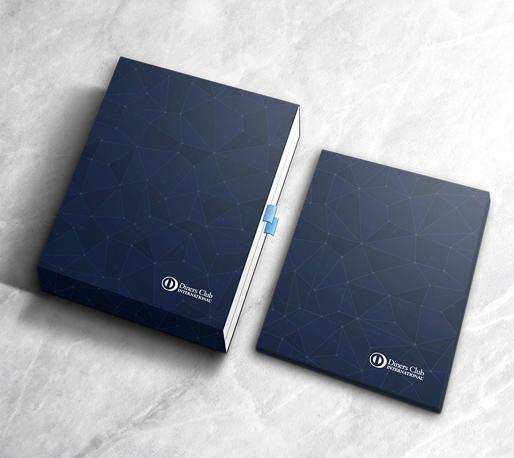
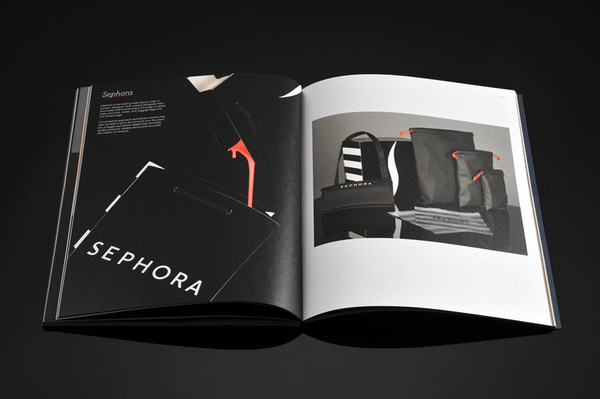
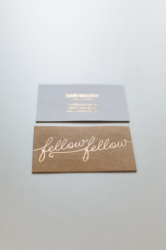
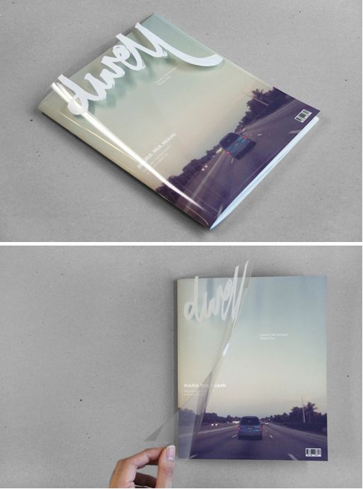
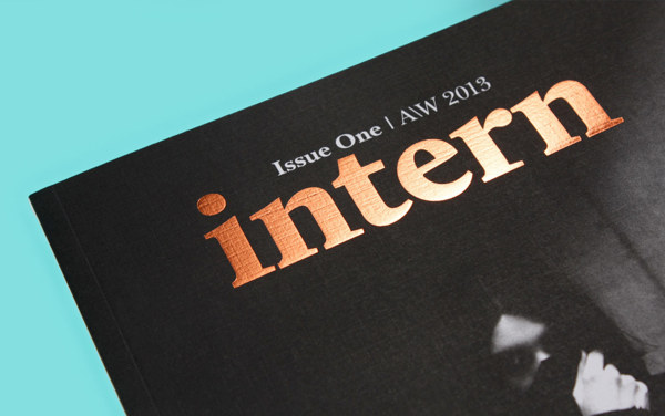
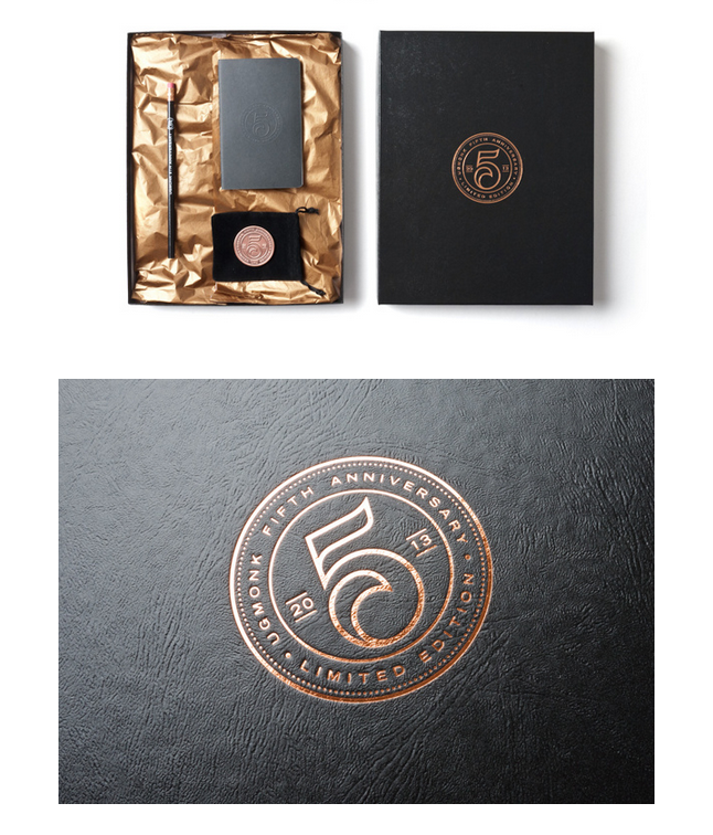
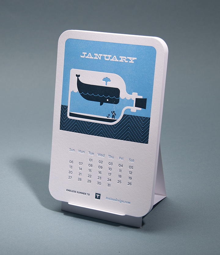
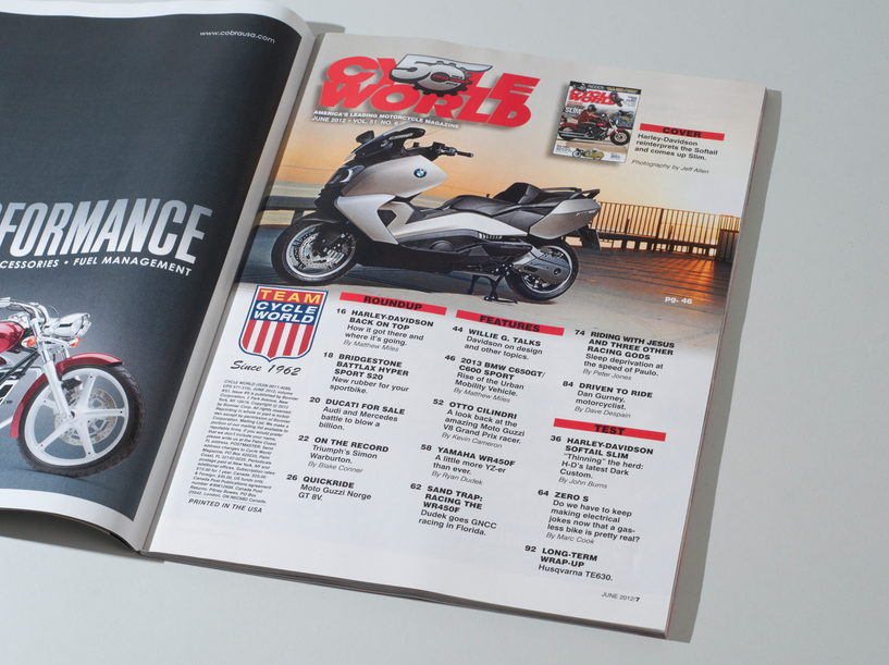
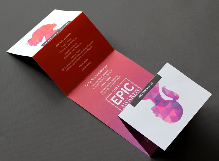
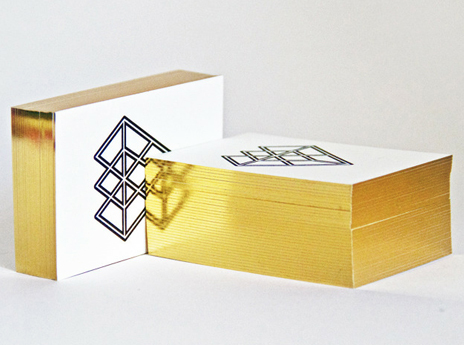
Designs can be magnified with the right type of luxury printing, such as 3D printing. Check out these print examples where the material complements the design.
Double Exposure
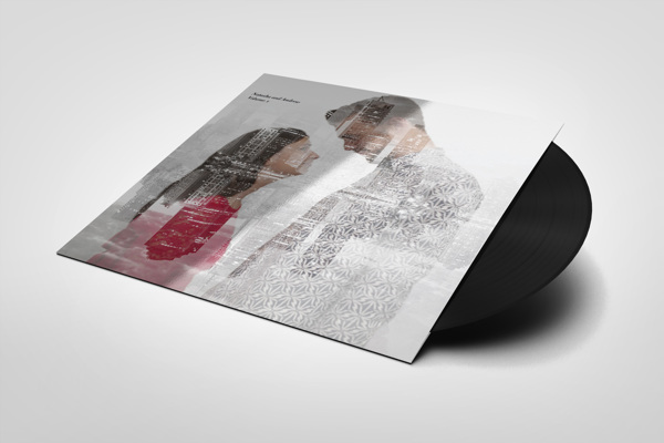
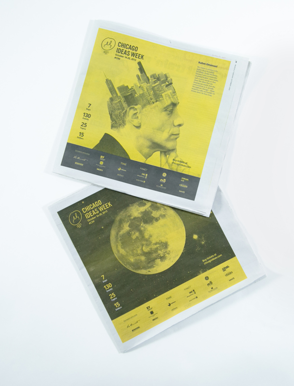
Double exposure is an edgy design concept that’s capable of adding a dramatic spin to the overall piece.
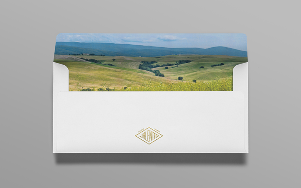
Nature Photography
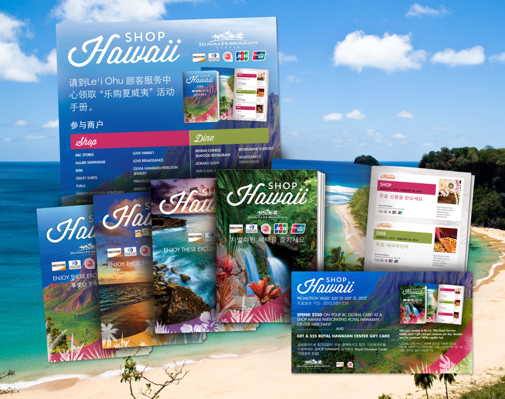
High-quality nature photography is great for creating emotion. This trend works for all types of industries, and can make a catalog or a brochure look striking.
