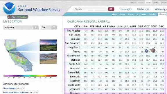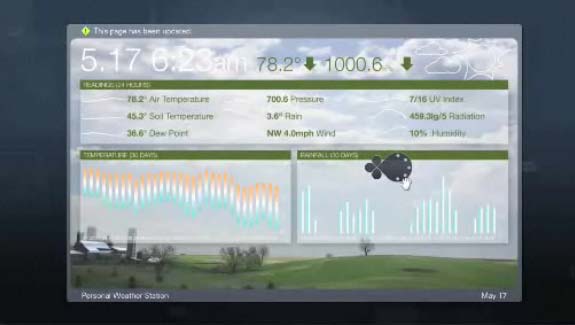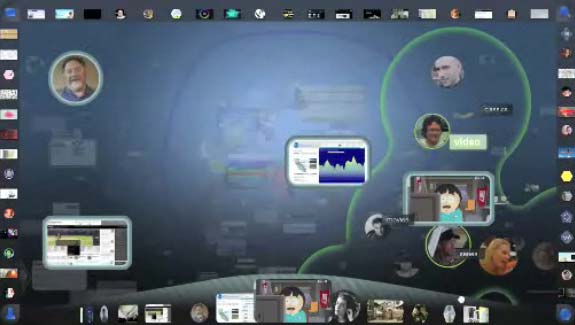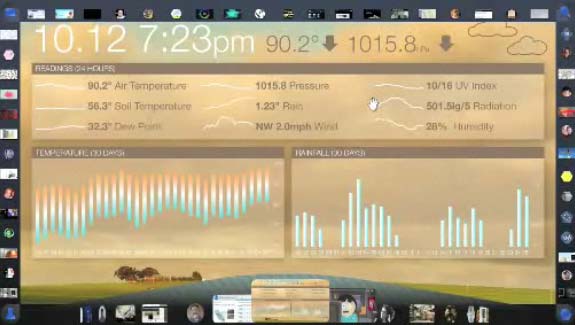
Behold, the future of web browsing! Fear its almighty powers and forward thinking omnipresence.
Or, um, maybe not. According to it’s creators:
This is Part 1 of Aurora, a concept video created by Adaptive Path in partnership with Mozilla Labs. With Aurora, we set out to define a plausible vision of how technology, the browser, and the Web might evolve in the future by depicting that experience in a variety of real-world contexts.
Here are five things Aurora got wrong about the future user interface of the web browsing…
Tiny Icons – Remember when the web first began, and bandwidth was hard to find? Back then we lived with tiny images. As download speeds increased we realized what we’d always known in print – pictures are good. Today the Internet is a lush place. User interface functions have no excuse to be small again.
Specialized Apps – Your car was once just a car. Now it has an air conditioner, a radio, a computer, and heated seats. But applications rarely improve when you bolt on more functions (see Mozilla’s FireFox). With more operations, we have more memory holes, and even more crashes. Someday far in the future when no application crashes, maybe, but this about as likely as cars that don’t crash. Custom applications will beat plug-ins for the foreseeable future
Radial Interface – I love me some radial interface. The Mac application Quicksilver’s approach particularly was exceptional. But Quicksilver was custom-made for a geeky crowd. User Interface’s need to be designed with a core user in mind. The average Mozilla user is likely your Mom or Dad. If they have problems with two-mouse buttons imagine a context-sensitive set of 10. Unless an operating system forces the average user to try this, it will never-ever happen.
3D Interfaces – In sci-fi we can always count on robots, flying cars, and 3d interfaces, and reassuringly, all of these exist in some form today. Due to technology though two are held back…and then there is the 3d interface. Get one free here. Or buy one here for $12! Or pick me! But one thing you’ll notice is that it isn’t really 3d, but faux 3d on a 2d plain. The reason is 3d sounds great in practice, but is simply frustrating to navigate. Until touch interfaces become standard, this is a good idea that is too ripe for the picking.
More options for users are better – This has never been true. People love a few clear choices. The more choices we receive the more we dread messing up. And the worse the possible outcome the more we delay. Don’t believe me? Just think about completing your taxes by hand.
