


Creating contact forms might not be the most interesting part of website design, but the execution plays a role in a number of important big-picture factors. Well-optimized forms can increase the conversion rate and also boost the user experience. In this ultimate guide to contact forms, we will share some key considerations that must be made when designing your own contact forms.
The Ultimate Guide to Contact Forms
Design and Structure
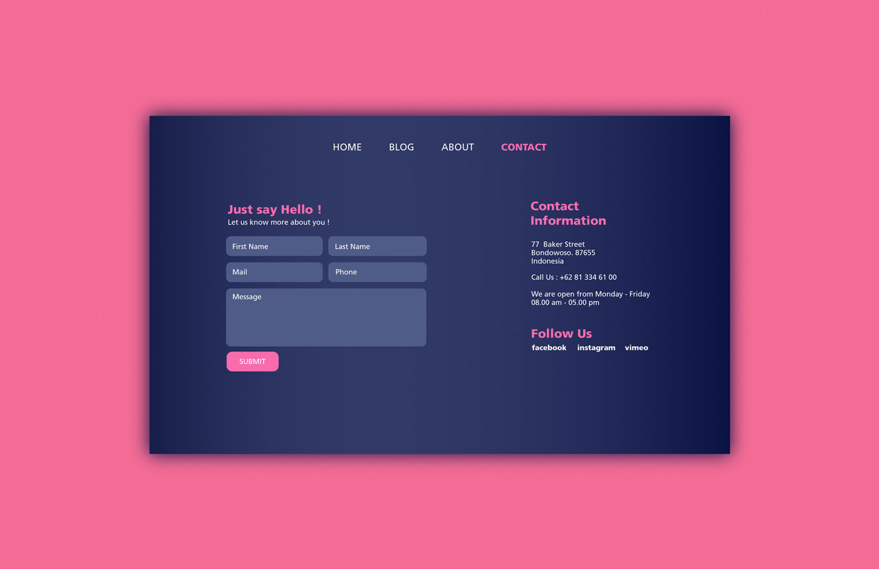
The form must be designed for maximum user friendliness so that the user can ask a question in a straightforward manner. Cumbersome contact forms can lead to frustration, which in turn may cause the potential customer to leave your website never to return again. To avoid that from happening, we’ve compiled some of the top design considerations to make:
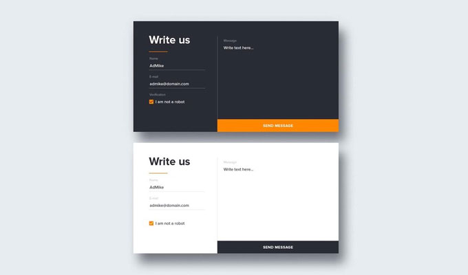
- Remove Non-essential Fields: Don’t ask for more information than is required. Typically the name and email address is enough — you can always ask additional questions later. The email address is the most important field — once you have that an open line of communication is established until they decide to unsubscribe.
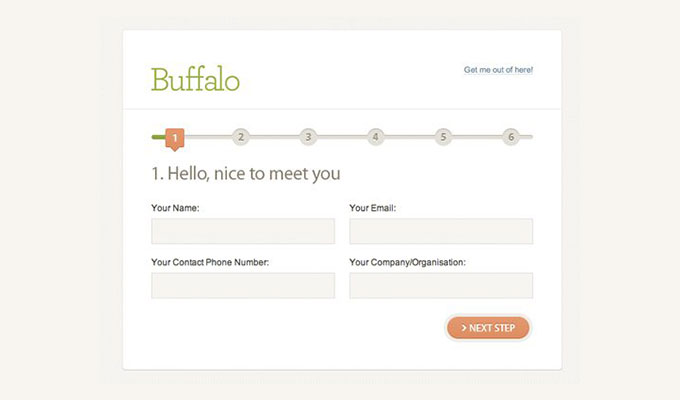
- Multi-step Forms: Consider using multi-step forms as these have shown to generate a higher completion rate – especially when you’re asking for more information. For example, if you absolutely must ask for the job occupation or telephone number then break up the form into several steps. When using multi-step forms ensure you provide a progress bar. This allows users to figure out how many steps have been completed and how many are left. By indicating how many total steps are left it encourages the user to complete the process. You can get away with asking for more fields to be completed when you use a multi-step process.
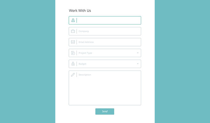
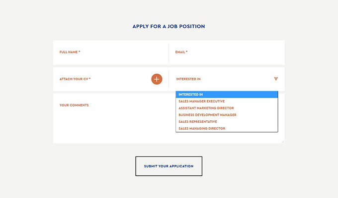
- Top Left Hand Labels: Having the field labels above each field on the left has proven to work better than having the label alongside on the left. That’s because it requires less visual fixation to take in the information of what a particular field is asking for. It’s a subtle difference, but one that leads to a better user experience. Drop down menus: when there is a predefined set of answers using a drop down menu is a solid way to increase the chances of form completion. It also makes the data more manageable when your CRM software receives it.
How to Increase Form Completion Rate
The last thing you want is for your contact form to look daunting to the potential customer. Ideally each customer that has a question will go ahead and complete the contact form so their issues can be resolved, which in turn increases the chance of a potential sale. Here are a few ideas to ensure your contact form has a healthy completion rate:
- Indicate Optional Fields: If you want to task non-essential question like job occupation and telephone number, then at the very least make them optional. However, you must indicate alongside the field that it’s an optional field. When visitors see they only need to fill out a few fields to submit the form they are more likely to do so.
- Privacy: Have a line of text that explains how their data will be handled from a security standpoint. Explain that the personal data entered will not be shared with third parties – this is a major concern nowadays that will be on the mind of the customer.
- Limited Form Fields: Where possible, offer multiple choice answers in the form of a drop down box. For example, if you’re asking for their gender then it’s simpler to click on the answer rather than typing it in.
Furthermore, you must consider validation and input error handling, but don’t make this more cumbersome than it has to be for the end user. For example, when entering the phone number do not restrict the customer to only one type of number format input. Give them the freedom to enter the format they want and allow your programming to convert the number into the desired format. Also asking people to enter their email address twice is not required. Your system should send an automated email conveying that the question has been received and is placed in the queue. If this email is not received the visitor may question the email they submitted and fill out the form once again. When using field validation, report the errors on the right hand side inline with the field. For instance, if the email address is entered using a wrong format indicate this in red so that it clearly stands out. One of the most frustrating things with filling out forms are errors that are not self-explanatory and don’t provide meaningful error messages. Provide suggestions or examples to help the user figure out how to enter the information correctly.
CRM Integration
For best results your contact form should be integrated with a CRM (Customer Relationship Management) system. Such a system ensures questions can be organized in the order they were received and also categorized based on the nature of the question. A CRM system allows questions to be answered faster because employees will have an organized user interface to work through the questions. Also time based alerts can be setup to indicate the questions that need immediate answers. An organized setup like that reduces the chances of a question getting lost in the system and being left unanswered. Making sure all customer questions are answered adequately is important to avoid losing customers. It would look unprofessional if there is no reply and instead of buying from you the frustrated lead will go to your competitors. Furthermore, the CRM system can link the contact form with other systems, which means the information collected can be used to improve the customer profile and consequently help create a more targeted marketing plan.
Mobile Form Optimization
Nowadays it’s just as important to create useable forms for mobile users as it is for the desktop environment. Globally around 50% of all internet traffic is mobile based, which means you must optimize for those users equally. Here are 3 things that you can do to improve the user-friendliness of your mobile contact forms:
- Fields Must be 48 Pixels High: The average width of an adult finger is 10cm, which roughly converts to 48 pixels. Therefore, any fields or buttons that need to be pressed must at minimum be 48 pixels in height. This ensures the user can easily click without having to do so several times.
- HTML Input: Have you noticed how your smartphone shows a variety of keyboard types? This is thanks to the HTML input types and they can make the data entry process easier. For example, when entering the data of birth a slider is used that can conveniently allow the user to input the data.
- 16px Fonts: All font must be easily read, which means a minimum size of 16x. It’s better for the user to scroll down in order to read all the text rather than squinting hard to make out the fine print. There are a number of features on a smartphone that can help with automated form input. For example, the geographic location can be determined by using the in-built geo location feature. Typically in the desktop environment when sensitive information such as passwords are entered they are masked. However, to improve usability for mobile entry, unmask these type of fields. Finally, focus in on the fields being entered. You can do this by highlighting the border of the field or placing it in the middle of the screen. On a mobile it’s easy to lose focus of what field is being entered if the user looks away from the screen. Therefore, help them out by keeping the focus on the relevant field.
Additional Ideas to Implement
There are a number of things you can implement to increase the overall user experience. For example, suggest taking a look at the FAQ page to get the answers they need right away. This will also alleviate some of the burden from your customer service department as fewer questions will need to be answered. Consider having a drop down menu that allows the user to specify the category of their question. Is it about a payment, delivery time or special offer? By specifying the nature of the question it can be forwarded to the employee that’s most qualified to answer it. This ensures that quality of the answer will be better, and potentially the speed too. Have a bunch of other information alongside the contact form such as email, phone, physical address and live chat. Choice is something that customers expect nowadays and by offering alternative means of contact you give the freedom to use the preferred method.
Test, Test, Test!
Over time as you receive feedback from customers about the contact form consider making changes to improve the overall usability. Use the form yourself to see that everything works as expected. There is nothing worse than website errors as it leads to user frustration and a smaller overall conversion rate. You can test out new features such as predictive data entry and a variety of different data entry formats. Ask your user base for feedback to see what might be missing and what needs to be added. You’ll be surprised by the amount of info people will offer if you just ask.
Conclusion
Contact forms have been around for as long as the internet itself and they serve an important function. They allow customers to ask a question to resolve a problem or concern. This might be the only roadblock left for a customer to pull the trigger on a purchase. Therefore, you need to make the process of asking a question and getting an answer as straightforward and efficient as possible. It’s in your best interests to create highly usable contact forms as it provides you with the customer email address and in turn a way of contacting them on a regular basis. However, you must ask them to opt in for promotional messages to let customers know what’s going on. These tips will point you in the right direction. Once you have created your contact form you can always make positive changes in the future based on user feedback.
Looking for more web design and development insights?
Check out our Mind-Blowing Web Design Facts for a surprising new perspective!
Is it time to upgrade your contact form? Our web design and development ninjas can help. Get in touch today to start brainstorming!