Website Conversion Matters
No matter your profession or line of business, the web has become an indispensable tool for client acquisition, e-commerce of all sorts, and the general task of day-today reputation building and maintenance. With that in mind, employing website conversion best practices is a MUST.
In any line of work, if your website isn’t your top salesperson, you’re heading up the creek without a paddle. Your digitally savvy competitors will outstrip you in the blink of an eye, and odds are good that you’ll be closing up shop before you know it.
So how can you ensure that your site draws the right prospects, makes them aware of your central mission, and then entices them to align themselves with you? Read on for 4 tips for designing a high-conversion site that will help your business thrive for years to come.

1. Take Advantage of Color
Human beings are drawn to color like moths to a flame. Apart from the obvious matter of aesthetic appeal, it creates an underlying unity to your site which, if executed successfully, will actually pass unnoticed by your visitors. Sounds strange that something you went to so much trouble over should fly under the radar, right? Not at all. That’s exactly how you want it to be.
When you read an immersive poem, or get lost in the sweeping experience of a symphony, you’re not consciously thinking about it. And that’s the point. The writer or musician has done such a phenomenal job of capturing and holding your attention that you’re effectively spellbound without realizing it.
And so it goes with successful web design. Your particular color scheme will vary largely depending on your specific context, and what you’re looking to accomplish. But however you go about it, always ask yourself, “Am I consciously noticing the colors I’m employing?” Or do the aesthetics of your site blend into a cohesive unity so effectively that the visitor doesn’t even question your visual choices, but just sits back and enjoys the ride?
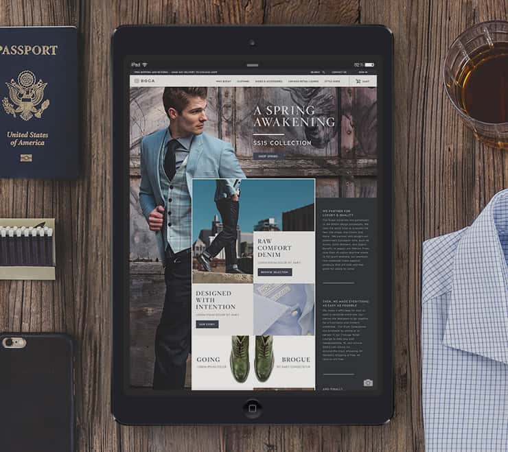
There is no hierarchy in a design where all colors are consistent. When the most valuable calls to action are highlighted with color it isn’t just a design detail, it adds instant clarity where to go next.
That’s where you want to end up. If you can get visitors into that semi-hypnotic state, they will be much more receptive to your message, and your attempts at website conversion.

2. Flow is Your Friend
Flow is everything, in writing as in painting and music (not to mention web design…). If the ideas, persuasive elements, and calls to action on your site aren’t dancing in unison, you’re dead in the water.
You might be able to get away with a contextually inappropriate color scheme. Perhaps you’ll even be forgiven for one that’s downright garish. But you will not (let me repeat…not) make the slightest bit of headway with your prospects if your words and pictures don’t flow naturally and intuitively into a cohesive narrative. When a prospect finishes reading the copy on your web page, buying from you should feel like the only reasonable course of action.
Examples of stable flow include:
- Does your copy pair naturally with the design? Or is one driving the other?
- Are your paragraphs short and snappy, with large amounts of open space to entice your reader’s eyes further down into your body copy? Or are they relatively dense (though still well-spaced) because you have in-depth or serious info to convey? Which is more effective for your audience?
- Do the images add to the conversation? Or are the photos low-quality visual filler?
- Does the content drive a reader to a call to action multiple times throughout the work? Or is the reader led into a dead end, forced to find a way to move forward?
Balancing the flow of your website a tall order, and to achieve it, effective writing offset with thematically appropriate design is an utter necessity. When words and images play together nicely, magic happens.
If you can’t write or design as well as you’d like, there’s an endless supply of books out there geared specifically at web conversion. Or if you lack the time and interest, you could always hire a professional to bring your vision to life.
3. Make (& Break) the Grid
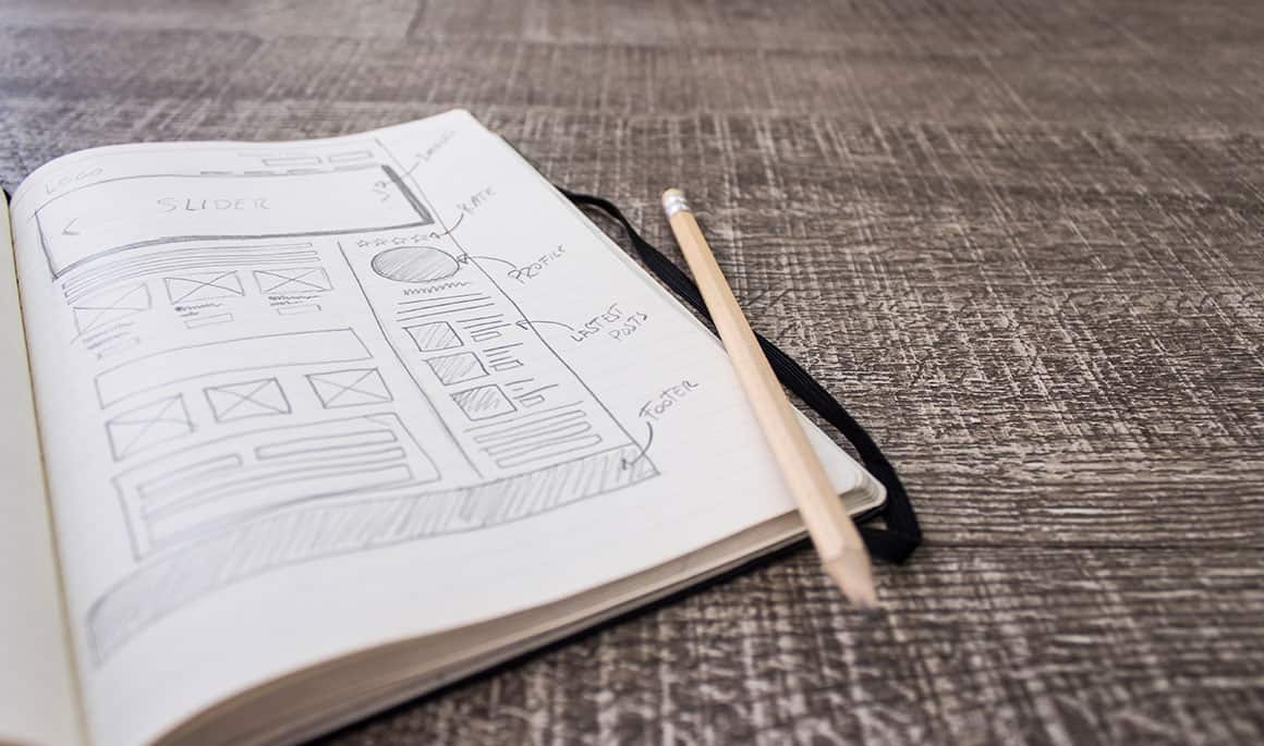
Utilizing a basic grid in your design layout is a very simple but very effective web design tactic. The human eye is drawn to symmetry: it calms us, and when people are calm, they’re less likely to be critical, slowly being lulled into your site’s writing and its message.
Sometimes it is best to purposefully break your symmetry, especially in areas you want to stand out. Whether this is an important call to action or copy that needs to be read, you design your grid to be able to defy it.
Think of your website like a story. If the same thing happens every chapter a reader will soon lose interest. By breaking the confines of normal you can jolt the viewer back onto the edge of their seat.
You want to effectively accomplish your site’s mission, while making your visitor’s life as simple as possible. Making and breaking visual rules accomplishes both.

4. Emotion Is Your Secret Weapon
Many people who are new to sales and website conversion operate on a “build it and they will come” basis. If you want to waste a large amount of money, time, and effort, we wholeheartedly recommend this approach. But if you want to convert (and you do) you need a healthy dose of emotion. No, scratch that…you need a direct injection of the stuff.
You see, the people with the “build it and they will come” mentality fail, and fail miserably. Why? It’s simple. When you take that tack, you’re giving your prospects what you believe they should want. Facts and figures. Pretty copy. No sales.
Because you know what? Human desire and human needs are deep, complex, and multifaceted. If the depth of your argument doesn’t go past the fact that “money is changing hands”, you’re absolutely screwed. Because whenever money changes hands, you’re not dealing with money. What you’re dealing with are individual human needs, emotions, and desires. And these are extraordinarily complicated things. Dizzyingly complicated, frankly. And this is what makes emotion so vital to sales and conversion.
To be effective with website conversion, you must ditch your motivations, and ask yourself repeatedly what your visitors are truly after. Because we can almost guarantee that it’s not what you’re selling on the surface that matters.
What your products or services mean to the prospect is what will carry the day.
Humans are creatures of meaning. In fact, it’s been neurologically proven that when a human being sees an object, their primary analytical mode is not sight, scent, touch or taste. It’s meaning. The meaning of the object comes first: its significance, its use, its consequences. The object itself is only inferred afterward based on the interpreted meaning.
How Does Emotion Translate To Website Conversion?
Every single object on your website should be unified towards creating an emotion inside your visitor.
Don’t just list facts or data. Reframe these boring ideas in a way that your customer can feel. Spark joy, hope, fear – any emotion that drives action.
Highlight how increased efficiency will help your customers save time, so they can spend it at home with their family. Note how a cost savings would mean less sleepless nights for your customer. Showcase how your customer’s purchase is an investment to position themselves as the successful industry thought leader you know they are.
Harvard Business Review can confirm. HBR implemented a research study on why people convert online and found:
The message from our study is clear: When making decisions involving risk, such as an online purchase from a website, consumers tend to rely more on intuition than on deliberation. This is important because it challenges the established deliberative perspectives of consumer trust formation and offers an explanation as to why things like aesthetics, professionalism, and other implicit clues matter for building online trust.
Emotions convert. They stick inside us, pushing us at a root level to move. And we can’t but feel understood when we see ourselves in these concepts.
So remember, never just throw a site up on the web and expect visitors. They won’t show. Those that do will see you as another vendor in a sea of options. Think long and hard about what your prospects actually value, irrespective of your own desires, and then give it to them in spades.

Summing Up
Look, we’ll be quite honest with you. Effective website conversion is extremely difficult, and it never “just happens.” Never. But then, what does?
Like all things worth doing in life, if you do your homework and learn the terrain before you leap, you’ll be miles ahead of your competition. Because most people are of the “build it and they will come” mentality.
Most people simply choose color schemes that they find personally appealing, rather than consciously looking at it as a strategic tool to drive conversion. And most people never stop to consider the deep relationship between visual layout, copy layout, and conversion power.
Don’t be one of those folks, and your battle’s already halfway won.
Looking for more website conversion tips?
We continue our website conversion analysis series in Part Two here. Or you might also enjoy covering all the bases with the Ultimate Website Redesign Checklist, or brushing up on the 15 Things To Know Before Designing a Website.
