


Check out these 10 data visualization techniques that are simultaneously clear, engaging, and memorable.
Helping people understand complex data can be tough, regardless of the topic. But when you factor in the challenge of visualizing data in engaging ways, the stakes are raised considerably. Data visualization design isn’t intuitive for most people, and if your visualization technique is too convoluted or opaque, your audience members will tune out.
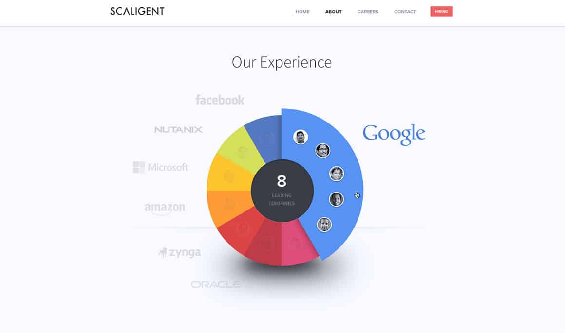
1. Pie Chart
Among the most well-loved and widely used charts, the pie chart is a quick and direct way to display data. Visualized as a circle with “slices” of variable sizes representing each data set, the pie chart more than earns its namesake.
This sort of chart is ideal when you’re dealing with relatively simple and discrete data sets. For example, if you want to track the performance of different products or sales numbers in different teams or territories, you can’t go wrong with a pie chart.
If you’re interested in maximizing impact and memory retention for your audience, consider using brightly colored slices for the chart or contrasting colors for the outer borders and inner coloration of your data slices.
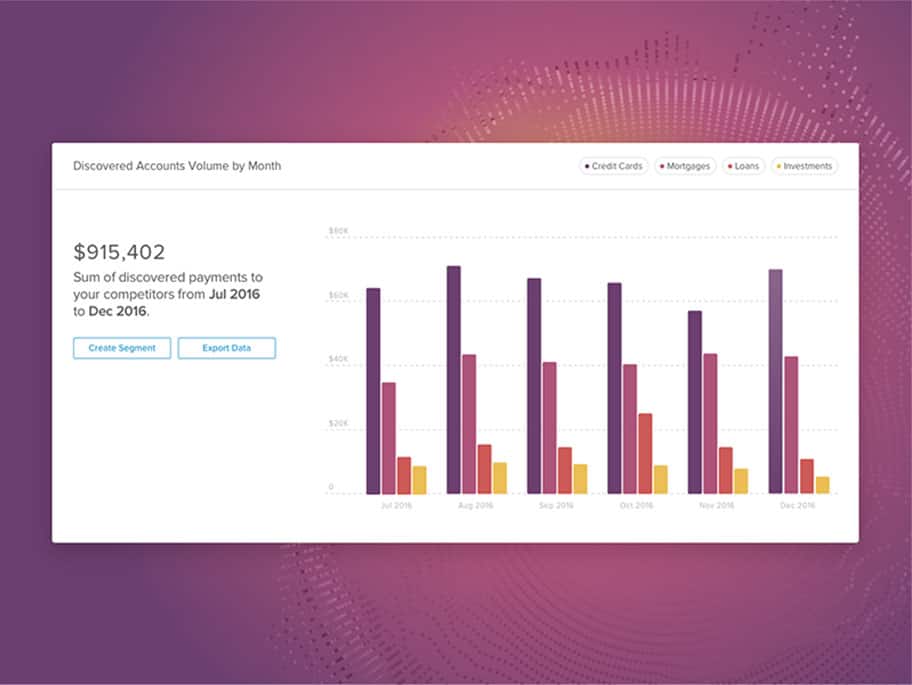
2. Histogram Chart
A histogram chart represents the varying prominence or frequency of various data sets over an interval of time, plotted on the graph’s horizontal axis.
Like pie charts, some major benefits of this kind of data visualization design are their ease of comprehension and their visual immediacy. If you’re looking to quickly and powerfully represent a plot of data over time, you couldn’t do much better than a histogram chart.
A histogram would be especially appropriate if you were presenting on annual profits, with bars representing each quarter’s earnings and the fiscal year plotted on the horizontal axis.
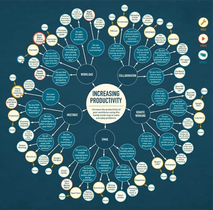
3. Brainstorm Diagram
Also known as a mind map, a brainstorm diagram is ideal for mapping out and discovering connections between ideas and concepts. You’ve almost certainly seen one of these before: in the diagram’s center is the core word or concept, with a circle around it. Several lines branch off from this central circle, each ending in their own interconnected word within its own circle, and so on.
Resort to a brainstorm diagram when “big picture” concepts are the topic of conversation. Say you recently decided that “innovation” was going to be the central theme of a new product line, and had gathered your team together to discuss it. A brainstorm diagram beginning with and radiating out from the word “innovation” could be massively helpful in discovering hidden connections and solidifying ideas.
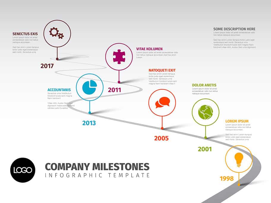
4. Timeline
Don’t discount the usefulness of the tried and true timeline as a data representation technique. Many presenters dismiss this tool precisely because of its ubiquity in our everyday lives. But what makes the timeline somewhat boring also renders it very effective for data visualization design. There won’t be a bit of confusion as to your intent, and everyone should get the message at the same time without having to think too hard.
Instances when you could effectively employ a timeline (or a calendar) include scheduling a product rollout or discussing target launch dates.
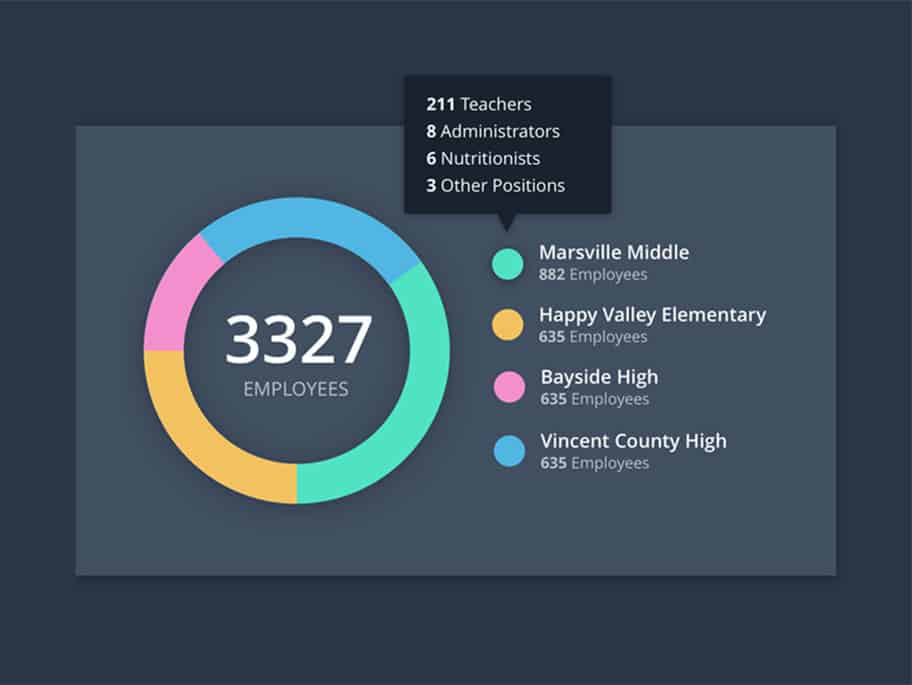
5. Donut Chart
The first cousin of the pie chart, the donut chart carries many of the same benefits, and an very similar design. It’s essentially a pie chart with its center cut out, creating a “donut” rather than a pie visual. The different data sets are represented as variously sized and shaded portions of the donut-shaped ring. A primary difference is that the percentage value for each data set is given beside each corresponding section. This makes the donut chart ideal in situations where the chart has many data values, and the relative proportion of each isn’t readily clear simply from looking.
6. Pictogram Chart
Pictogram charts are ideal for capturing and maintaining the attention of your audience, and are also highly effective in illustrating large discrepancies. Pictograms assign unique symbols to each data set being graphed, with the data sets on the Y axis, and the value being compared laid out on the X axis. Each unit counts for a certain amount of what’s being measured.
Depending on the scale and nature of your data, you might wish to assign multiple units of value to each figure. So let’s say you’re comparing the sales numbers for different types of printers sold by your company. Model 1 could be represented as a circle, Model 2 as a triangle, and so on. Each icon could stand for 10,000 printers. Just make sure you provide a clearly labeled key or legend!
Not only does the pictogram compress data in an extremely useful fashion, it also makes it immediately clear who your positive outliers and underperformers are.
7. Dot Matrix Chart
A dot matrix chart keeps percentages and figures at a minimum, instead relying on color to differentiate its data sets. This makes it a favorite among right-brain thinkers.
In a dot matrix chart, each data set is represented as a series of dots, with each set being assigned a color. The reliance on color instead of relative scale or percentage values allows for easy comprehension. It also presents an extremely vivid picture of your positive and negative outliers. The one drawback is that the elements of the chart are rather limited in scope and dimension. A dot matrix chart would be ideal, for instance, if you were comparing sales figures among different products or departments within your company.

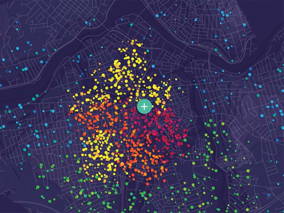
8. Dot Map
Unlike a dot matrix chart, a dot map is ideal when you’re trying to get a sense of how data of various sorts is distributed geographically. Quite simply, a map of a geographic region is presented with dots plotted out in alignment with the geographic layout of a data set.
As with the calendar chart discussed earlier, a dot map has the added benefit of building on an extremely familiar concept: a map. This built-in familiarity means you aren’t likely to have any head scratching in your — your point is made clearly and swiftly.
Dot maps comes up all the time in business. Whether you’re tracking sales by region or analyzing sales areas ripe for a takeover, the dot map will be a ready aid.
9. Density Plot
Density plots are essentially rounded-out histograms (rounding out the sharp edges of a histogram or related graph is known as “kernel smoothing”, by the way). This rounding out of sharp edges, and more gradual curvature, make density plots perfect for a “bird’s eye view” analysis of a situation. The peaks and troughs of any plotted trend become much easier to spot and contextualize when looked at as a whole.
All of this makes density plots great tools for broad financial charts, like asset performance over a given fiscal year.
10. Network Diagram
A network diagram is optimal for displaying the connections between “nodes” of data, and theorizing about new or undiscovered connections. Each node or data point being connected (or networked) is joined together by “link lines”.
Much like the brainstorm diagram, a network diagram is less rigorously analytical and more creative. You can even tailor the diagram further to suit your needs. You could make particularly important nodes a different color, shade in especially key link lines, and so on.
Network diagrams can be incredibly powerful, especially for stimulating group discussions. Just remember to use them in context-driven ways — when abstract creativity is at a premium.
Summing Up Data Visualization Design
The key to selecting an ideal data visualization design tool lies in self-awareness. What are your unique objectives? What are the expectations of your audience members, and what are they hoping to gain? Whether you’re a presentation designer, a motion graphics guru, or making a print design piece, as long as you appropriately gauge these points and others like them, you shouldn’t have too hard a time selecting the perfect chart or graph. And your audience will certainly thank you.