2020 Branding Trends – Ninjawards
Each year, Cubicle Ninjas’ reviews the industry’s creative highs and lows to publish a curated list of notable efforts in each specialty. Think of it as a highlights reel of the years’ best and brightest, along with some cautionary tales.
One of the core ninja principles is to always question the status quo. The Ninjawards provides a platform for inspiration, constructive criticism, and ultimately, recognition of bright new areas of design or technology. We hope our thinking unlocks new perspectives about the future of brand trends!
Want to download all of the 2020 Ninjawards?
Our 2020 Ninajwards eBook is 100% free!
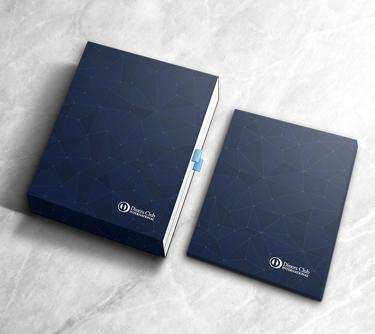
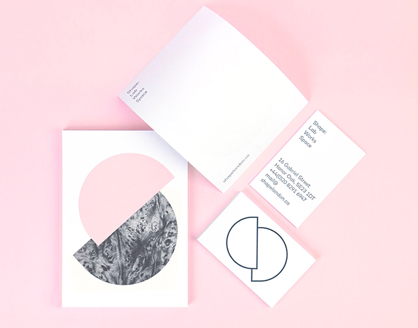
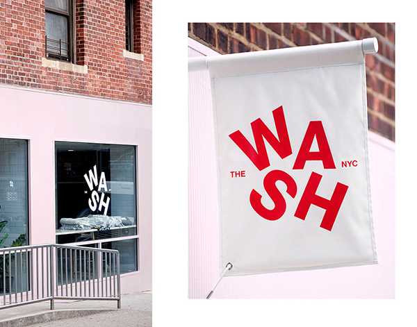
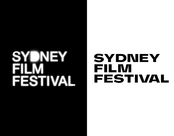
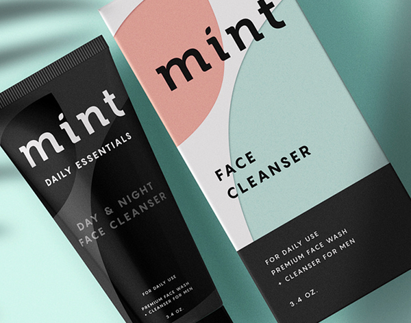
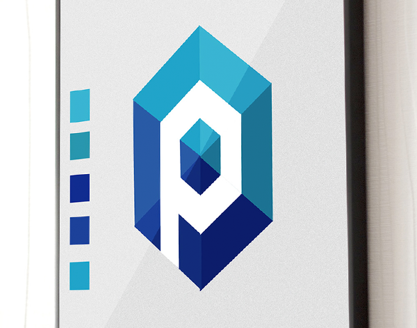
Using the Logo As A Window
As brands and logos continue to evolve, one trend we have seen emerge from the visual noise is using a logo as a container or window for images, patterns, and other elements. Whether the elements are completely contained within the logo or has something spilling out of its bound, this treatment has a prominent place amongst this year’s design community. This gives the company the opportunity to broaden their logo’s recognition across their identity.
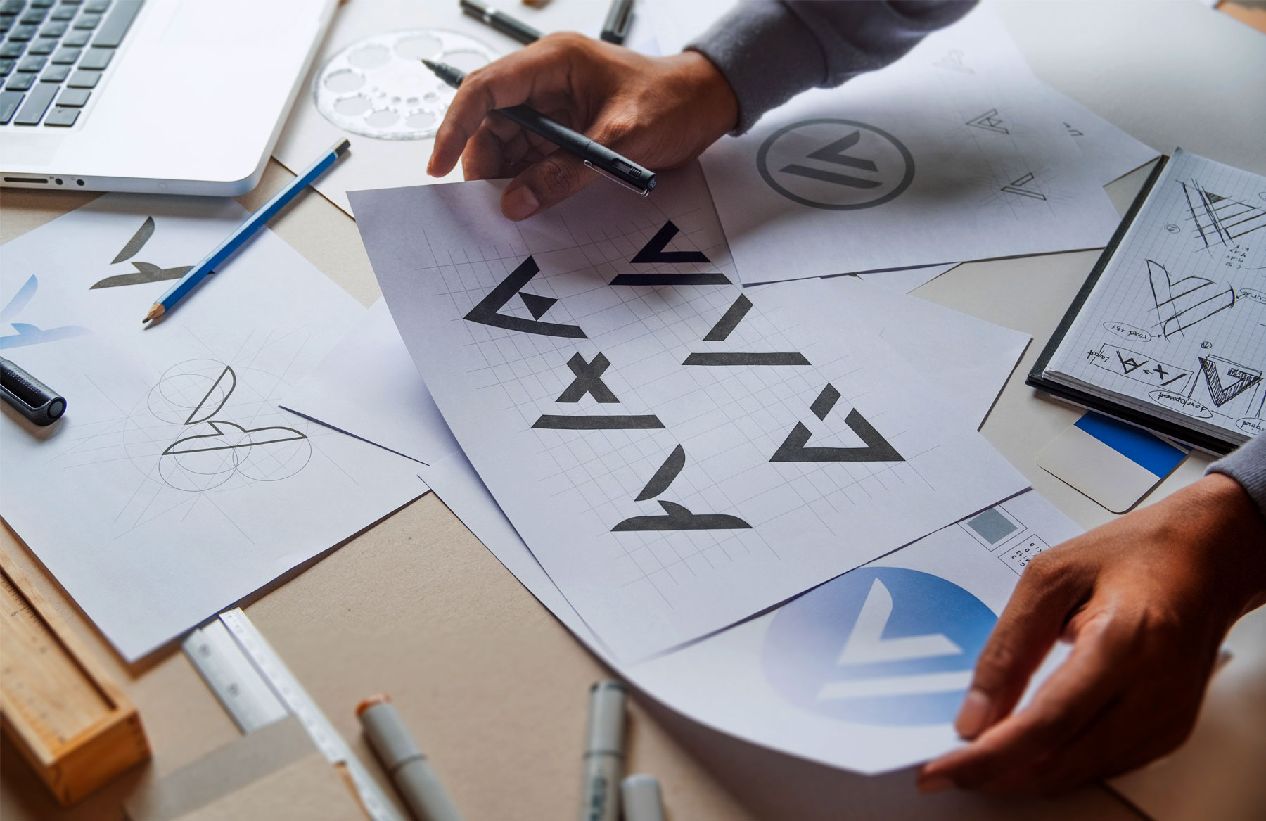
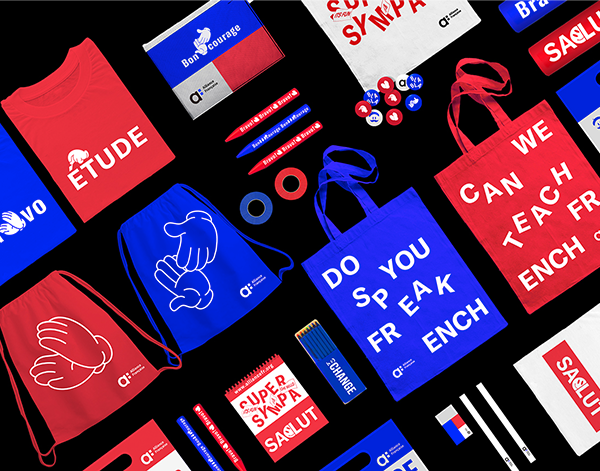
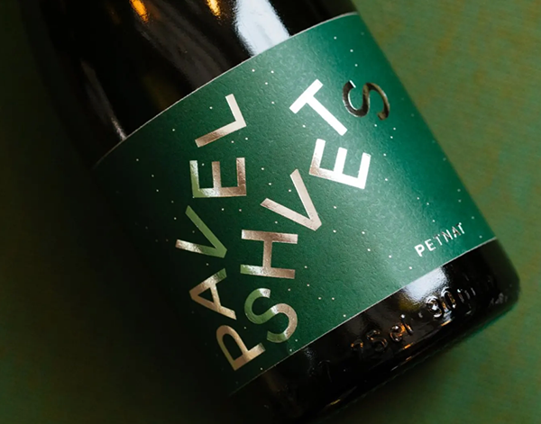
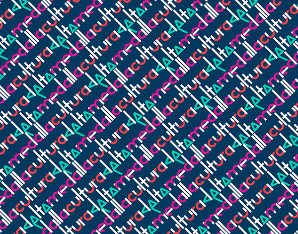
Shuffled Typography
Sometimes we think outside the box, and other times we say “forget the box even exists!” Well, in this case the box is the baseline of our type. We have seen a trend of typography where we scatter the letters around, but this look adds in the element of rotating the letters as well. The resulting look and feel is a shuffled, falling effect to the copy, not to the extent that the message is lost, but just enough to give it the effect of movement.
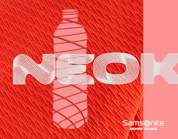
Contour Line Shading
This trend is one answer to the age old design question “how do I create dimension while using flat design?” Not only do we get a sense of depth, but depending on the specific application we also get a sense of texture. By using this sketch artist technique in combination with modern aesthetics, the end result is a refined look with rich detail.
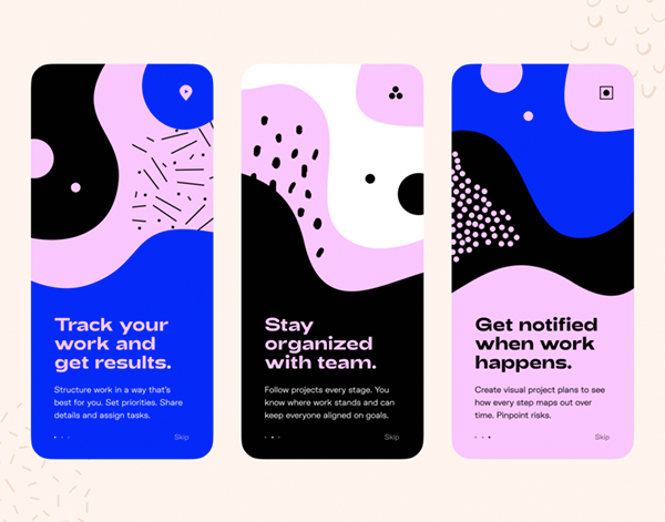
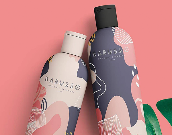
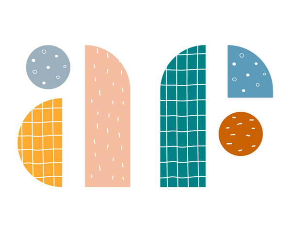
Organic & Asymmetric
Every designer loves a good grid, but this year, we saw brands like Hubspot break away from the ultra-structured and geometric in favor of the organic and asymmetric. Free-flowing, often brightly colored abstract shapes contribute to a shifting, whimsical feel. We even hopped on this bandwagon as well with our 2020 Ninjawards branding!
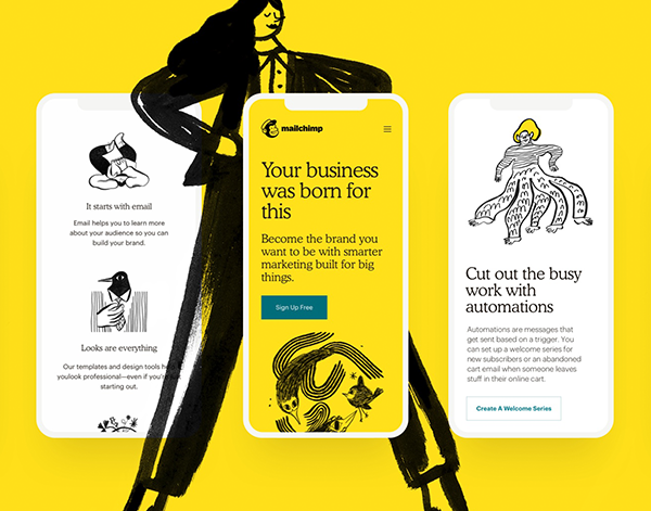
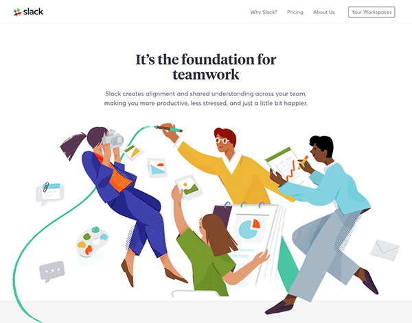
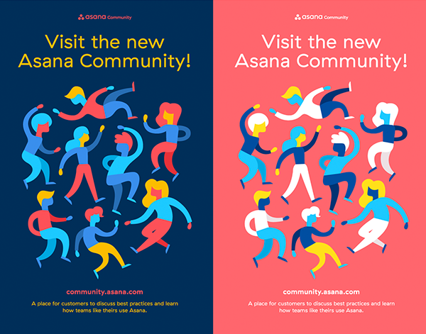
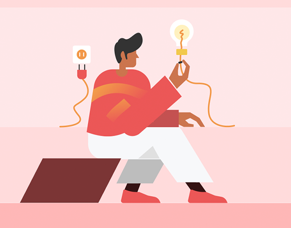
Abstract Illustration
A style that was once only seen in new-age animation projects has evolved into a truly marketable aesthetic. Abstract, dream-like illustrations are increasingly being leveraged by major brands like MailChimp, Slack, and Asana. From sleek vectors to textured linework to gritty gradients, the illustrative styles are diverse but the overall feel is loose, fluid, and highly conceptual. Even though we expect to see this design choice gain popularity, the flexible nature of illustration means that each brand will still retain a distinct, individual look. Pretty rad!
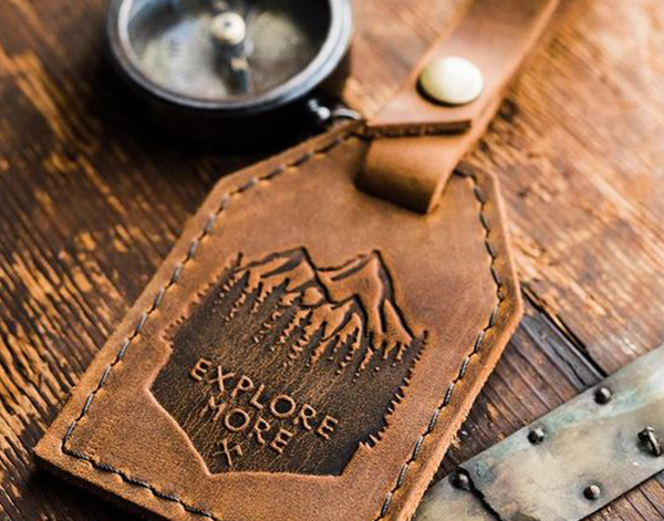
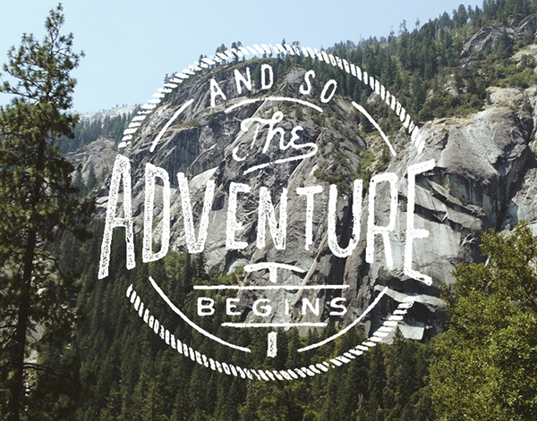
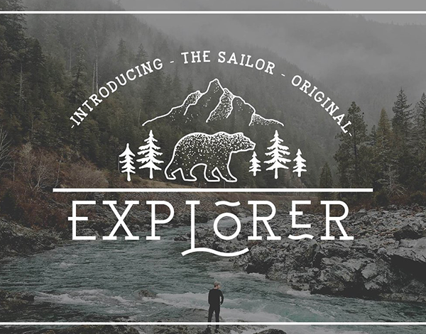
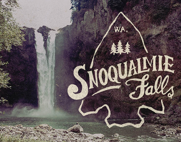
Generic Wanderlust
We all know that look – rugged yet artsy, travel-inspired, heavily filtered environmental photography overlaid with idealistic phrases in faux hand-lettered fonts. Largely popularized by Instagram and Etsy, this tired aesthetic attempts to show authenticity through its natural minimalism, but ends up fading into monotony among an army of look-a-likes. Next year, we hope brands stop trying to build their identities on trendy lifestyles and pretty pictures and start making purposeful, original decisions that differentiate themselves in the market and creates a look that lasts.
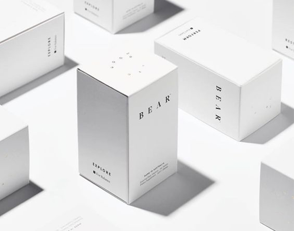
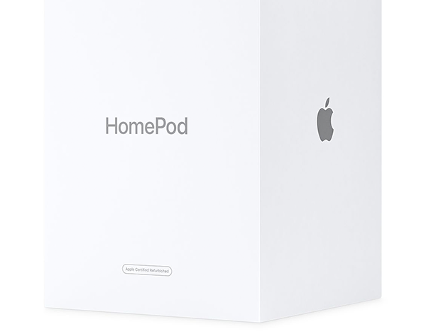
An Overload of White Space
Yes we get it – clean design is nice. An understated aesthetic can be beautiful. We support breathing room around design elements. But some brands become so obsessed with white space that their collateral looks unfinished or is difficult to parse. Often, this tactic is leveraged in an attempt at minimalism and elegance, but instead it comes across as a bit of a cop out. When a brand’s white space looks more like dead space, it’s time to do some reworking.
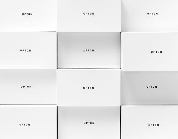
Blanding
Have you seen the [insert brand name here] rebrand? Chances are the only thing it communicates is “Hey, we are contemporary too!” Some of the biggest brands are falling victim to producing some of the most lackadaisical, uninspiring logos. It seems that more and more companies want to scrub their brands clean to the point of losing any visual identity that differentiates them from the crowd.
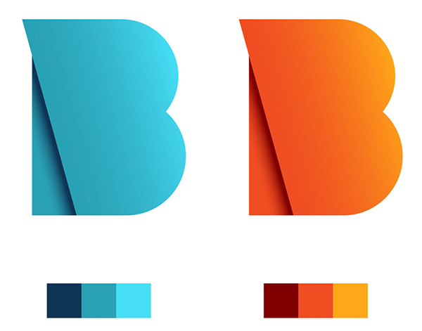
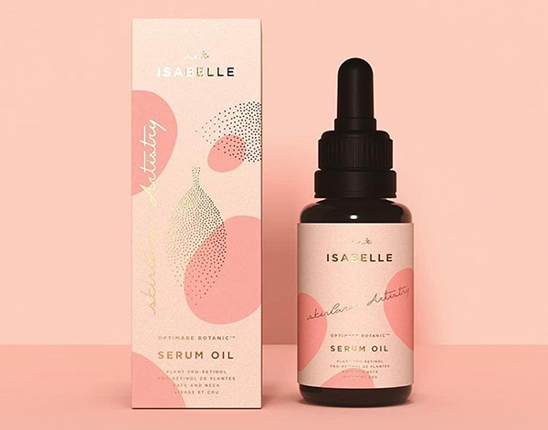
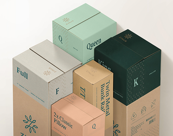
Muted Pastels
No, not the powder pinks and lilacs of Easter. Instead, think various peaches, blue-greys, dull teals, and light mustards. This palette puts a minimal, elegant twist on the standard pastel look without venturing too far from this popular trend.
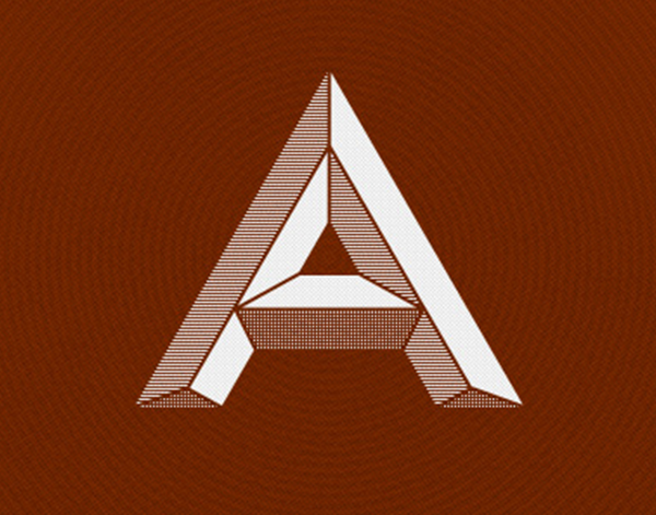
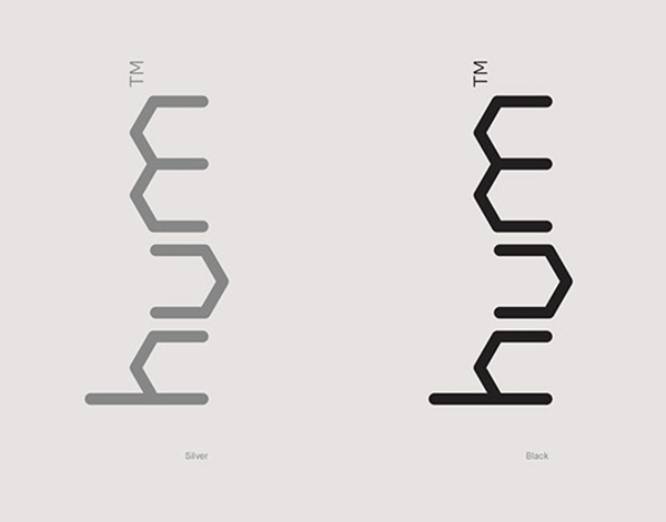
Polygonal Typeface
While so many companies are jumping into a sea of identical type treatments, some are carving out new avenues to stand out from the flock. From this mindset we see an approach emerge that brings in a hexagonal or octagonal structures to its rounded letter forms. Instead an apex of a circle we have straight lines. The result is a futurist aesthetic that carries modern and technological qualities.
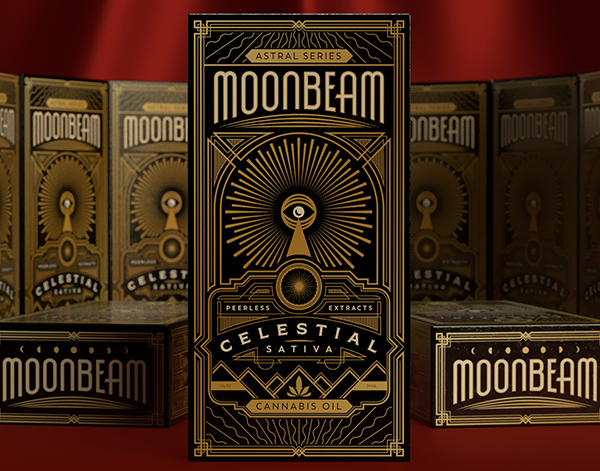
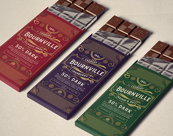
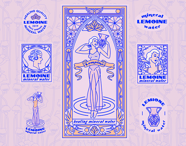
The Return of Deco
With the roaring twenties right around the corner, the design community can count on an incline of art deco influences. Whether it is the combination of organic, ornamental patterns, repetitive geometric line-patterns, or heavy gold accents, the twenties are back. Art deco is one of those brand trends that has been around forever (100 years now!), and we fully expect it to continue its ebb and flow of popularity far into the future.