

Creating a website can be an extremely rewarding endeavor – both personally and financially. But be careful!
Many people are so focused on the details of the design and content of their new website they miss the basics. Be sure not to fall into these extremely common website design mistakes. To both attract and retain traffic, avoid these 7 website don’ts.

1. Don’t Forget To Make Your Website Search Engine Indexable.
The explosion of easy to use Content Management Systems (like WordPress, which now accounts for 30% of all websites) has made this obvious problem a far too common issue. We’ve noticed an alarming trend especially in the past 12 months: many companies are forgetting to allow search engines to index their content or accidentally turning off search access on a live site. Why is this bad? A simple missed check box can make your website never appear in Google. All of your hard work deserves to be seen, and this can secretly be happening without you ever noticing why your traffic is suddenly crashing. Yikes!
What to do: have a trusted website partner to independently check the health of your website monthly. And just to be safe, sign up for Google Search Console to automatically receive an email anything odd is detected.

2. Don’t Hide Your Navigation.
There was a recent design trend where the navigation and menu options on websites were effectively hidden from view behind three horizontal lines that became known as the hamburger. Basically, you click on that symbol and then a plethora of menu options appears from nowhere as if by magic. Well, even though it has led to some people believing that the design is more clean-cut, it has significantly increased the frustration of users who simply want to get to wherever they need to go without hitting extra buttons. This is one of the top mistakes in modern web design. Remember, frustration with your website is never a good thing.
What to do: make your navigation clear and easy to explore.
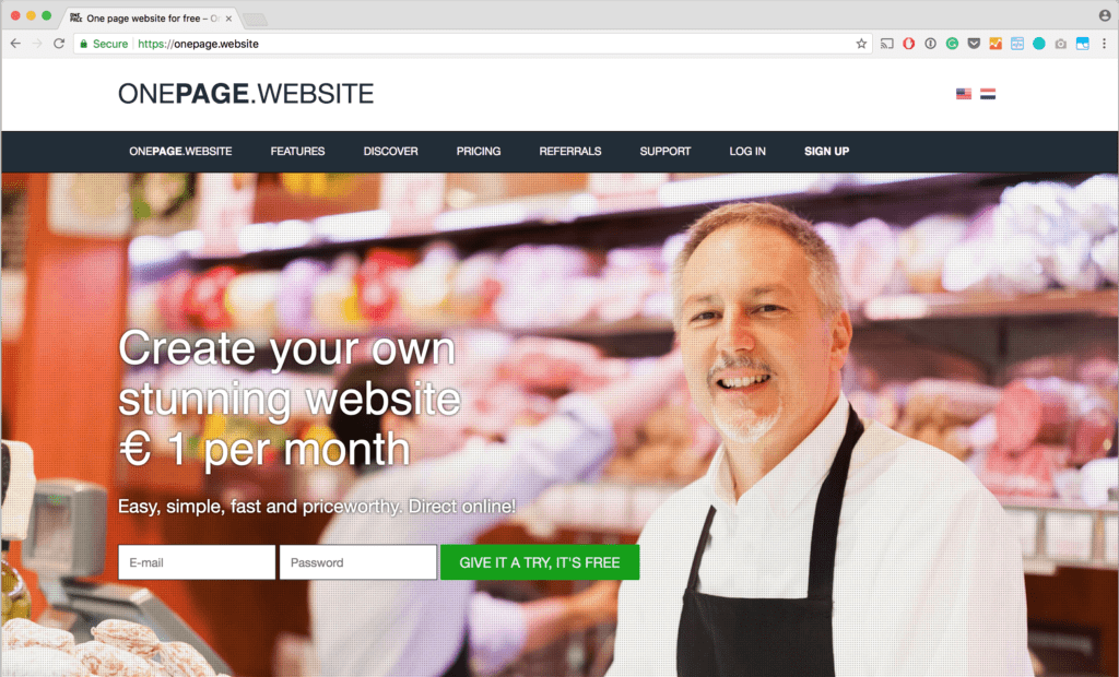
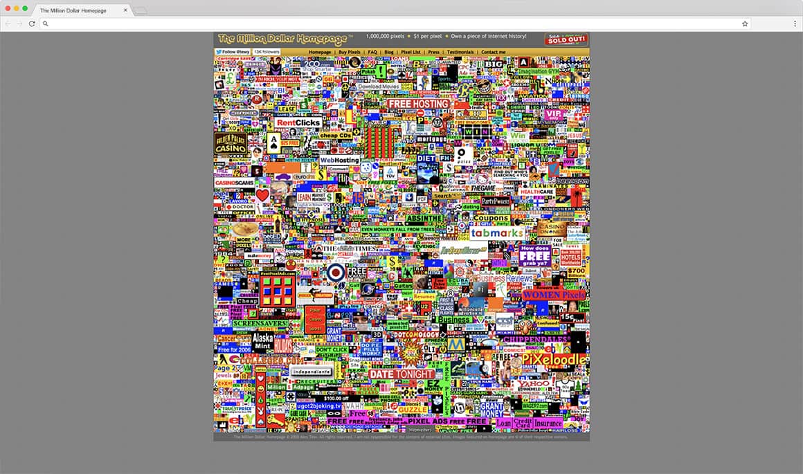
3. Don’t Build Single-Page Websites.
Single-page websites were all the rage a few years back with trend-setters singing their praises. They allowed the website content, design, and development processes to be shortened drastically, making them easier to build. And having all of your content on one page must be more useful for customers, right? The results are in…and they don’t paint a pretty picture. A single page website is bad for search engines, bad for scalability, bad for clarity, and a practice we wouldn’t recommend to our worst enemies. Unless you’re building a website for a very focused need, avoid at all costs.
What to do: your hard work is rewarded when creating multi-page websites.
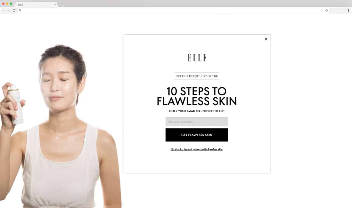
4. Don’t Use Pop-Ups Without Careful Planning.
Nothing quite covers the full spectrum of website don’ts like pop-ups. Even though some people may feel that pop-ups are a useful or effective marketing tool, that requires some serious consideration. For many pop-ups are annoying and intrusive and neither of those things are going to be good for business. People are visiting to your website for a particular reason, but you can guarantee that the reason doesn’t include having to deal with random tasks popping up all over the place. The use of pop-ups has calmed down in recent years, but the negative feelings associated with them do still resonate even today.
What to do: use pop-ups selectively and only in ways that improve a customer’s experience.
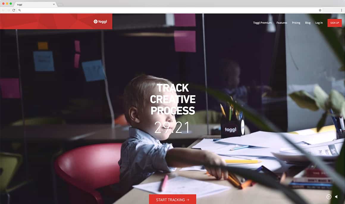
5. Don’t Use Content That Autoplays When The Page Loads.
Even though you may think that having content that autoplays on your website is a good thing, it’s not. Instead, it goes beyond being annoying since people don’t expect it, nor do they want to be forced into watching or listening to something that they don’t want to. Autoplaying videos or audio are a fast way to madden new visitors. In fact, it will then become more likely that they will simply run away from your website and never come back due to the irritation levels associated with this one thing. By all means, make sure that the video or audio is clear for all to see, but leave it at that or you will just annoy and irritate the visitors to your site. Starting in 2018 Google Chrome will block this content from autoplaying, so it is best to stop now.
We should note that video content looping in a background as a design element is very different! We embrace this design trend, because it can provide a richer and more emotional experience without bothering a user. Autoplaying audio is very different.
What to do: embrace the play button.
6. Don’t Use Lots Of Advertising.
While people generally don’t mind the occasional advert on a website, they hate when it is completely overdone. People go to your site in order to get something of use to them, but if all you are concerned about is selling space to make money, then you aren’t going to get far. Limit where adverts can go on your site, and also limit the number of adverts that you choose to have because in this instance, less is undoubtedly more. Also, Google is now punishing websites that have too many ads that take away from the user experience, so keep that in mind as you are certainly doing yourself more harm than good.
What to do: unless your livelihood depends on website ads, avoid or reduce them.
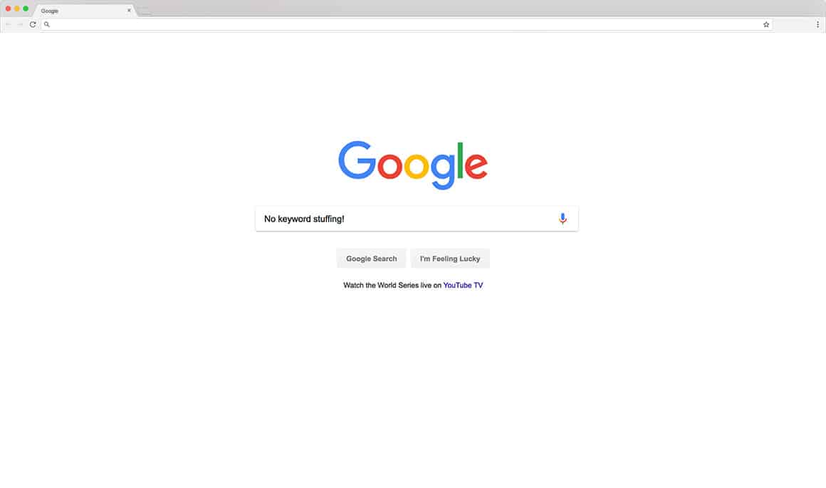
7. Don’t Build Weak Spammy Content.
It used to be the case that you could jam your desired keywords as often as possible into a bulk of similar pages or blog posts to succeed, but that no longer applies. Instead, Google will punish websites that have too much of an emphasis on keyword stuffing as it takes away from the quality of the content or experience that the individual is going to be having. The content needs to flow and actually make sense rather than appearing to be rather disjointed.
Google has clarified the type of content that has a greater chance of success:
- Does the site have duplicate, overlapping, or redundant articles on the same or similar topics with slightly different keyword variations?
- Is the content mass-produced by or outsourced to a large number of creators, or spread across a large network of sites, so that individual pages or sites don’t get as much attention or care?
- Are the articles short, unsubstantial, or otherwise lacking in helpful specifics?
- Are the pages produced with great care and attention to detail vs. less attention to detail?
- Does this article have spelling, stylistic, or factual errors?
And Google recommends avoiding content that:
- Stuffing keyword-rich links to your site in your articles
- Having the articles published across many different sites; alternatively, having a large number of articles on a few large, different sites
- Using or hiring article writers that aren’t knowledgeable about the topics they’re writing on
- Using the same or similar content across these articles; alternatively, duplicating the full content of articles found on your own site (in which case use of rel=”canonical”, in addition to rel=”nofollow”, is advised)
In short, Avoid “thin content”, but embrace richer explorations of these same topics without trying scammy tactics. The rules and regulations surrounding the use of keywords has changed, and if you don’t follow them, then your website will vanish down the results pages faster than you can blink. Keywords still matter. But great, relevant, and engaging content is more important than jamming more keywords on a page.
What to do: make interesting content that adds value and is worth sharing.
Looking for more effective web design tips?
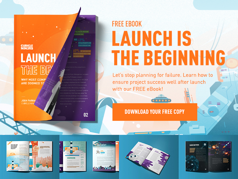
We’ve only just scratched the surface! Check out our Ultimate 9-Step Website Redesign Checklist for more. If you’re ready to build a website but need some help, get in touch. Cubicle Ninjas has the expertise to bring any idea to life!
SCHEDULE A FREE CREATIVE DESIGN THINKING BRAINSTORMING SESSION WITH CUBICLE NINJAS!