Can You Spot These Company Logo Secrets?
These clever logo designs include illusions and hidden messaging. Did you notice any of these company logo secrets before their mystery was revealed?
1. Wendy’s
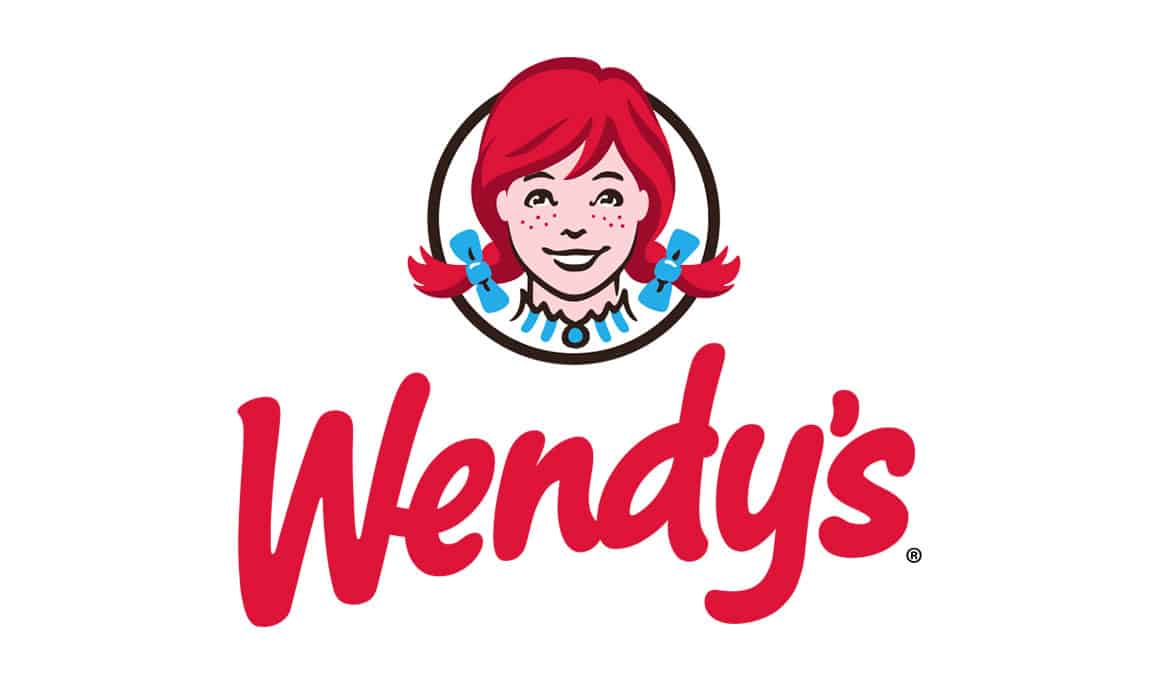
The Wendy’s logo has one of the most famous company logo secrets in the world, but most people are unaware that there is a secret hidden inside it. Chances are you’ve never noticed it, even though it’s been staring right at you this whole time. Take a closer look at the girl’s neck. Do you see the collar of her dress? Look closely and you can see that it spells out the word “mom”. This is no accident! The company wanted to invoke home-cooking and a personal connection in its brand, so its creator, Dave Thomas, made a point of sneaking in a reference to something that makes everyone feel at home. And now that you’ve spotted it, you wont be able to stop seeing it every time you look at the Wendy’s logo!
2. Baskin Robbins
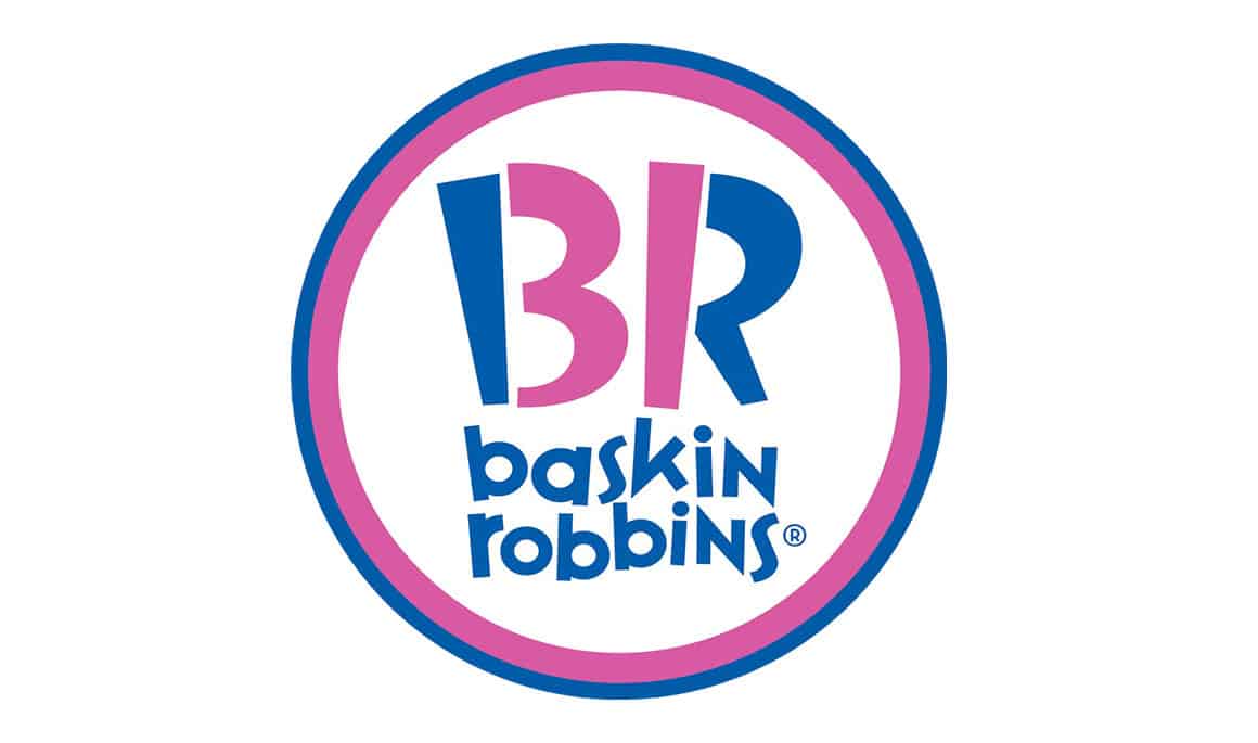
At first glance, there the Baskin Robbins logo seems pretty straightforward. But if you look closer at the “BR”, you’ll notice that the pink highlighted section forms the number 31. Why is this important? Well, the company sells 31 different flavors of ice cream, and they are telling you all about it in their logo. BOOM – mind explosion. Time to celebrate with some victory ice cream!
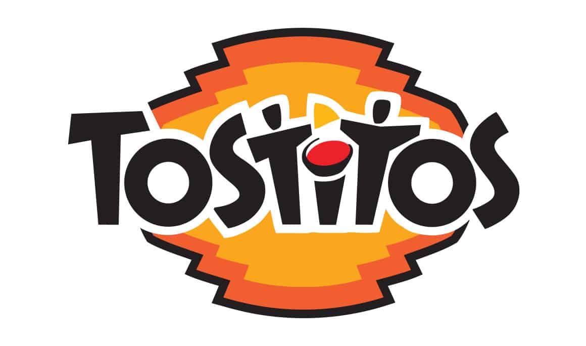
3. Tostitos
The Tostitos logo has been through a number of changes over the years, but they have made sure to keep a subtle company logo secret inside it. In the middle of their logo around, you can see that the letters form an image that shows two people sharing chips and dip. This clever design is a prime example of why you need to pay close attention to a logo — you never know what it may be hiding!

4. Hope for African Children Initiative
This logo contains an optical illusion where what you see depends on how your brain recognizes the shapes. If you focus on the negative white space, you will see the outline of the continent of Africa. But if your mind shifts and you focus on the outside region, you’ll see the shape of a young child on the left and an adult on the right. As you change your attention, the image will “pop” from one to another, thanks to the unique way our minds perceive shapes. This is a great example of how you can get a complex idea across using creative graphic design. Brilliant, simple, and yet unforgettable.
5. The Bronx Zoo
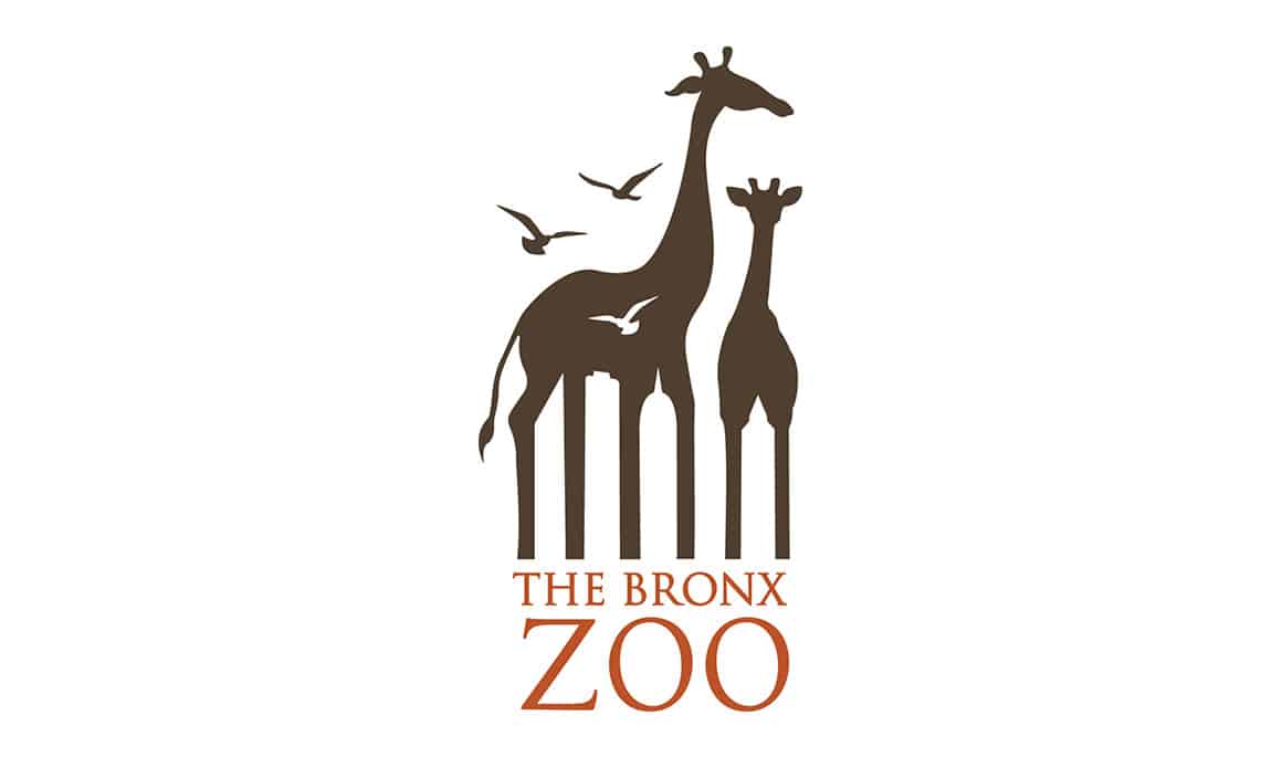
This logo for the Bronx zoo takes a clever approach at making everybody aware of its roots and its location. At first, you can see the giraffes in the logo, but if you look at the space between their legs, you’ll be able to see the company logo’s secret: several famous New York City buildings! The designer made an outside-the-box decision to find a way to incorporate these two different aspects of the zoo’s identity into a single, memorable logo.

6. Spartan Golf Club
This logo for the Spartan golf club is another fantastic example of a company with a hidden logo secret. The way the two images are cleverly combined create a unified whole. As you can see, there is a golfer and motion lines for the swinging club — but put together, they form a Spartan style head and helmet. This shows that by creatively combining shapes, designers can create logos that contain more than meets the eye.
Are Clever Logos Always Effective?
While these brands are wildly memorable, you might be surprised how few of them lasted.
Only 50% of the logos above stood the test of time.
Wendy’s, Baskin Robbins, and Tostito’s proved successful. But the rest changed their logos (Hope for African Children Initiative and the Bronx Zoo) or even went out of business (Spartan Golf Clubs). It goes to show that a brand’s clever logo should never outshine the products or services it provides.
Interested in More Branding Topics?
Check out these rebranding disasters or get inspired with the best and worst of 2018’s brand identity design with our Ninjawards series.
