
Simplification
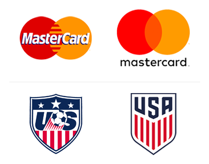
Flat design continues to reign supreme, and in 2016 we saw some major brands adapt to the changing times. Mastercard, for example, redesigned their logo for the first time in 20 years, opting for a much sleeker version of their iconic red and yellow circles.
MONOLINE
Featuring a flat and streamlined look, monoline logos present opportunities for more intricate designs without losing any modernity. Beyond just logo design, this style is an increasingly popular treatment for iconography as well.
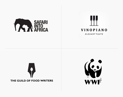
NEGATIVE SPACE
This trend requires ingenuity and a keen eye and has skyrocketed in popularity this year for its dual-purpose aesthetics and minimal feel. We predict its popularity will continue well into 2017 and beyond.
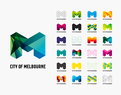
LOGO SETS
Dynamic, diverse, and flexible, logo sets expand a brand’s ability to personalize separate facets of their business while retaining an overall cohesive and recognizable mark.
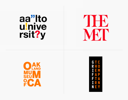
LETTER STACKING
We recognize that letter stacking in logo design is a love-it or hate-it kind of trend, but at Cubicle Ninjas, we hate it. More often than not, this design trend looks forced and messy with iffy legibility and poor translation to a horizontal version.
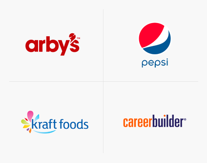
LOWER-CASE
Using all-lower case letterforms doesn’t automatically make a logo more modern, more fun, or more personal. This stylistic choice can be a valid one, but it is often used as a lazy solution to look more current and should be nixed in 2017 for more purposeful design decisions.

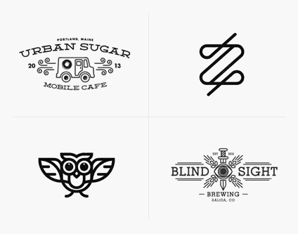
FAUX VINTAGE
Extra points if a badge or crest is used. It’s not that vintage-inspired logos can’t be well-designed, but they are extremely overused and often don’t correlate with the age or style of the business at all. In 2017, let’s stop falling back on this trend.
EXPANDED USE OF ANIMATED LOGOS
Complex storytelling through design really began to hit its stride this year, and we only expect 2017 to push that further. One of the ways we anticipate seeing brands push their message further is via animated logos, engaging viewers and creating a story out of the most visible element of their visual identity.
Takeaway: movement is no longer an optional element of an identity. Animated logos should be a standard element of the design exploration process.