Colors have a huge impact on the way we think, feel and behave.
Consider this: our brain decodes visuals 60,000 times faster than text and this is why it is important to understand color theory for marketers and how it influences marketing today.
Have you ever wondered why BMW chose a mix of blue, black and white? Or why Coca-Cola decided to go with red and white?
This is why color theory for marketers is so important, and brands that get maximum mileage out of it mix art and science to create an emotional connection with their audience. In fact, studies show that color increases brand and logo recognition by 80%!
Color Theory For Marketers
When choosing a brand color scheme, marketers should aim to find a palette that helps them cultivate positive emotions and a connection with their brand.
Take Google: why did the search engine giant opt for a rainbow-colored logo? Ruth Kedar – the graphic designer who worked on the logo – told Wired Magazine that she chose the green L last to add a pop of color to the design.
The idea behind Google’s multicolored, light-hearted logo was to show people that ‘Google does not follow the rules.’ And it worked! It beat Doritos and Oreo to become the third coolest brand in the world.
This proves just how powerful color play and a uniformed marketing strategy are for branding and marketing.
Building A Brand Color Scheme
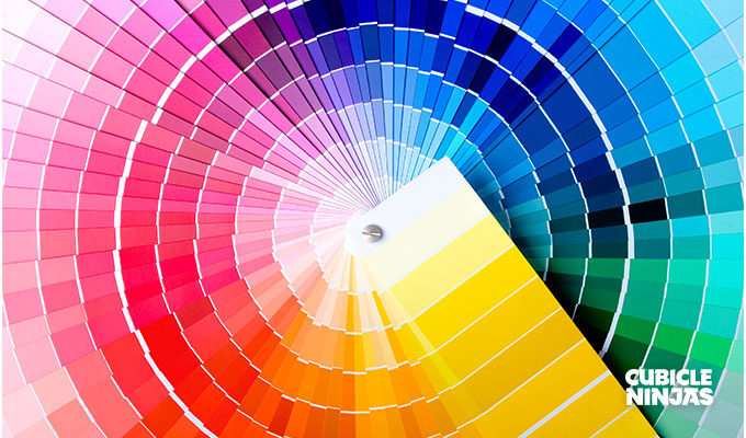
An important thing to understand about color theory for marketers is that different colors trigger different responses in the human brain.
Most brands typically choose from 1 – 4 colors, depending on the type of scheme and image they want.
Using way too many colors could lead to clutter. However, if you can justify your philosophy and if you get desired returns on it, then there’s no harm in pushing the envelope a little.
A typical color scheme includes:
- Base – Also known as the dominant, this is the main color your brand will be associated with. If you’re following the design rule of 60-30-10 ratio, then this color would make the 60% portion. For example, red is the dominant color for Coca Cola.
- Accent – Your accent is the color you use with your base to broaden your palette and the two should obviously complement each other. For example, white is the accent in a Coca Cola logo.
- Neutral – Beige, grey and white are usually the neutrals that brands use for their logos and visual assets. Since Coca Cola doesn’t have a third color in their logo, white is both the accent and neutral for the brand.
Using Color To Convert
You will notice that many food brands, such as Kellogg’s, KFC, Dominos and Burger King choose red as their dominant color.
Why do you think this is? Well, red represents love and is known to trigger appetite.
Knowing the color landscape well could eventually increase your sales. According to a study by Kissmetrics, 85% of shoppers said that color is a primary factor when they’re buying a product.
Moreover, a study found that magazine readers recognize colored ads 26% more compared to black and white ads. This gives us a good insight into how we process colors and how brands can use them for maximum psychological impact.
If you don’t want to experiment with a completely new color scheme, you can look at case studies from the past to know what colors work best for boosting sales.
The Isolation Effect
The Isolation Effect – or the Von Restorff Effect – predicts that a number of similar stimuli are presented together and the one that is different from the others is remembered for a longer time.
This is why adding a ‘pop’ of color to your brand assets is a good idea – look at Facebook’s sign up page, for example.
Their brand colors are white and blue, which evoke a feeling of trust and cleanliness – this works for them since it’s all about networking.
However, notice how the sign-up button is in a completely different color. This is the Von Restorff Effect in full swing. They want the signup button to pop out so that more people remember to click on it and convert.
If you’re looking for colors that stand out and promote your brand, you can choose from the following to get started:
- Red – love, passion, hunger
- Blue – peace, tranquillity, calm
- Green – freshness, nature, purity
- Purple – regal, expensive
- Black – mysterious, powerful
- Orange – zesty, optimistic, full of life

Color Theory In Practice
You can test the effectiveness of your brand colors and their contribution to conversion through a number of strategies. You could change the color of your CTA for 1 – 3 months. Facebook settled on green, but what if red works better for your brand? Keep experimenting and analyzing till you hit the conversion jackpot. Or you could refresh your website using the same color palette in a different way. For example: Use colors from your logo and apply them on your website and other visual assets. Or you could even pick a color from your brand theme that triggers action (like red, orange, and yellow) and use it in different sections of your website where you want the reader to do something, like a ‘click to read more!’ button. The good thing about color theory for marketers is that it gives you a lot to play with! You can keep making subtle changes in your brand’s visual assets to see what brings you the highest returns.
Looking for More Creative Design & Branding Insights?
Check out 5 Reasons NOT to Update Your Brand!
Need more help? Our ninjas are ready to go! Contact us today to get started on your next big idea!
